
Infographic
Food Maps
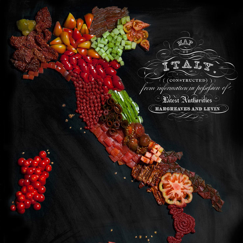
It’s no secret that we at Barbour are bunch of foodies of some degree or another, so we can’t resist food concepts that are really well executed. And this series, by New Zealand-born, Brooklyn-based photographer/artist Henry Hargreaves (see a previous post of his work here) is a perfect example. In his own words, Hargreaves explains:…
Read MorePhotographic Infographics
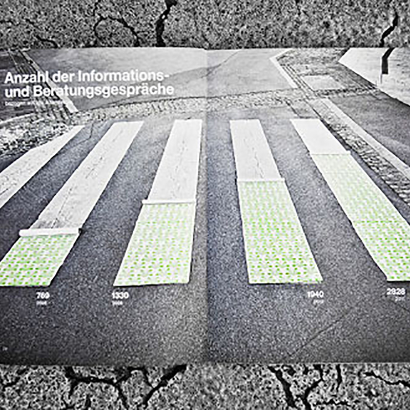
Having created our fair share of infographics, we are fascinated by new and interesting ways to approach them. Austrian brand consulting and design firm Moodley Brand Identity has re-imagined what could be an annual report full of humdrum charts into compelling photographic compositions. The simplicity of text and image is graphic design in its purest…
Read MoreThe Price of Being a Superhero
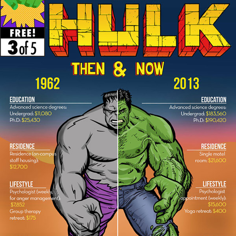
We try to be discriminating about the superhero art we share. There’s so much out there, you really have to sift through. But this incredible series of infographics for Mashable is great on several levels. Not only do we love the illustration (by Bob Al-Greene) and design (by Emil Lendof), the research is fascinating. We…
Read MoreNegative Space Animals

Art director/illustrator George Bokhua, based in the Eurasian state of Georgia, has an affinity for both animals and negative space. This fantastic series marries both in these self-proclaimed masterpieces. Working with negative space is actually more difficult than it may look, but in the hands of Bokhua these marks really shine. Excellent work. Via Behance
Read MoreStony Brook University Athletics Annual Report by Barbour Design
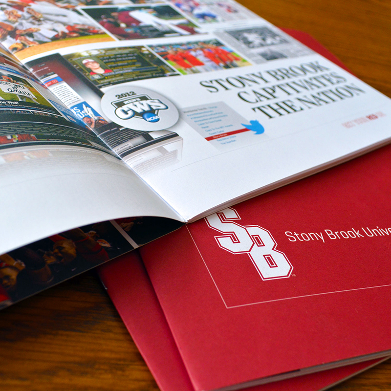
The 2011-2012 school year was a tremendous one for Stony Brook University Athletics — having produced conference champions, scholars, an NCAA national title and an Olympian. To mark such a momentous year, Barbour worked with Stony Brook to create an annual report that highlighted these significant achievements. Our approach was to build image-driven layouts with…
Read MoreFruit Prints by Chris Dina

With spring now in bloom, we are reminded of the bounty of fruits the warmer weather brings. What better way to start a Monday than with this vibrant series of prints by New York City-based designer Chris Dina. We have a certain fondness for series (and fruit!), so these pieces, complete with compelling shapes and…
Read MoreGood Design Travels Fast
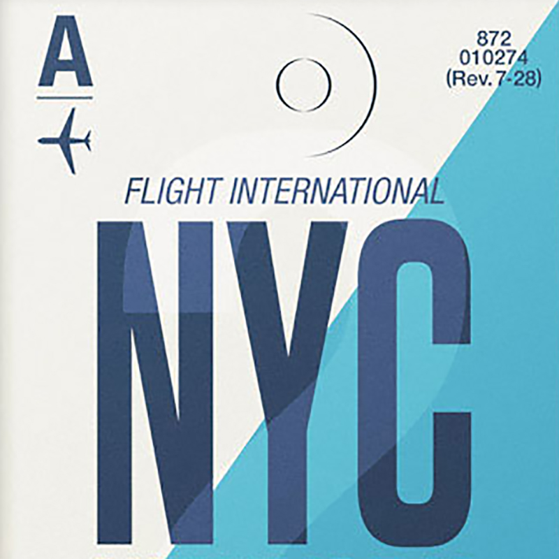
Self-described one-man studio Neil Stevens has an appreciation for vintage type, as do many of us designers. There’s something pure about it, free from extraneous effects or trendy design devices. This collection of flight tag prints by the London based designer/illustrator captures the essence of a bygone design era (and would make a great inspirational…
Read MoreThe World of 100
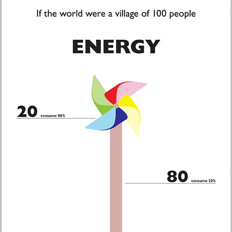
Hong Kong-based designer/illustrator Toby Ng brings to life various (often surprising) statistics about the spread of population around the world. Ng poses the question “If the world was a village of 100 people…” The clean graphics and typography put these statistics into perspective in a way that is really easy to digest. This is just…
Read MoreShapes of Cities
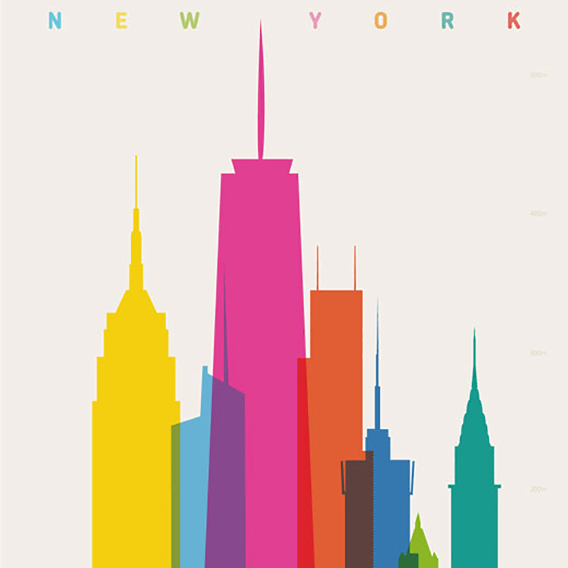
London based designer and art director Yoni Alter developed this series of beautiful posters, Shapes of Cities, depicting cities from around the world and a spectrum of vibrant colors. But as with all good design, it’s more than meets the eye. These depictions of select cities, each featuring silhouettes of key buildings and landmarks, are…
Read MorePostmammal
San Francisco-based creative director Robert Murdock has a outstanding body of work that ranges from interface design to brand and identity to interactive design. His site, Postmammal, the name of which he describes as being “based on the notion that humans are always evolving, and are always looking for what’s next — essentially what’s beyond…
Read More