
Typography
Uber Branding Blunder
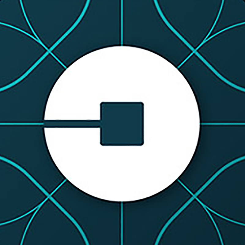
Just this week, Uber unveiled a global rebranding that not only strayed a bit from its recognizable logotype, but also introduced a rather detached set of app icons. Can’t say that we suffered from extreme design envy over the previous Uber logotype, but it was fine. While their new logotype seems like a step in…
Read MoreSnow Script by Faust
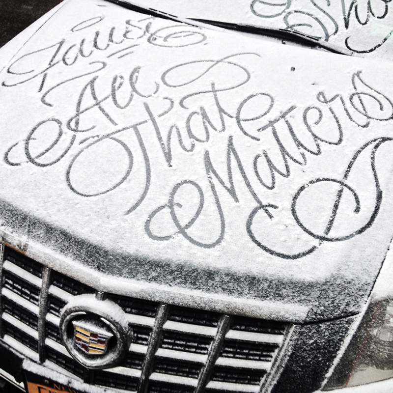
Given all the snow in the news lately, we thought it fitting to peek at the work of street artist simply known as Faust. Paying homage to a favorite pastime for most who have grown up with even semi-snowy winters, he brings his impeccable calligraphy skills to snow-covered surfaces in a series he calls Snow…
Read MoreThis Ampersand That
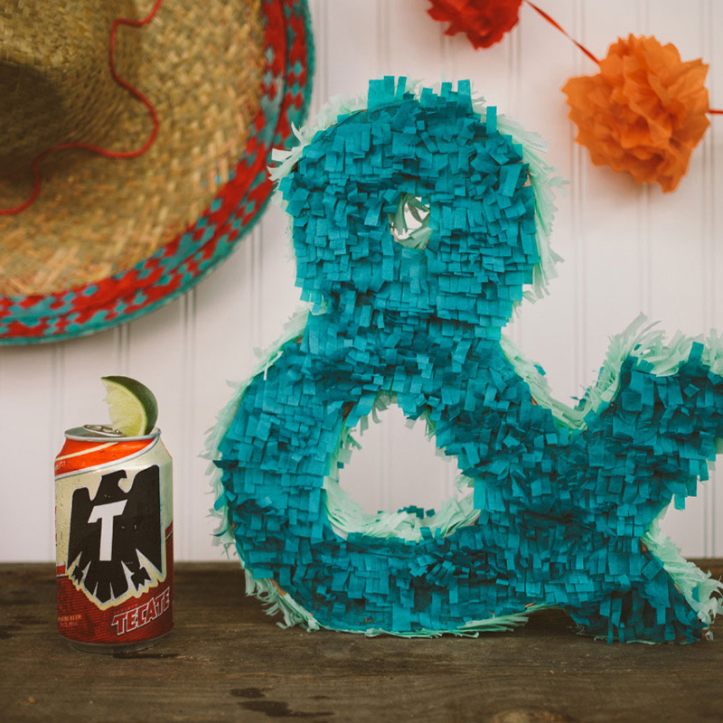
It’s no surprise that we’re big fans of photographer Emily Blincoe (previous posts here and here). Blincoe splits her time between Austin (ampersand) Nashville, creating some compelling photography, that’s both thoughtful and fun. A quick look at her typographic ampersand series, now several years old and aptly titled “This Ampersand That”, is long overdue. We…
Read MoreTurning Fear on its Head
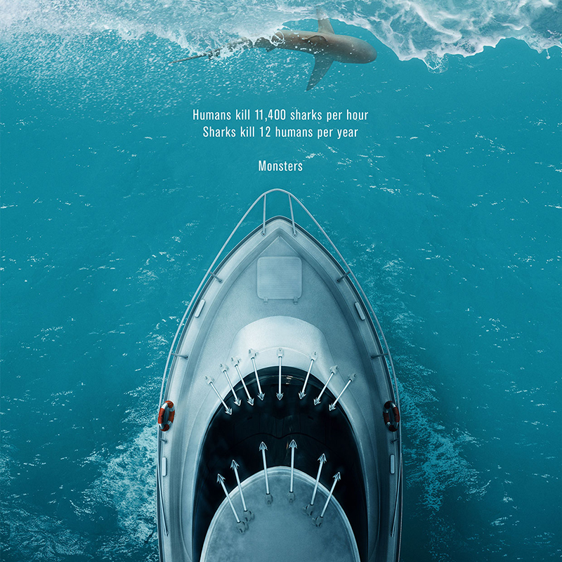
Design really is all about communication and education, whether its purpose is to sell, explain, or simply draw attention. In the case of this brilliantly clever self-initiated poster, the visuals do all the work to raise awareness of an often ignored issue facing sharks in their, well, house (more about that here). A collaborative effort between…
Read MoreEveryone Has Something Good
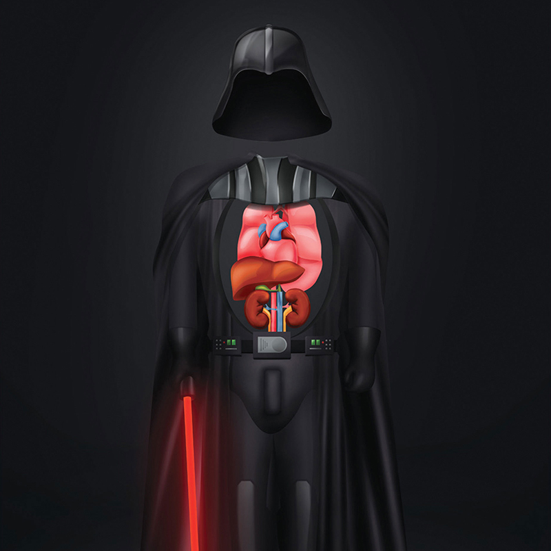
Most designers know that sometimes in order to really grab an audience’s attention, you need to be edgy, perhaps even controversial. This notion is not lost on Brazilian-born, Hamburg, Germany-based art director Felipe Nunes Franco. His refreshingly unexpected approach to soliciting something as virtuous as organ donation, of all things, is both tongue-in-cheek and thought…
Read MoreMosaic Master
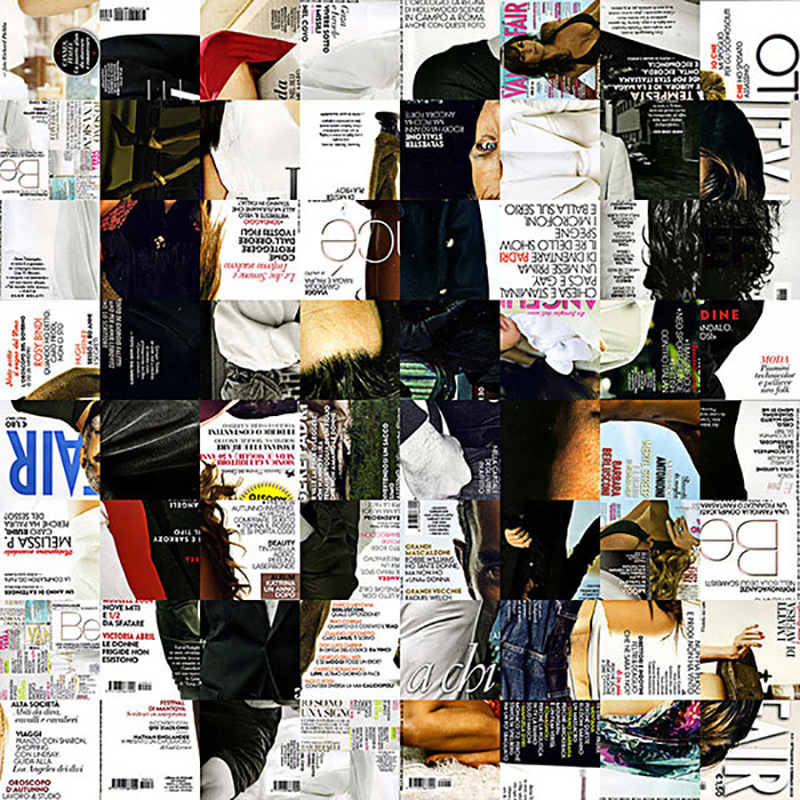
Exercises in typographic and mosaic compositions bring us back to our early studies as designers. Not because they are novice or effortless, but because they touch on the fundamentals of good design. Italian artist/designer known as Antonio Village9991 is quite adept at both, as exhibited by this sampling of his impressive body of work. For…
Read More10 Rules to Instantly Improve Your Presentations
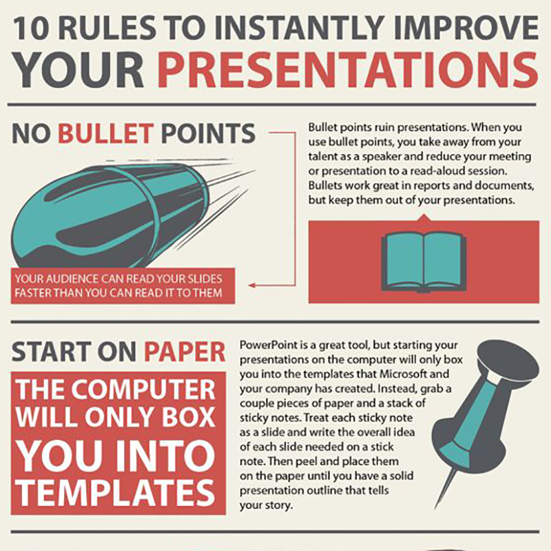
We at Barbour are not only in the business of making our clients look good, but also helping them present smarter and more efficiently. Originally created by Dutch designer Maurice ten Teye, this superb infographic is worth sharing for its clarity and spot-on advice. The best that we can do as designers is preach these…
Read MoreEphemeral Urban Art by SpY
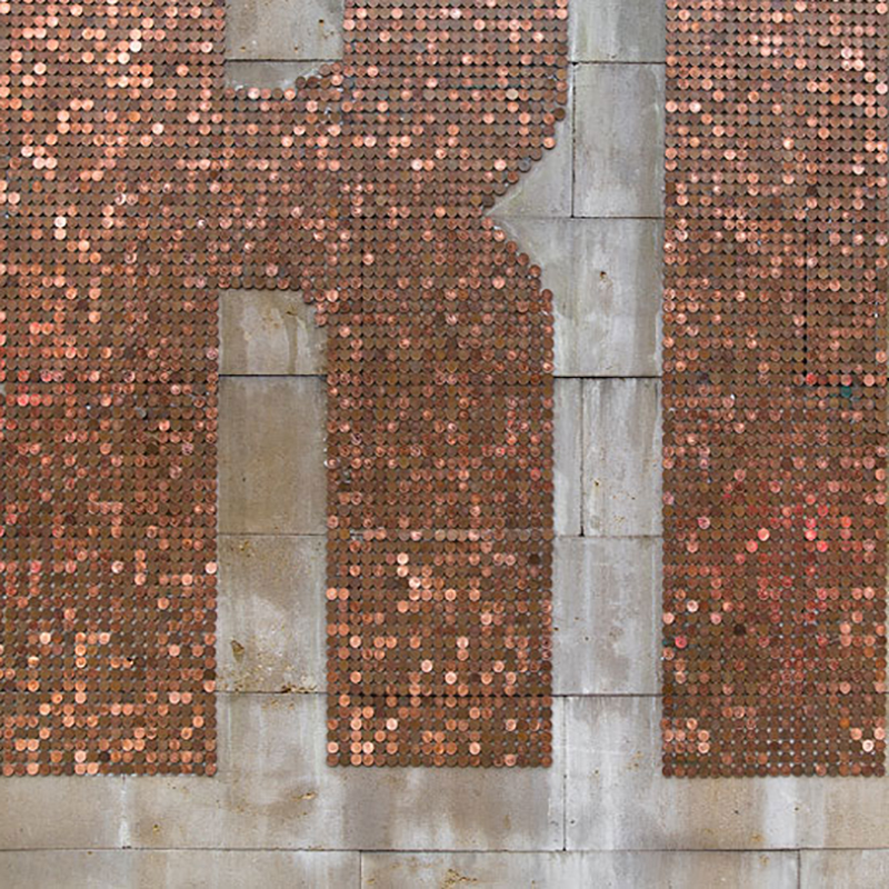
Given the somber mood surrounding all things politics and money in Europe, particularly Greece, this installation street art, fittingly titled “Crisis”, is especially relevant. Conceived and created by Madrid-based artist SpY, and installed in a central neighborhood in the city of Bilbao, the piece consists of 1000€ (almost $2,000) in 2 cent coins making up…
Read MoreTo Pluto and Beyond
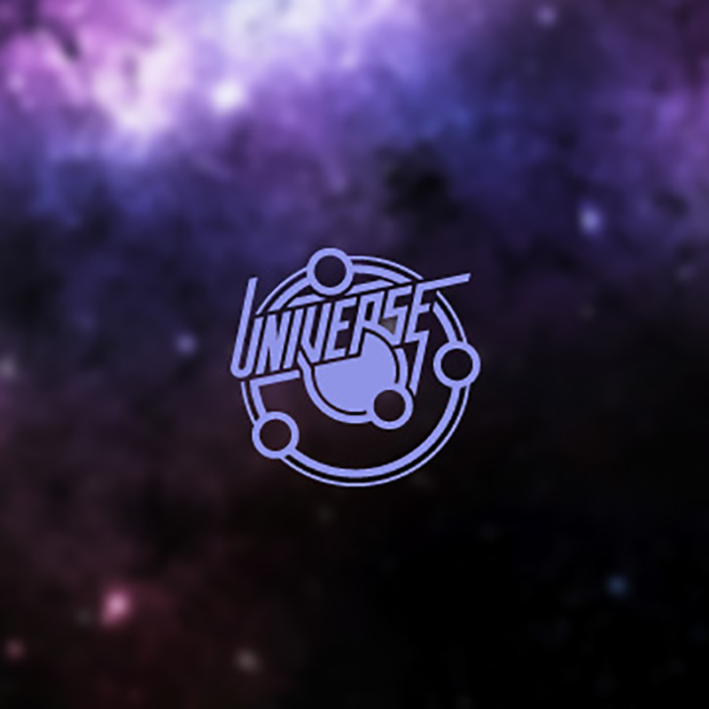
Given the late breaking, historical news that a NASA probe, launched some nine and a half years ago, and traveling an astounding 3 billion miles, has finally reached Pluto just hours ago, we thought it fitting to showcase this series of custom astronomy logos by Berlin-based designer Jonas Söder. We love Söder’s style here, sort…
Read MoreLogo-Recreating Calligraphy King Seb Lester
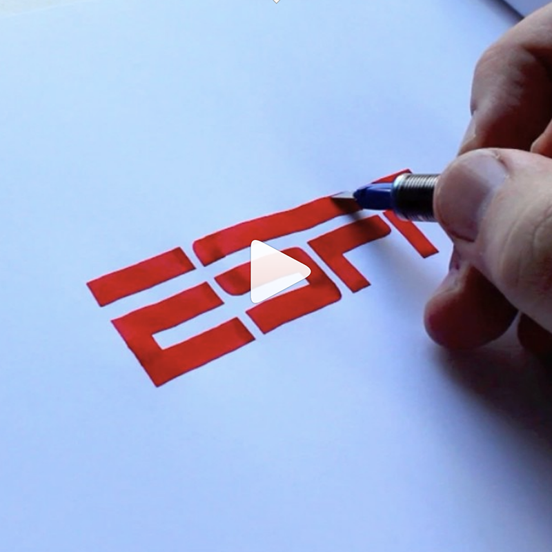
So, we stumbled upon this viral video recently, and were in complete awe. You will be too, if you haven’t seen it already, guaranteed. It made us ponder the irony of being so taken with corporate logos carefully drawn by hand, even though that’s exactly how they were developed in the not so distant past.…
Read More