Light Painting Luminary
Arizona-based photographer Alex DeForest has a rather unique approach to portraiture. Though the medium of light painting is not a new one (can be traced back to American artist Man Ray’s 1935 series “Space Writing”), DeForest’s reclamation approach makes for some pretty remarkable pieces. In his own words, “I buy cheap flashlights at Walgreens, grocery…
Read More »The Secret Life of Heroes
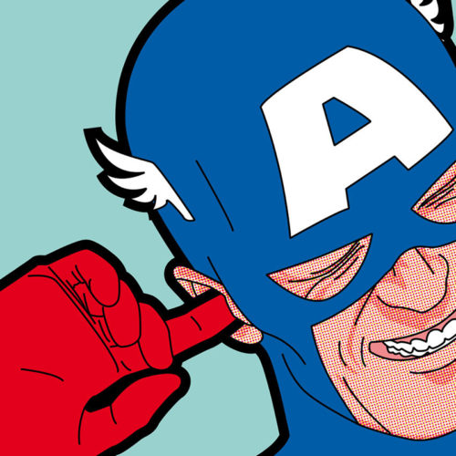
Superheroes (and villains) are often depicted in all their idealized glory. But French artist/illustrator/designer Grégoire Guillemin’s unique perspective is rather striking. Not just for their (highly effective) pop art style, but for his depictions of everyday life, and sometimes compromising situations. Guillemin’s sense of humor shines through these outstanding illustrations (prints for sale here). Via…
Read More »Inventive Collage Series
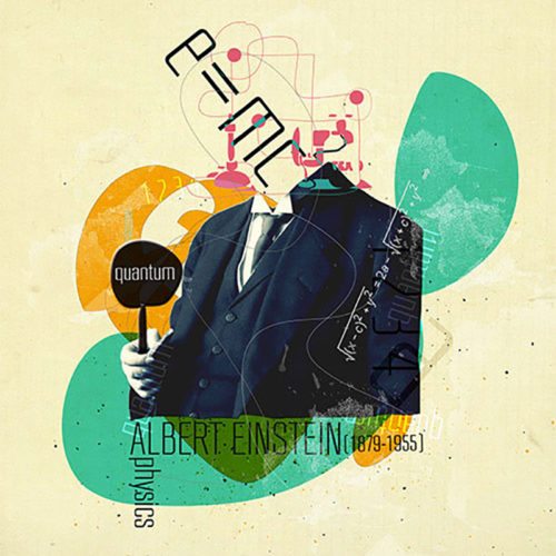
Istanbul-based designer/illustrator Selman HOŞGÖR has a distinctive collage style. We love how he merges vintage photography with illustration and typography. In less capable hands, this series could come across as rather pedestrian, novice work. But HOŞGÖR really hits the mark with these. Great balance of uniformity between each piece to come across as a true…
Read More »Graphic Genius Alberto Seveso
Italian illustrator/designer Alberto Seveso employs some awesome Photoshop skills to merge contrasting textures for a very distinct design style. We’ve featured his work before, but had to share some of his latest work. From album artwork, to packaging for Adobe, Seveso is a true master of digital art. He brings a certain beauty and elegance…
Read More »Food for Thought
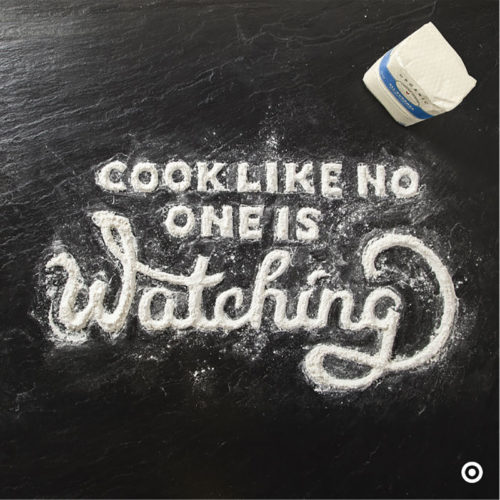
We do have a certain fondness for food photography (here, here and here), so when we come across something special, we have to share. Allan Peters, Minneapolis-based in-house senior art director for Target, was at the helm of this superb “Food for Thought” series aimed at increasing awareness about grocery products in Canadian Target outlets.…
Read More »Hypnotic/Geometric/Fantastic Work of Andy Gilmore
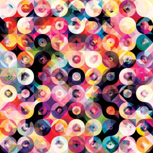
Local (as in Rochester, NY) artist Andy Gilmore creates mesmerizingly hypnotic geometric compositions. These are not pedestrian takes on kaleidoscopic views, but truly unique works of art. As revealed in the following (terrific) short video, Gilmore’s often complex pieces are inspired by the world around him, especially patterns in nature. His remarkable work has garnered…
Read More »
