
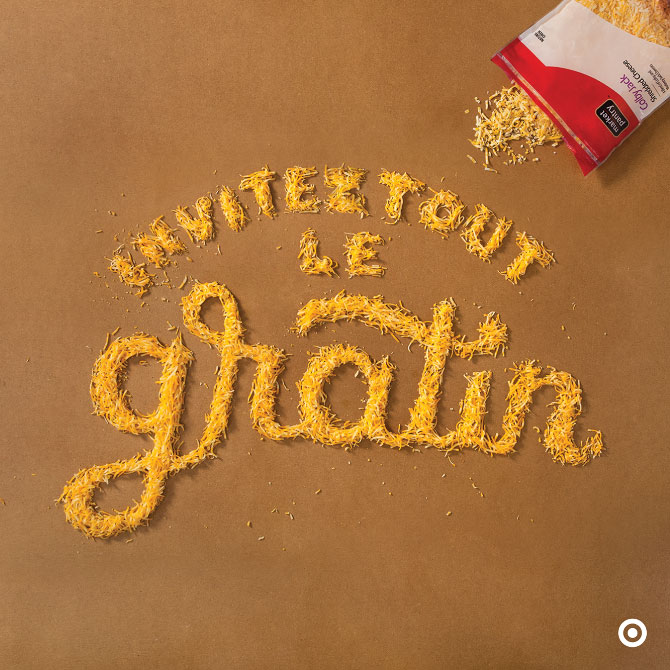
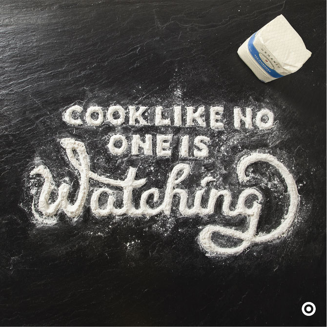
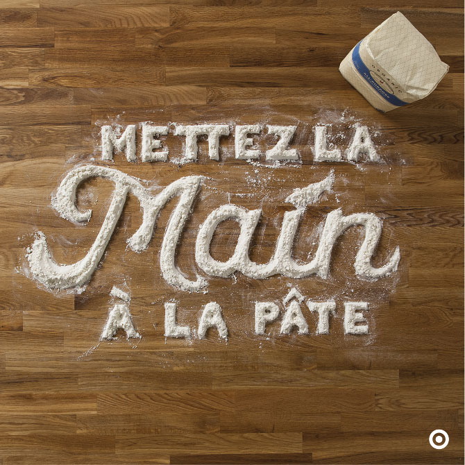
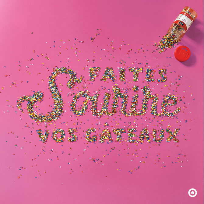
Food for Thought
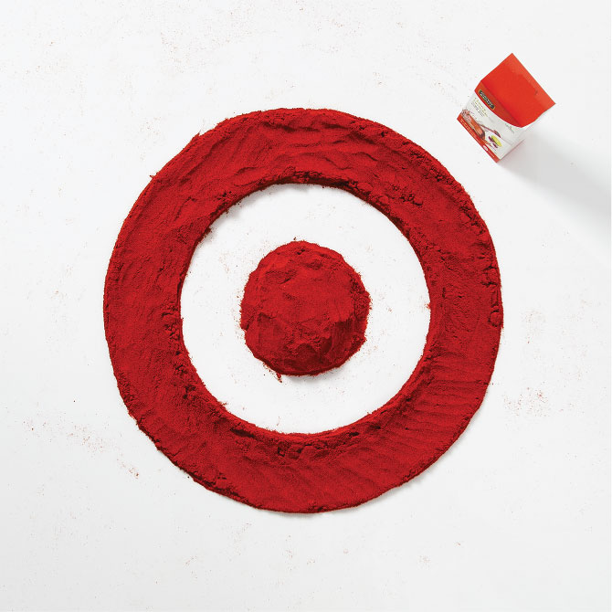
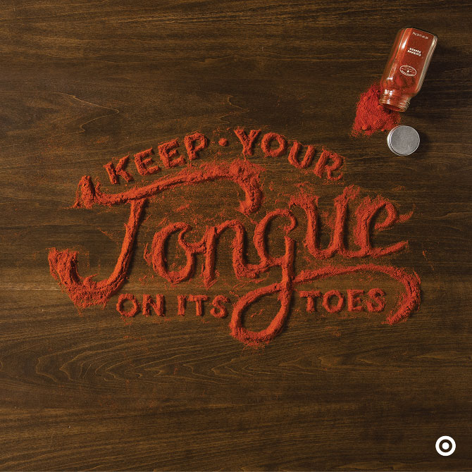
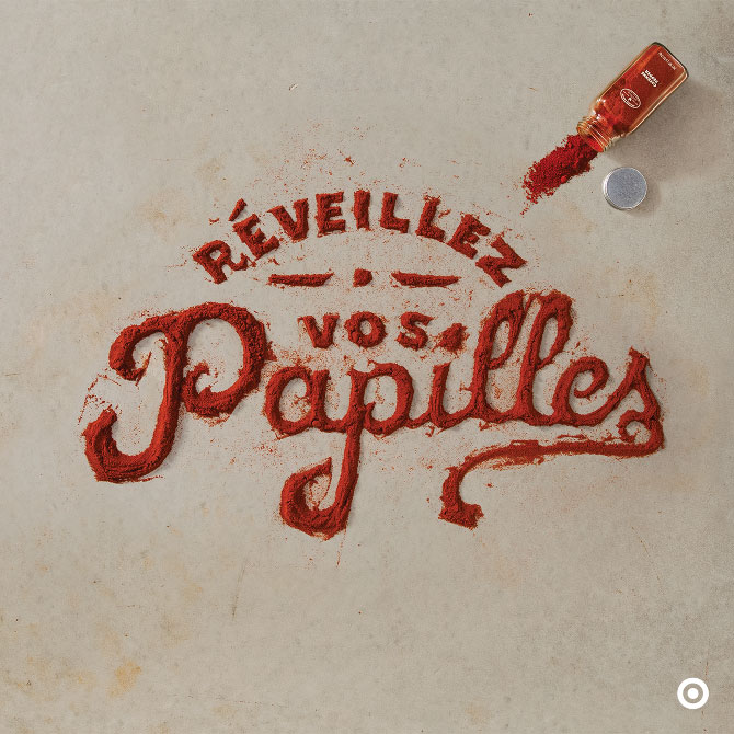
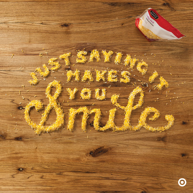
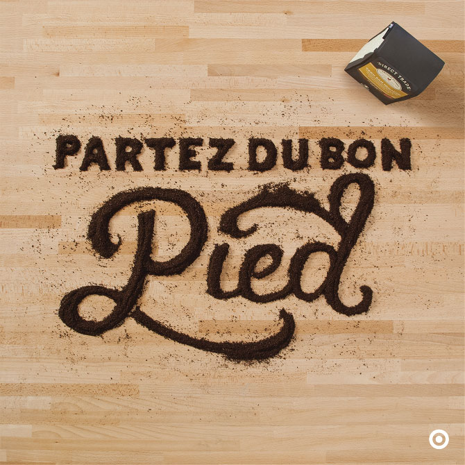
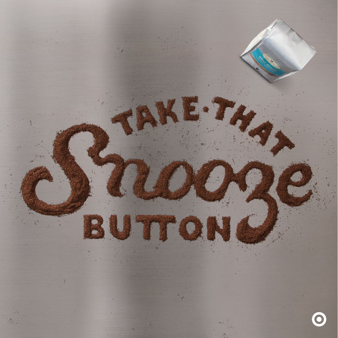
We do have a certain fondness for food photography (here, here and here), so when we come across something special, we have to share. Allan Peters, Minneapolis-based in-house senior art director for Target, was at the helm of this superb “Food for Thought” series aimed at increasing awareness about grocery products in Canadian Target outlets. Illustrator/letterer Danielle Evans did an amazing job getting her hands dirty and bringing the concept to life (in both English and French!). Well done.
Via allanpeters.com and marmaladebleue.com

[youtube=http://www.youtube.com/watch?v=XaVI43q3Qn4&w=640&h=360]
[…] and available here) is really something, and reminiscent of some other typographic wonders (here and here and here). Their project entitled “Ride” is not too shabby either. These guys are […]
[…] food-based typography here and here and […]
[…] in, so do all the colors, textures and visuals of the season. We love food-related typography (here and here and here), so when UK designer Daniel Coleman pulled back the curtain on his process for […]