
Infographic
Barbour for the Win
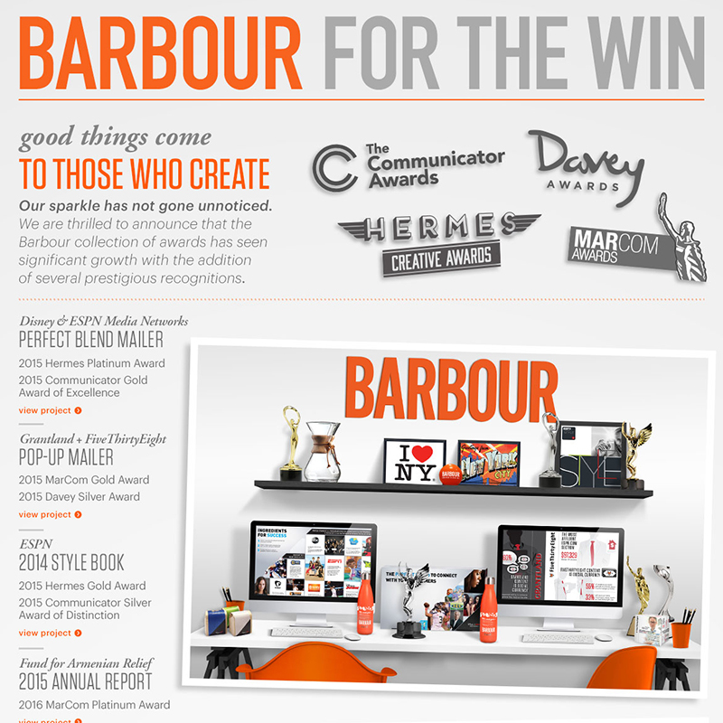
We are thrilled to announce that the Barbour collection of awards has seen significant growth with the addition of several prestigious recognitions. See live announcement with links here
Read MorePick Our Brain
Stony Brook University Athletics Annual Report by Barbour Design
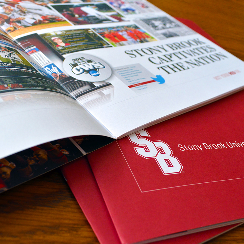
The 2011-2012 school year was a tremendous one for Stony Brook University Athletics — having produced conference champions, scholars, an NCAA national title and an Olympian. To mark such a momentous year, Barbour worked with Stony Brook to create an annual report that highlighted these significant achievements. Our approach was to build image-driven layouts with…
Read More