Superhero Silhouettes
San Francisco-based designer/illustrator Khoa Ho explores the past and present of some notable superheroes in this terrific series. The minimal, monochromatic style gives them some gravitas appropriate to the subject matter. In his own words, Ho says “I took a dive into the origins of these individuals and who they were before they became superheroes…
Read More »Typography Photography
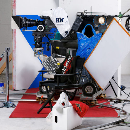
When typography and photography converge, beautiful things can happen, as is evident from this amazing series of photos. Created by New York-based photographer Bela Borsodi, these remarkable photos for Rocawear feature everyday sort of objects arranged in such a way to reveal clear typographical forms. We love the level of accuracy in placing the objects…
Read More »Inked Mini-Figures
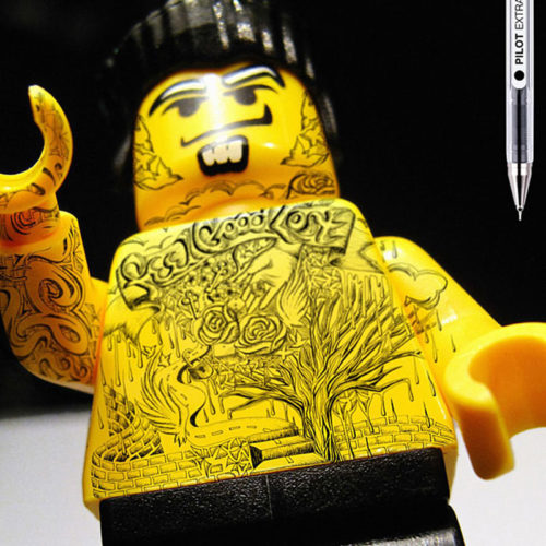
A few years back Pilot advertised its line of extrafine pens in a particularly clever way. The campaign, by Barcelona advertising agency Grey, featured Lego mini-figures with highly detailed tattoos. Really clever. We love all things Lego (here and here and here)… this campaign definitely gets a thumbs-up from us! Via designboom
Read More »Sandwich Book
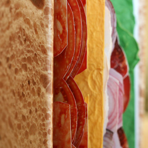
Some projects are just unadulterated novelty, as is the case with this book by Polish designer/photographer Pawel Piotrowski. The entire book contains pages made up of sandwich ingredients. It’s purely delicious fun, and we love it! Other food-related posts here and here and here. Via piotrowskipawelart.pl
Read More »Polygonal JLA Heroes
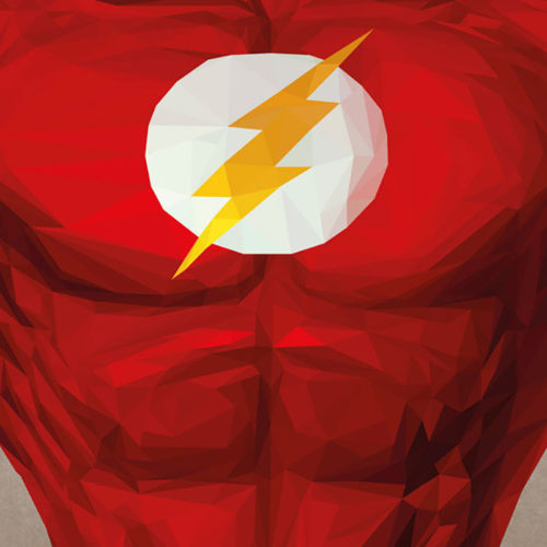
Yes, we have a certain fondness for superheroes, as well as polygonal art (here and here). Once again, an illustrator/designer has merged the two into some impressive works. This time it’s French artist Simon Delart, otherwise known as s2lart. His series of Justice League heroes is made up entirely of triangles, which is pretty impressive…
Read More »Negative Space Animals
Art director/illustrator George Bokhua, based in the Eurasian state of Georgia, has an affinity for both animals and negative space. This fantastic series marries both in these self-proclaimed masterpieces. Working with negative space is actually more difficult than it may look, but in the hands of Bokhua these marks really shine. Excellent work. Via Behance
Read More »Magnificent Misery
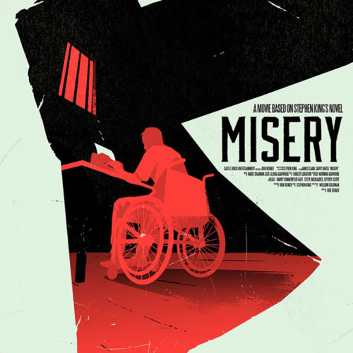
Who doesn’t love a good movie poster? The marriage of type and image is something that gets designers excited (us included). And some just really strike a balance. This take on the Stephen King novel turned movie by Belgian designer/illustrator Levente Szabó is one such example. We love the concept, executed in a fitting bold,…
Read More »Extraordinary Origami
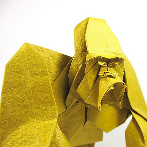
Vietnamese paper artist Nguyễn Hùng Cường does with folded paper what some artists do with, say, a paintbrush or pencil. His highly expressive form of origami is really remarkable. Featuring mostly animals, Cường’s body of work is like a masterclass in the art of paper folding. The level of detail he achieves is really quite…
Read More »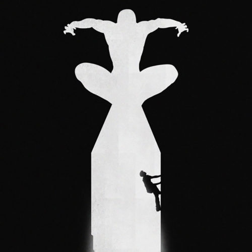

Fallen Princesses
Though this series is a bit dark, and probably disturbing to some, it’s hard to disagree that it’s highly creative and really well executed. The series, by Israeli-born, Vancouver-based photographer/conceptual artist Dina Goldstein, strips fairy tales of their ‘happily ever after’ ending, replacing them with a realistic outcome and addresses current issues. Via dinagoldstein.com and…
Read More »