VIMBY Brand Identity
VIMBY is a video production team that began 15 years ago with a simple goal: to enable a more fluid way of telling stories that celebrates the power and voices of communities, companies, and organizations in a way that is authentic, efficient, and affordable.
VIMBY recognized their 15th anniversary as an opportunity to reflect, reimagine and reinvent their brand to represent better what they’re in business to do—create human connections with communities and consumers.
Inspired by the local connections VIMBY has made, the stories they’ve told, and the infinite stories they have yet to share, we came up with a wayfinding logo concept that incorporates the shape of a map marker representing the local communities and a hint of an infinity symbol at the center to reflect their infinite stories. The fluid shape and coloring portray their fluid way of telling stories. The soft break in the shape creates the VIMBY “V,” with the top half symbolizing the connections they’ve made.

VIMBY15
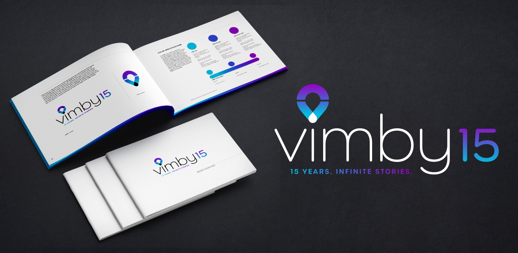
In celebration of VIMBY’s 15th anniversary and the launch of their new brand identity, we also created a special edition VIMBY15 logo for use throughout the year. The VIMBY15 tagline, “15 Years. Infinite Stories.” expresses their legacy and brand promise—storytelling is at the heart of what they do, and infinity is at the heart of their logo.

ADDITIONAL MATERIALS
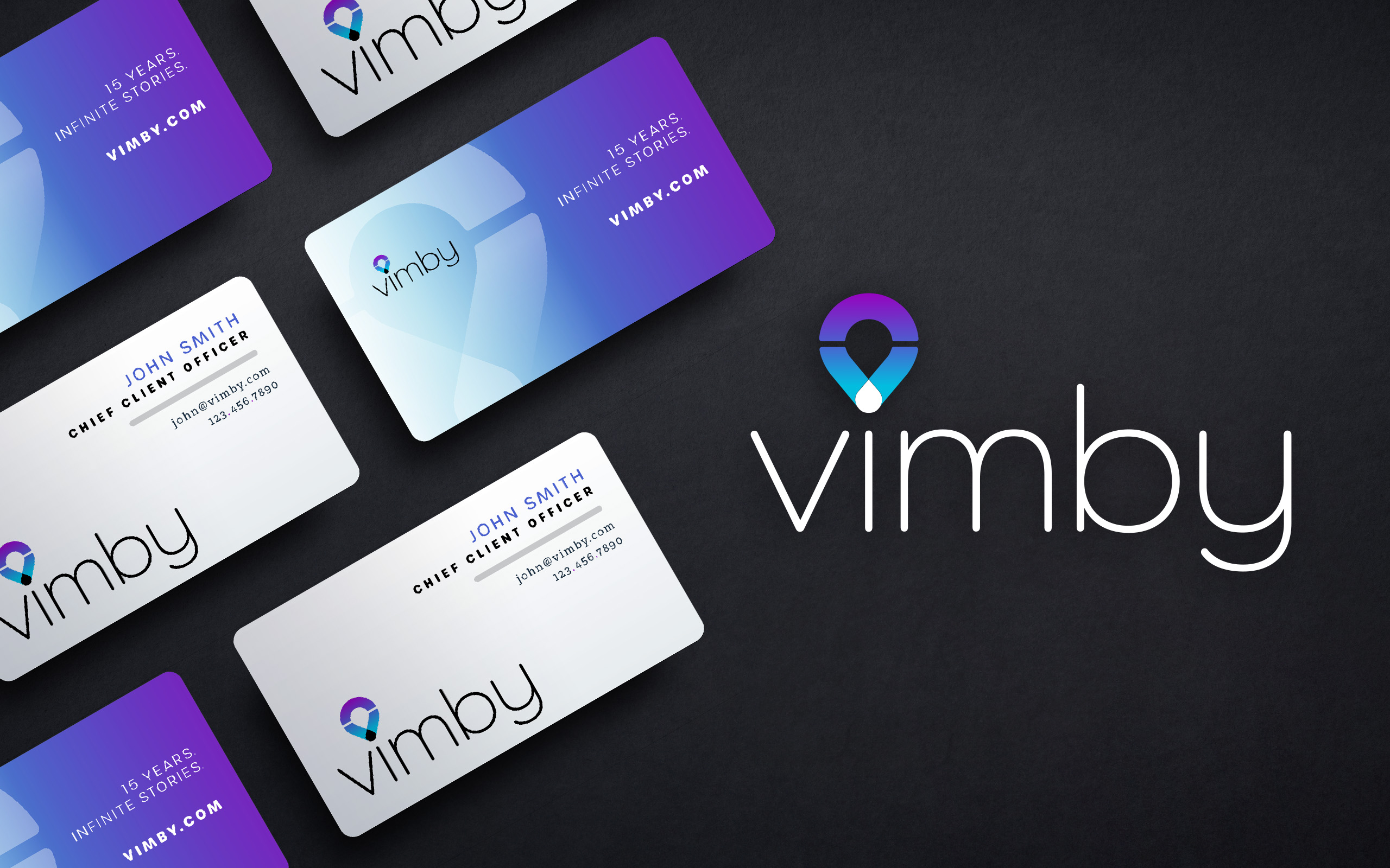
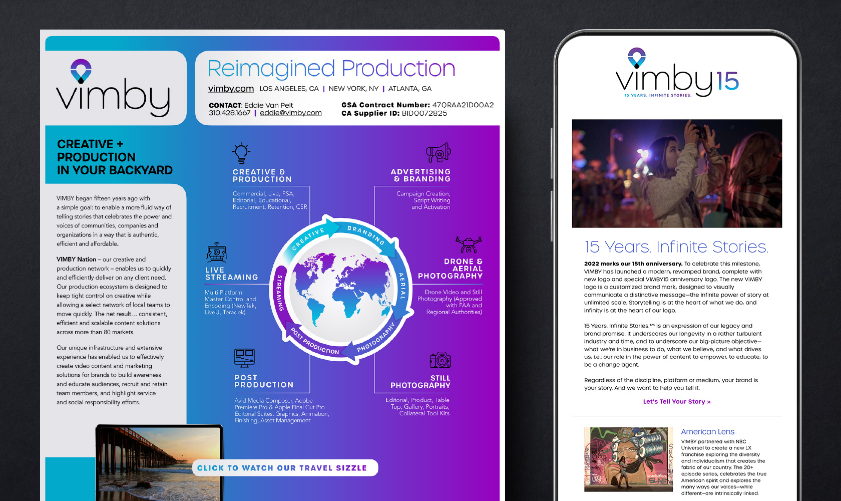
Along with a complete logo package, we also developed supporting brand materials, including business cards, a presentation template, a sell sheet, an animated logo for digital use, and an email marketing toolkit complete with a custom HTML MailChimp template and email signature.

Working with the Barbour team was a homerun. They helped us reimagine the look of our brand identity and create a client mailer that pulled our new branding throughout.
Learn more about the infinite ways we can help your brand.