Type Fight
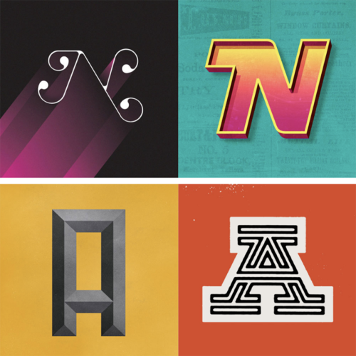
This is one of those ideas that we’re surprised hadn’t come about sooner. Designers Drew Roper, Ryan Paule and Bryan Butler started this project to “distract from their day-to-day grind.” They basically arrange weekly “fights” between two designers, who are asked to create a typographic treatment of the same character and then have their final…
Read More »Limited Edition Iron Man 3 Posters
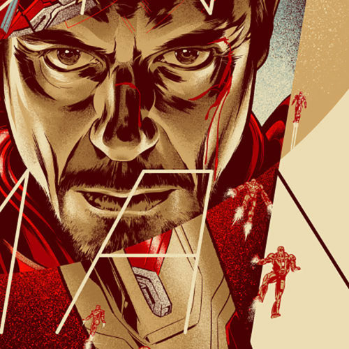
As the summer movie season ramps up so does the barrage of movie posters. Most are not great (or even good), but these limited-edition Iron Man 3 posters by Uruguayan illustrator/designer Martin Ansin set the bar really high. Though these posters went on sale (and quickly sold out) at Mondo earlier this month, we can’t…
Read More »Map Portraits
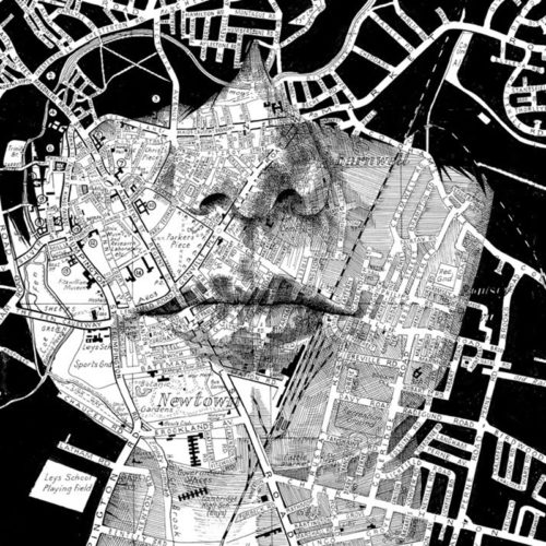
UK illustrator Ed Fairburn’s approach to portraiture is really something special. His mostly figurative work through painting and drawing is only accentuated through his keen eye for patterns. His ongoing series of map portraits are simply fantastic, using all sorts of maps as a basis for each piece. Fairburn explains, “I paint, draw and construct…
Read More »BEEloved
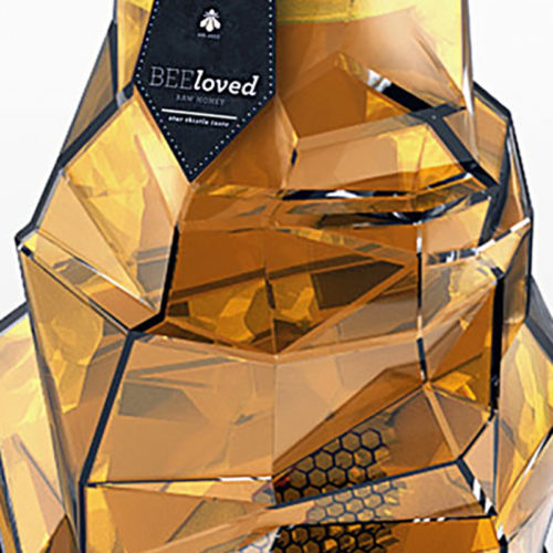
Young Serbian designer Tamara Mihajlovic has some impressive skills. Her student work for a luxury honey brand, of all things, is really, really good. From the container, to the logotype, to the typography, to the name, this project is well conceived and beautifully executed. Mihajlovic is a designer to watch. Via Behance
Read More »What the World Eats
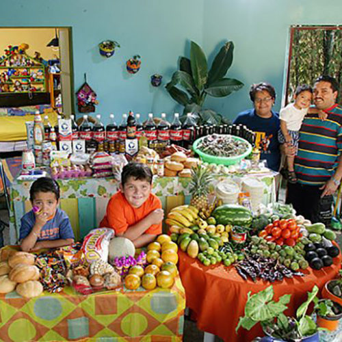
While some photographers have an affinity for shooting food, California-based photojournalist Peter Menzel takes a different approach. Menzel, known for his coverage of scientific and technological subjects, focuses less on the food in this series, but rather the larger scale of what we consume. Documented in his book Hungry Planet: What the World Eats, Menzel…
Read More »Pencil to Pixel
For those in the NYC area, venerable type foundry Monotype is putting on a must-see exhibition for designers and type geeks out there (ourselves included). Pencil to Pixel is a comprehensive exhibition spanning over a hundred years, featuring rare artworks and artifacts relating to type history, chronicling the development of typography up to its present…
Read More »Modular Gourds
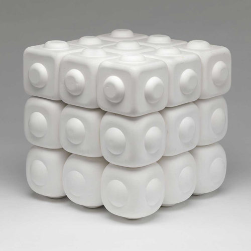
Artist Andrew Mowbray is walking a line between science and sculpture with his latest works. Mowbray cultivates Lagenaria gourds (in the Squash family) to grow in a cube, and therefore take on that shape. Gourds are are easily dried and made into vessels because they become so hard (almost like wood), and Mowbray also forms…
Read More »Typography by Txaber, Part Two
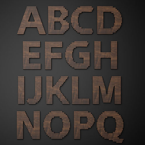
We’ve seen the terrific typographic work of Bilbao, Spain-based designer Txaber before (here). His latest work, a custom typeface for Nike is a great addition to his body of work. It’s composed of wooden slats, but for some added texture and dimension, Txaber curls the top layers. And the result is quite beautiful. Via txaber.net
Read More »