Advertising
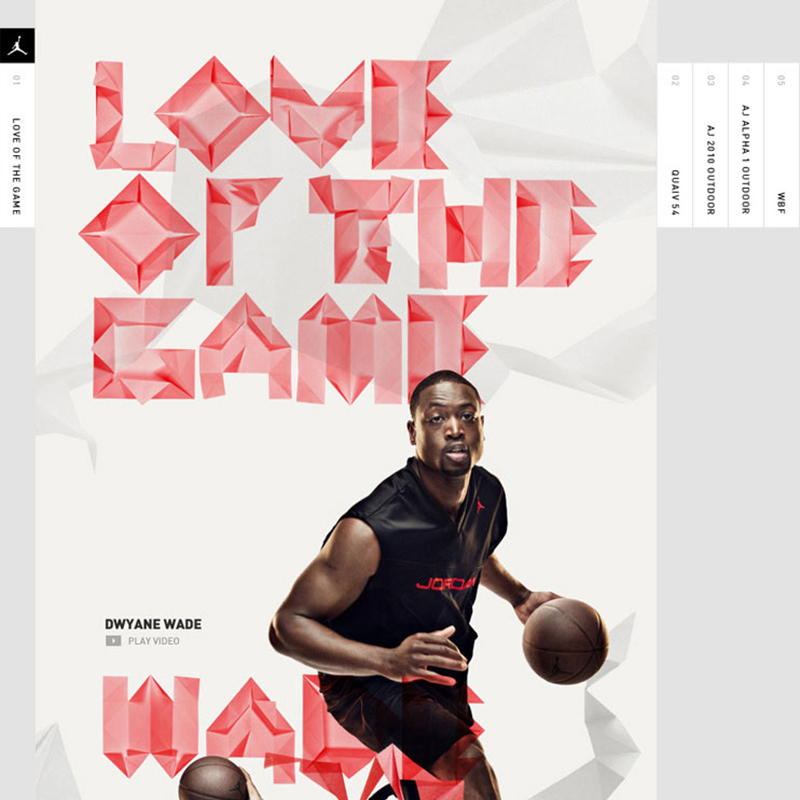
Love of the Game
Vancouver studio Academy created this excellent interface for Jordan/Nike’s “Love of the Game” campaign. We love the origami typography paired with clean photography and layers of origami design throughout that give it some depth. Well done. Via weareacademy.com
Read MoreKreopoleio Restaurant Identity
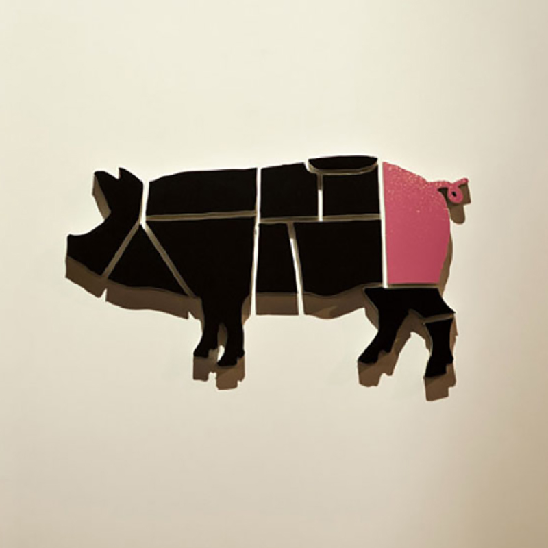
For fellow carnivores out there, this one’s for you. Greek designers Beetroot Design Group created this clever identity for Kreopoleio Restaurant (kreopoleion = shop in Greek). Visual references, like beef/pork chart, butcher’s knife and chalkboard all meld into a really nice, smart identity. The splash of color in the last cut (being the tail) is…
Read MorePumped Up Kicks
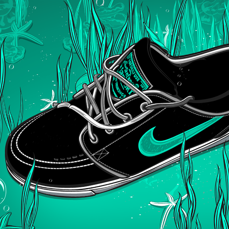
Filipino illustrator Rhafael Aseo has a really great style and bold sense of color, as exhibited in this series of Nike shoe illustrations. Love the contrast of the shoes in an organic setting… like he’s capturing them in the wild. Also love Aseo’s portrait work, very talented dude! Via Behance and aseo.prosite.com
Read MoreWe Like Luke Lucas
Australian illustrator/designer/typographer Luke Lucas has some serious typography chops. We first saw one of his great illustrations in The New York Times last year. And have come across his work a few times since then. While there’s a common aesthetic in his work (I wouldn’t say his style is subtle by any means), it’s often…
Read MoreHarvest ID
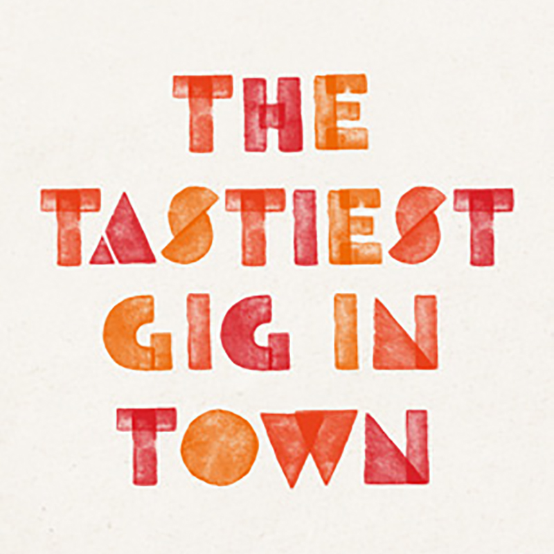
Potato prints are not just for school-age children anymore. UK designer Ben Brears made great use of this simple process for a festival identity, with great results. The lighthearted nature of the technique is very fitting for family oriented festival atmosphere, and the bold forms lend themselves to a variety of executions. Via brears.co.uk
Read More“Sting” Operation
Swiss creative director/illustrator Alberto “Sting” Russo has some serious illustration chops. From pop culture to sports, Russo captures his subjects in dynamic and engaging ways. Beautiful work Via sting-one.com
Read MoreThe Apple Collection
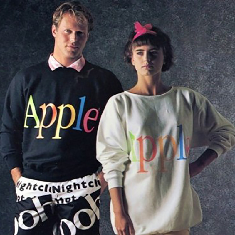
No, we’re not referring to the fantastical omnipresent electronic devices that have been embedded in our very culture. We’re referring to Apple’s short-lived clothing line from the mid-’80s. You can be sure knockoffs are just around the corner at your local Urban Outfitters. Via mashable.com
Read MoreCross Country Travels
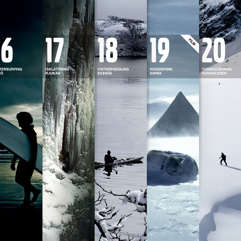
Though sort of a novelty, since most folks who visit this microsite won’t actually travel around Scandinavia, Volvo’s Cross Country Travels site and mobile app are really well designed and fun to navigate. Interactive Art Director Robert Lindström documents the creative process here. Love the badges too… nice uniformity among the variety of illustrations. Via…
Read MoreThe Wonderful Work of Jessica Hische
Type designer/letterer/illustrator Jessica Hische is wildly talented. We first became familiar with Hische’s work when it was featured in HOW Magazine a few years ago. Having built a body of work under Loiuse Fili, and later venturing out on her own, Hische has since become an “it-girl” in the field of typography and design. Below…
Read MoreJordan 365 Ads by Character
These ads for Jordan 365 (Nike) by Character are simple, sophisticated and dynamic. I love the black and white, and how the star athletes are housed in the logo but breaking out of it at the same time. It’s like stepping out of the shadow of MJ but still paying respect to the legend. Check…
Read More