Corporate Identity Bliss
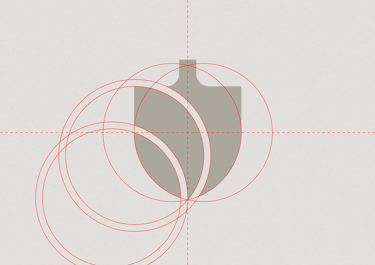
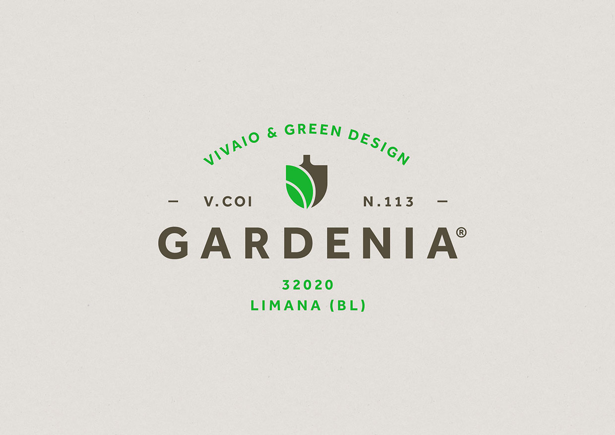
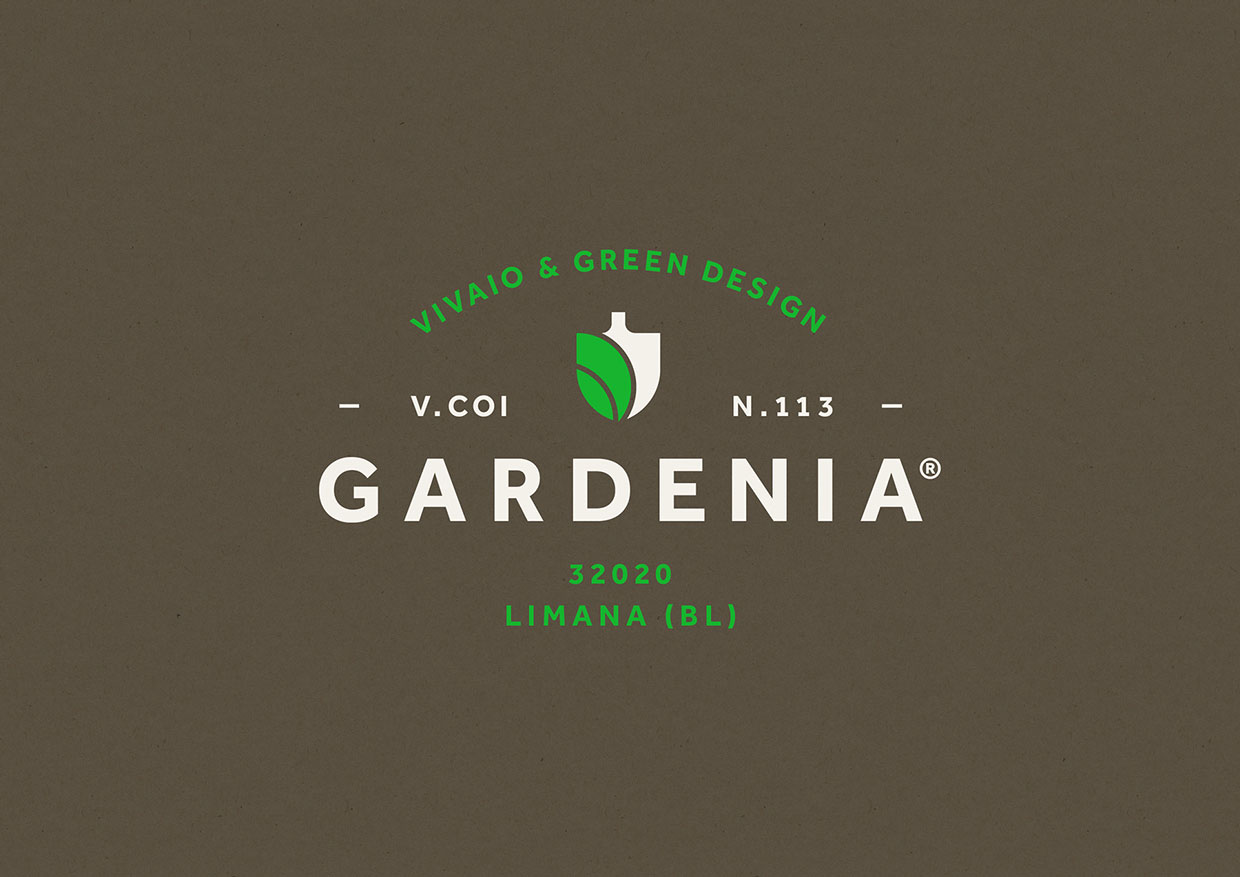
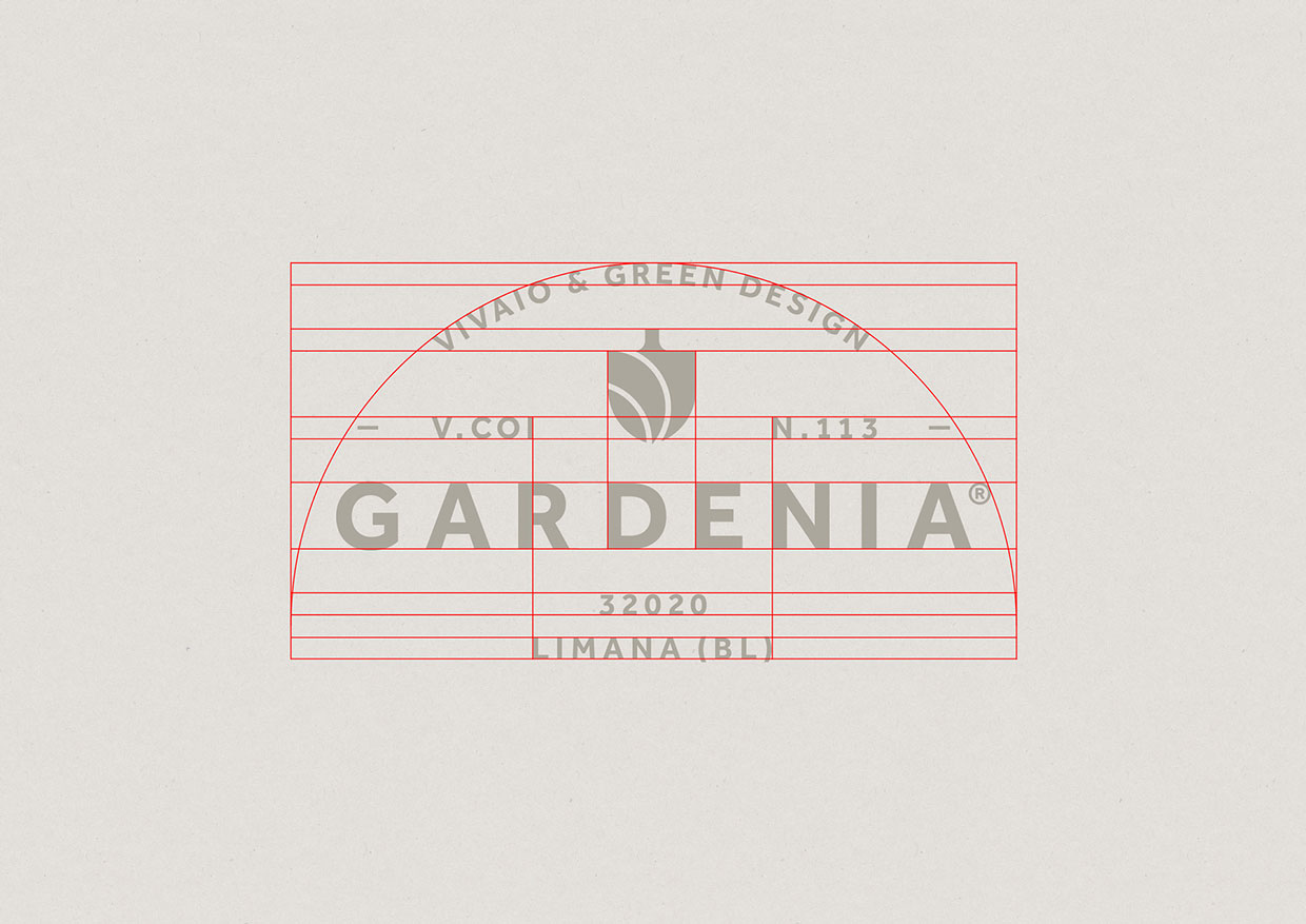
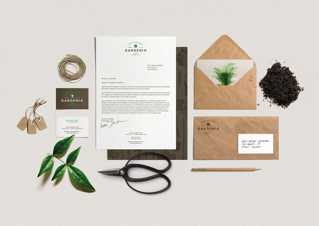
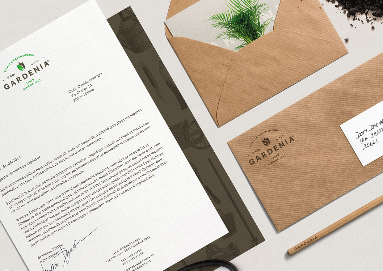
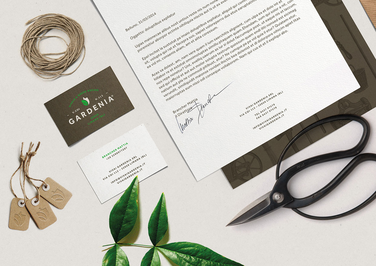
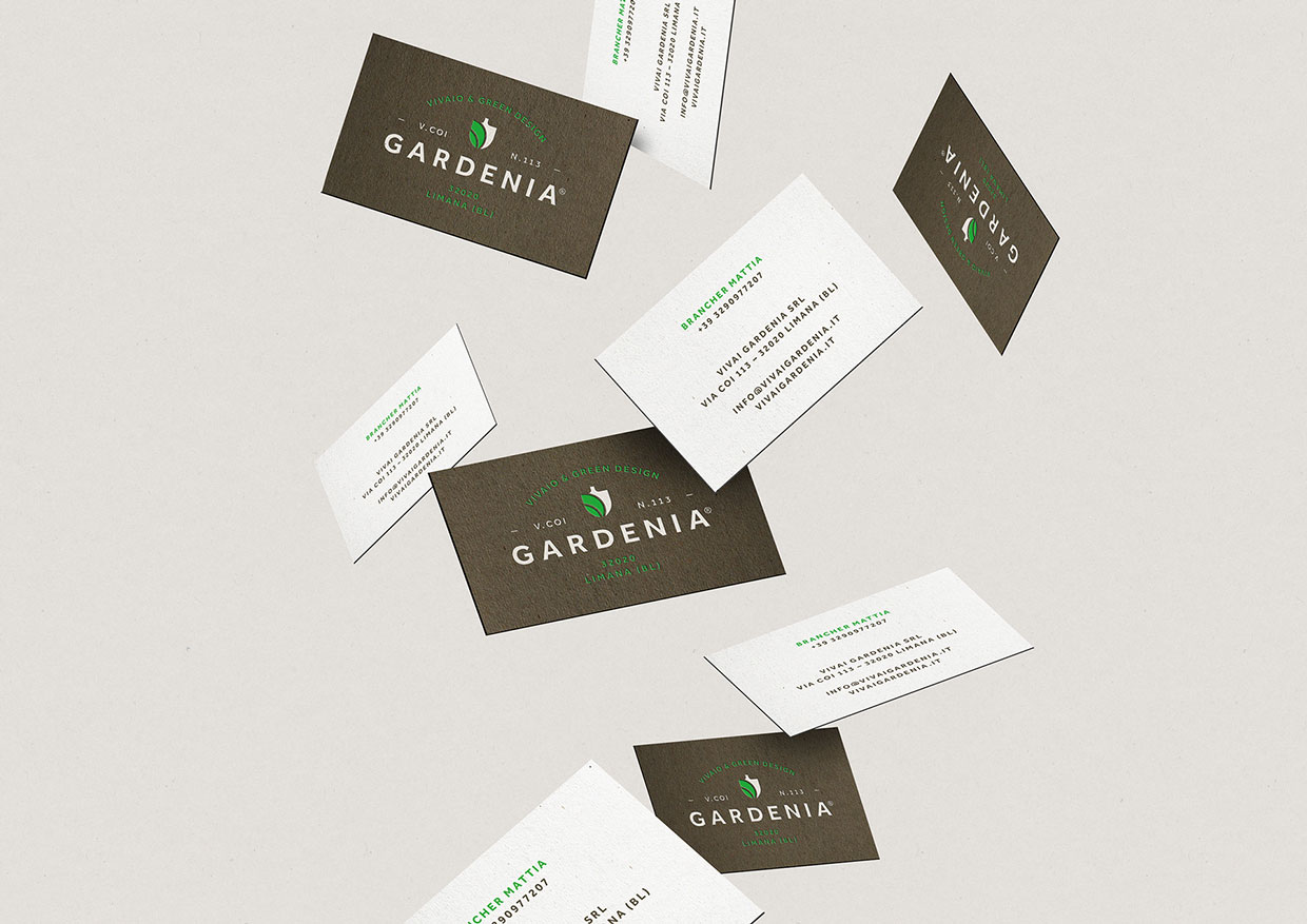
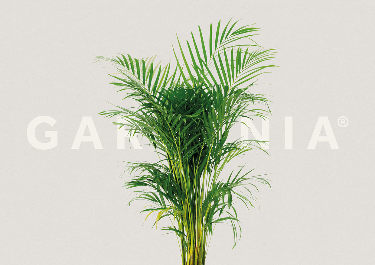
At the risk of sounding totally geeky, there’s nothing quite like a really well executed corporate identity. No matter the industry, effective branding design gets us excited. This example, by German-based designer Luca Fontana, of a logo and identity for a plant nursery in Italy is a perfect specimen of a very thoughtfully conceived and flawlessly executed package. From Fontana’s choice of color and fonts, to his embrace of the circle as a foundation for his forms, we can’t say enough about our admiration of this work.
Other examples of brilliant branding here and here and here.
Via Behance

