Magnificent Misery
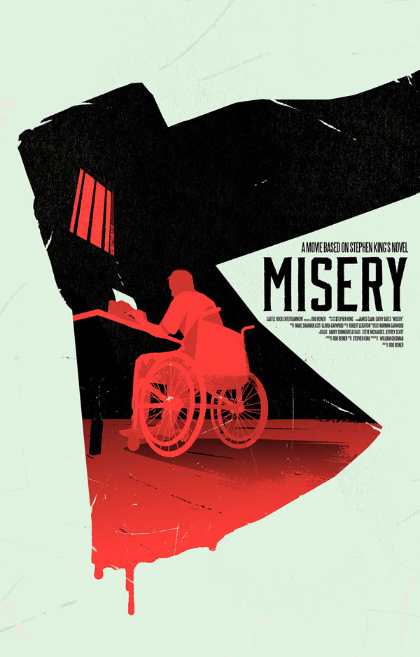
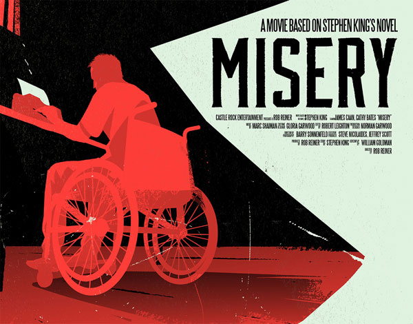
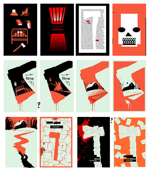
Who doesn’t love a good movie poster? The marriage of type and image is something that gets designers excited (us included). And some just really strike a balance. This take on the Stephen King novel turned movie by Belgian designer/illustrator Levente Szabó is one such example. We love the concept, executed in a fitting bold, graphic style. As well as the perspective of the illustration inside the axe silo. Though the size and placement of the type probably wouldn’t fly on a real movie poster, we do appreciate his choice of typeface… it compliments the bold, yet slightly rough illustrative style.
Via Behance


[…] and themes. Belgian designer/illustrator Levente Szabó (whose stellar work we have featured before) has this on lock-down, as exhibited by his fantastic ongoing series of book cover designs of his […]