Negative Space for a Positive Cause
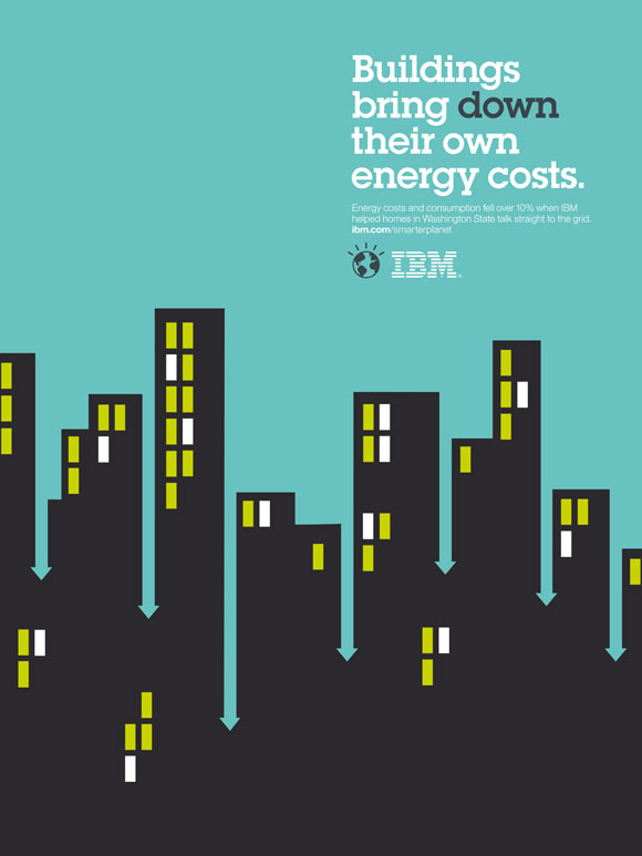
Israeli-born, London-based graphic designer Noma Bar has a very specific style. Use of negative space may look simple or straightforward to most, but as any designer will tell you, to employ it really effectively is no easy task. And negative space is the cornerstone of Bar’s style, which is really saying something. Perhaps one of the best examples of Bar’s masterful work is an IBM campaign from a few years back, which is sure to be studied by designers for many decades to come. In his own words, Bar’s general philosophy is “maximum communication with minimum elements.” And IBM clearly (and smartly) tapped Bar for its Smarter Planet campaign for that very reason.










[…] negative space here and here and […]