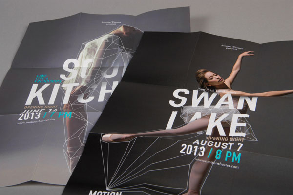
Standing Ovation-Worthy Design
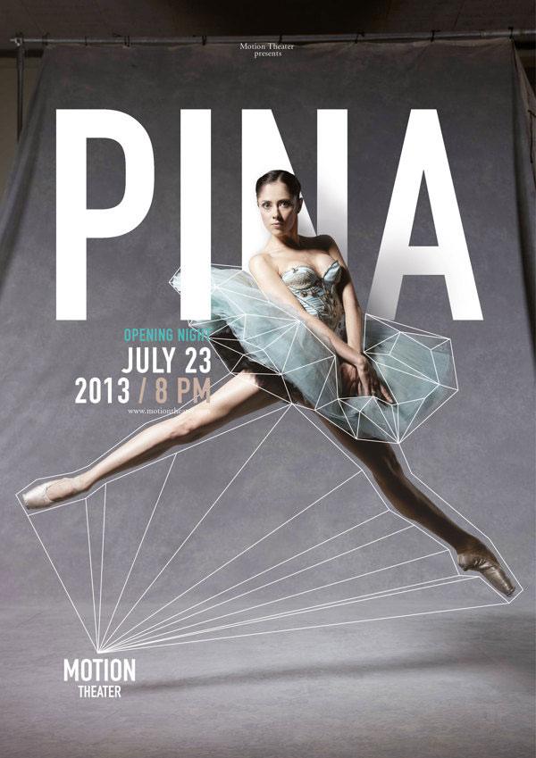
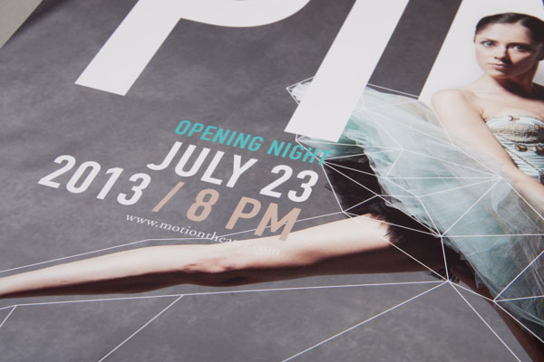
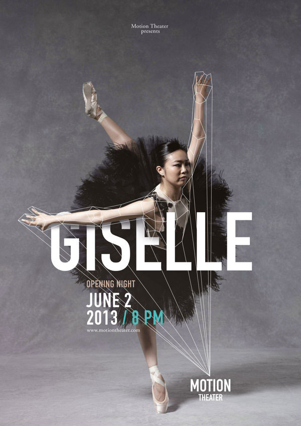
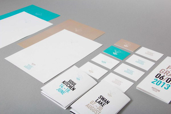
Design and marketing for the arts often goes one of two ways: really good or really bad. From what we’ve seen, budgets often correlate directly with how well such materials are conceived and implemented. In this instance, German designer Caroline Grohs imagines a beautiful corporate identity for a fictitious theater company (with a robust marketing budget). Grohs’ concept and design execution are outstanding. From the color palette, to the imaginative wire-frame graphics, to the superb typography, this really is a well rounded piece. Bravo!
Via Behance
