
Posts Tagged ‘logotype’
Uber Branding Blunder

Just this week, Uber unveiled a global rebranding that not only strayed a bit from its recognizable logotype, but also introduced a rather detached set of app icons. Can’t say that we suffered from extreme design envy over the previous Uber logotype, but it was fine. While their new logotype seems like a step in…
Read MoreTo Pluto and Beyond

Given the late breaking, historical news that a NASA probe, launched some nine and a half years ago, and traveling an astounding 3 billion miles, has finally reached Pluto just hours ago, we thought it fitting to showcase this series of custom astronomy logos by Berlin-based designer Jonas Söder. We love Söder’s style here, sort…
Read MoreBEEloved
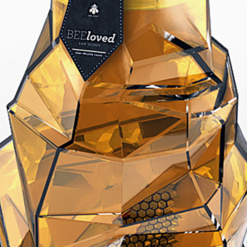
Young Serbian designer Tamara Mihajlovic has some impressive skills. Her student work for a luxury honey brand, of all things, is really, really good. From the container, to the logotype, to the typography, to the name, this project is well conceived and beautifully executed. Mihajlovic is a designer to watch. Via Behance
Read More