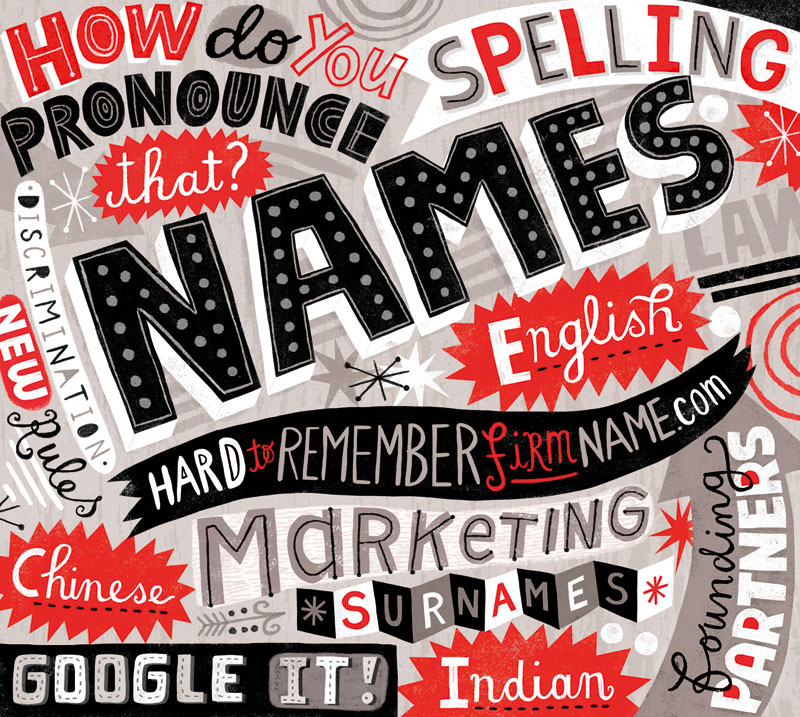
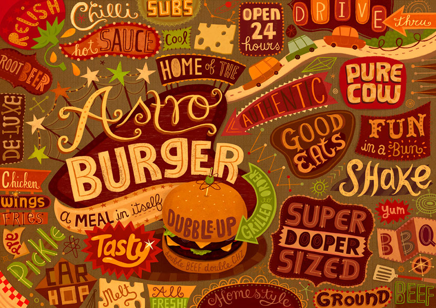
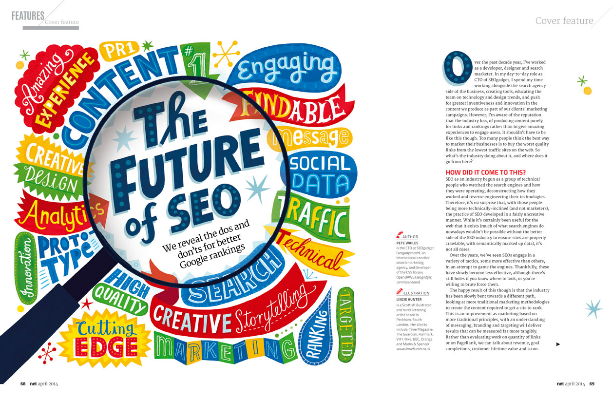
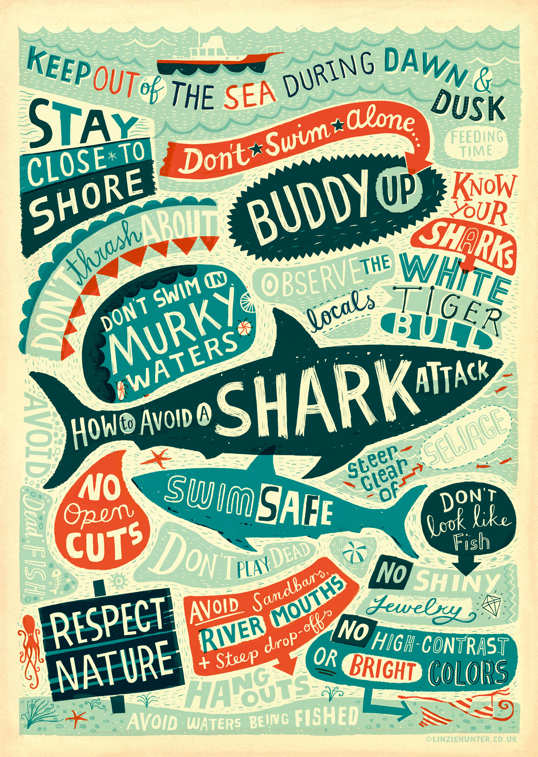
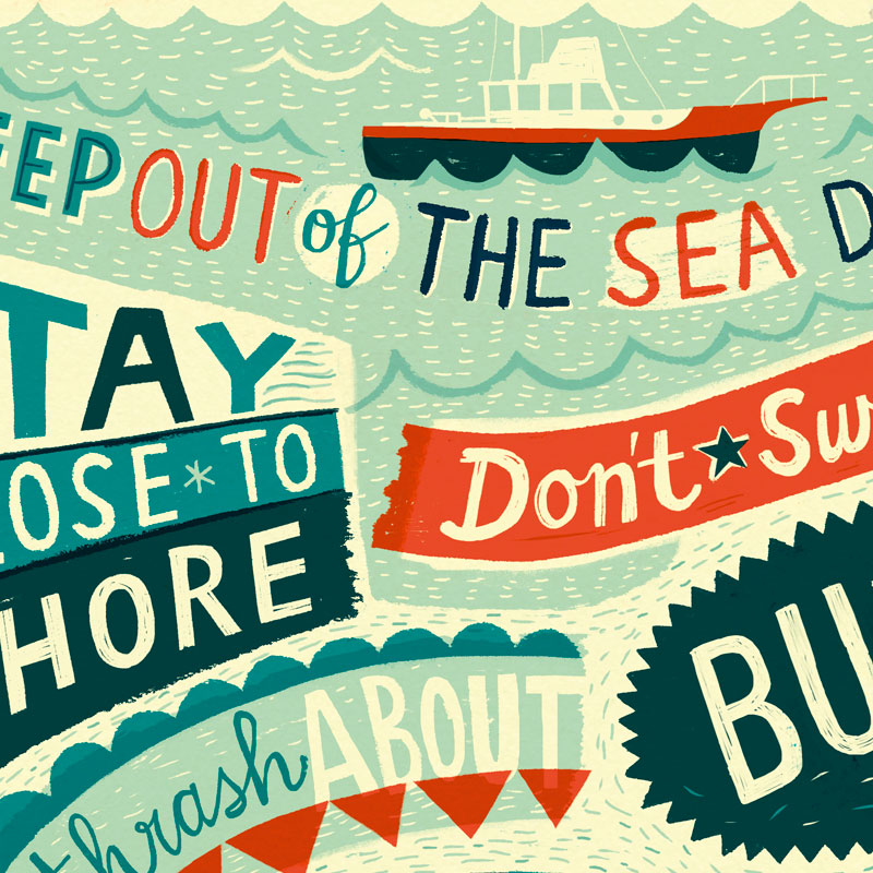
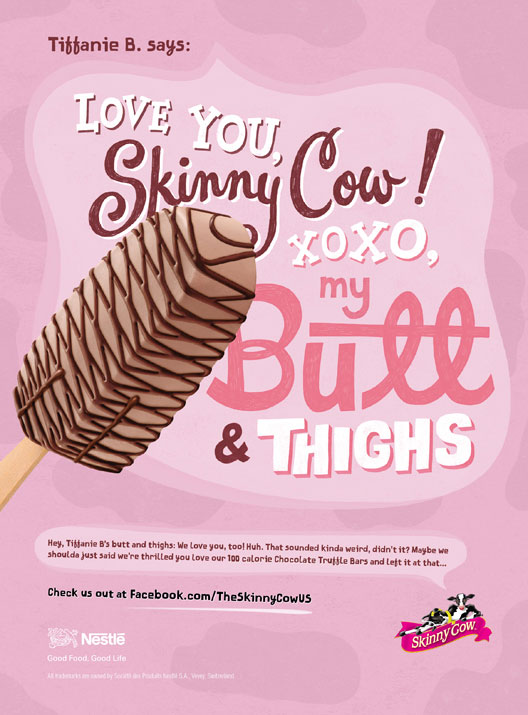
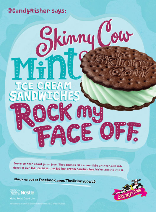
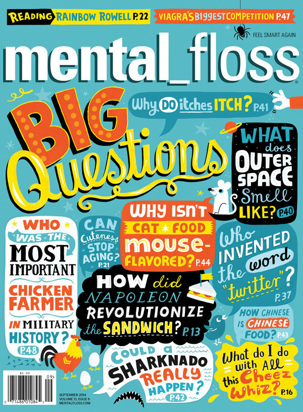
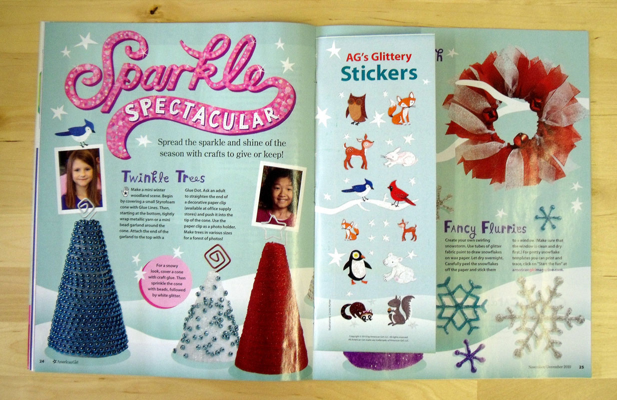
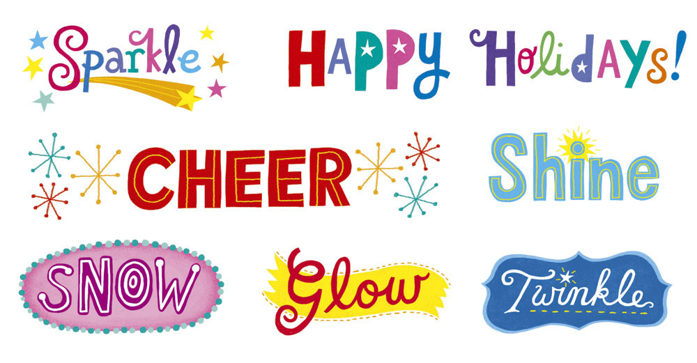
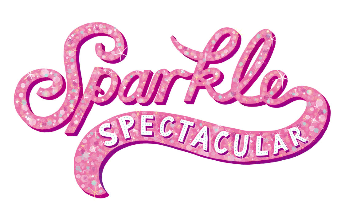
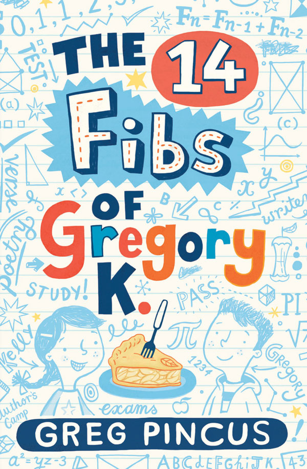
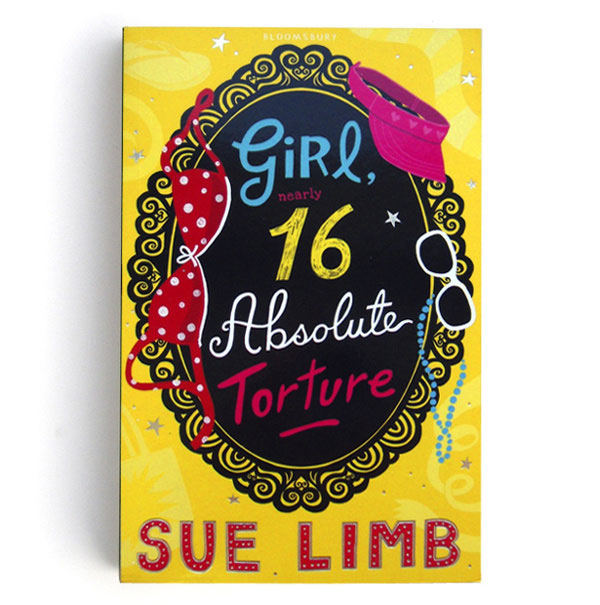
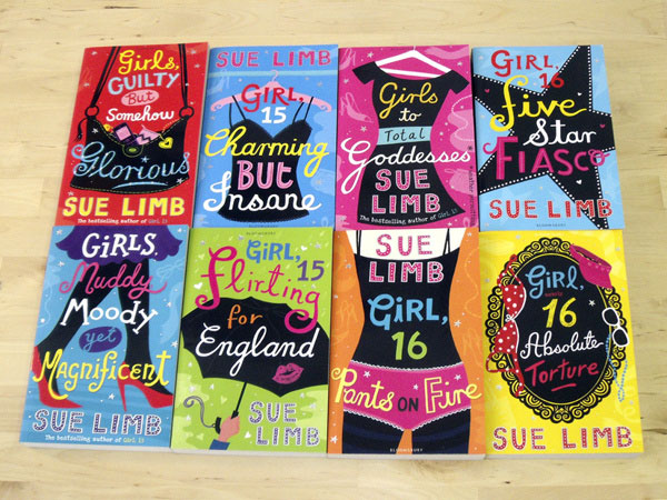
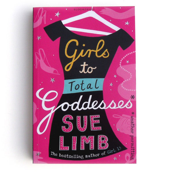
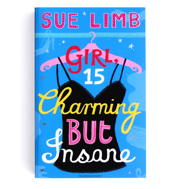
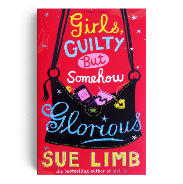
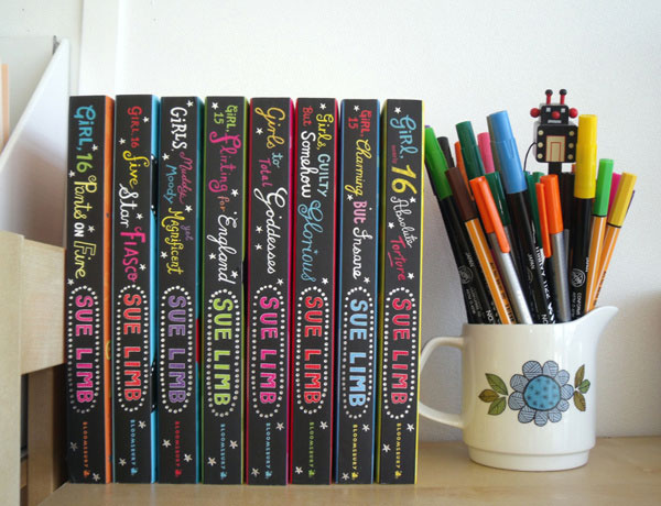
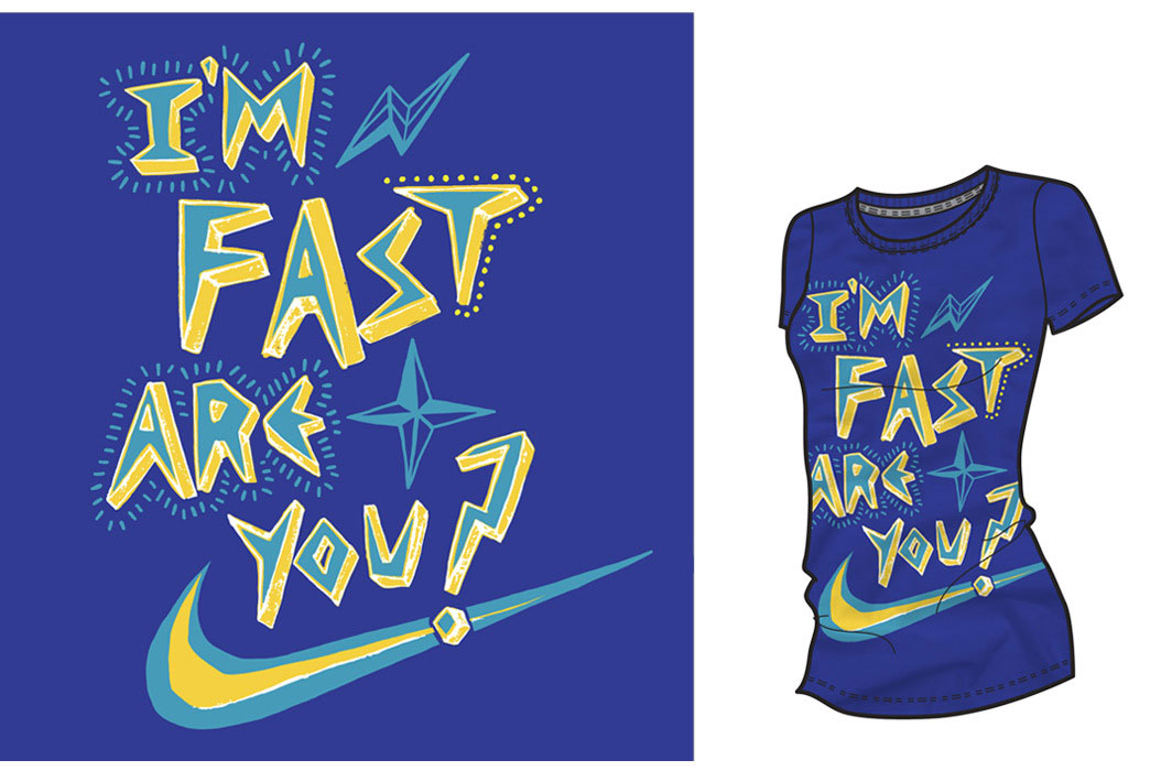
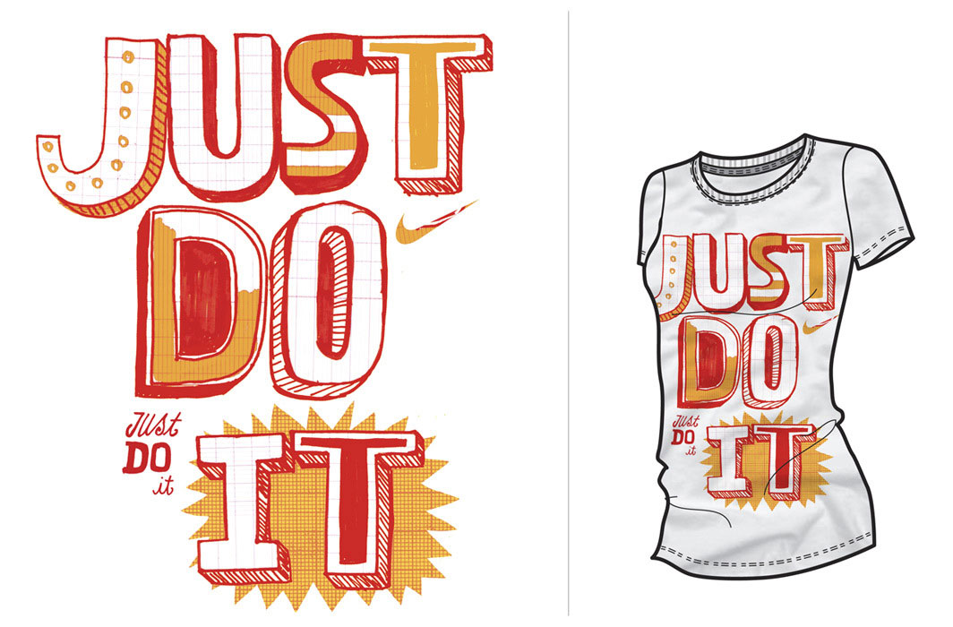
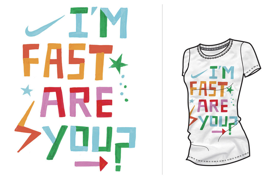
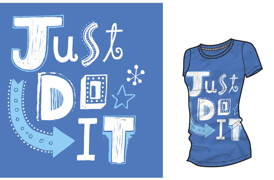
The Beaming Body of Work by Linzie Hunter
Given the abundance of fonts out there (many of which are often free), one would think that the tradition of lettering would be dead. But similar to the rise of vinyl in music these days, the opposite is actually true. Lettering is experiencing a sort of renaissance in the design community. Call it novelty or nostalgia, but there is something very special about lettering, especially in this era of (and we don’t particularly like this term) desktop publishing. Styles run the gamut, and we have an appreciation for the great variety of lettering work currently being done. We are particularly fond of London-based freelance digital letterer and illustrator Linzie Hunter. Her colorful, whimsical style has served an impressive list of clients very well. Those clients include New York Observer, Washington Post, Random House Publishing, Harper Collins, Scholastic, Hallmark, American Girl, Time Magazine, Wall Street Journal, Nike, and many more. Hunter’s work is really quite something… she has a distinct ability to make a heap of information engaging, and even beautiful. And her illustrations are fantastic too. What a talent!