Branding
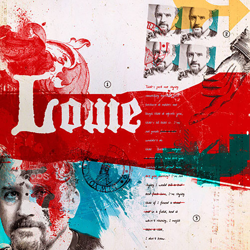
We Got Love for Louie
Not only are we huge fans of comedian Louie C.K., but this series of promo posters for his FX series are some of the best we’ve ever seen. Under the helm of supremely talented Los Angeles-based Turkish designer/creative director Ozan Karakoc, these posters transcend advertising… they are like individual works of art. We love the…
Read MoreEast Meets West
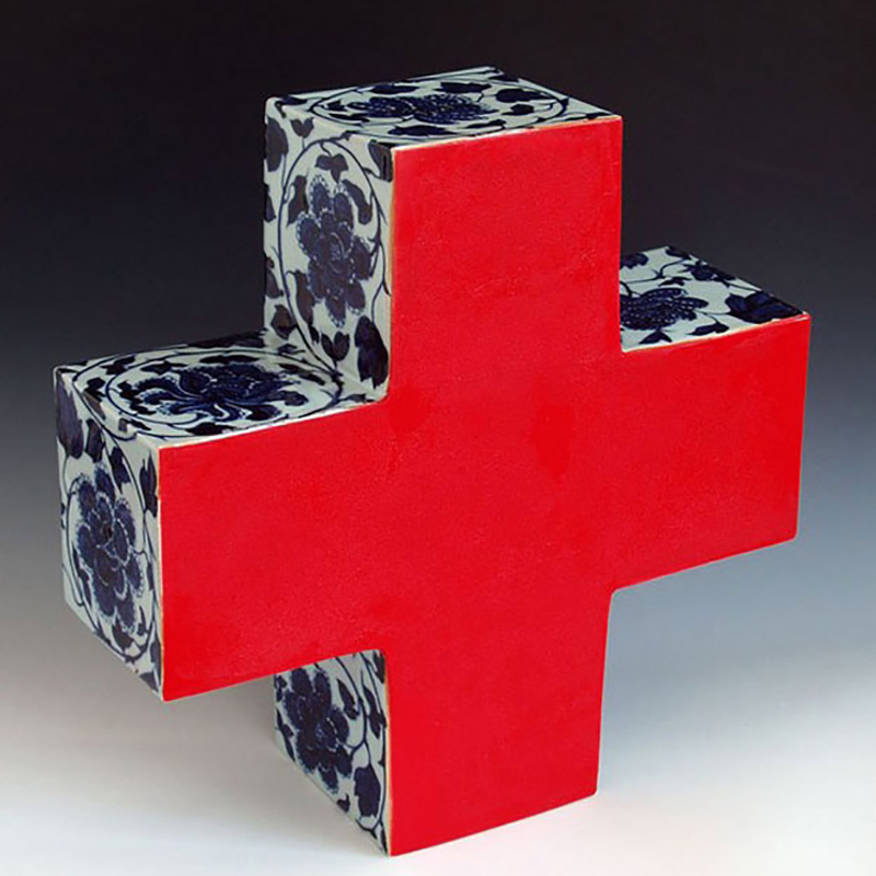
Chinese sculptor Li Lihong juxtaposes contemporary corporate logos with traditional Chinese imagery and ceramic techniques, with fantastic results. The series is a sculptural mashup of corporate identity and fine art, of contemporary and traditional, of East and West, of old and new. Western business has become integrated into Chinese culture, and Lihong’s work seems to…
Read MorePhenomenal Packaging: Stoutnik
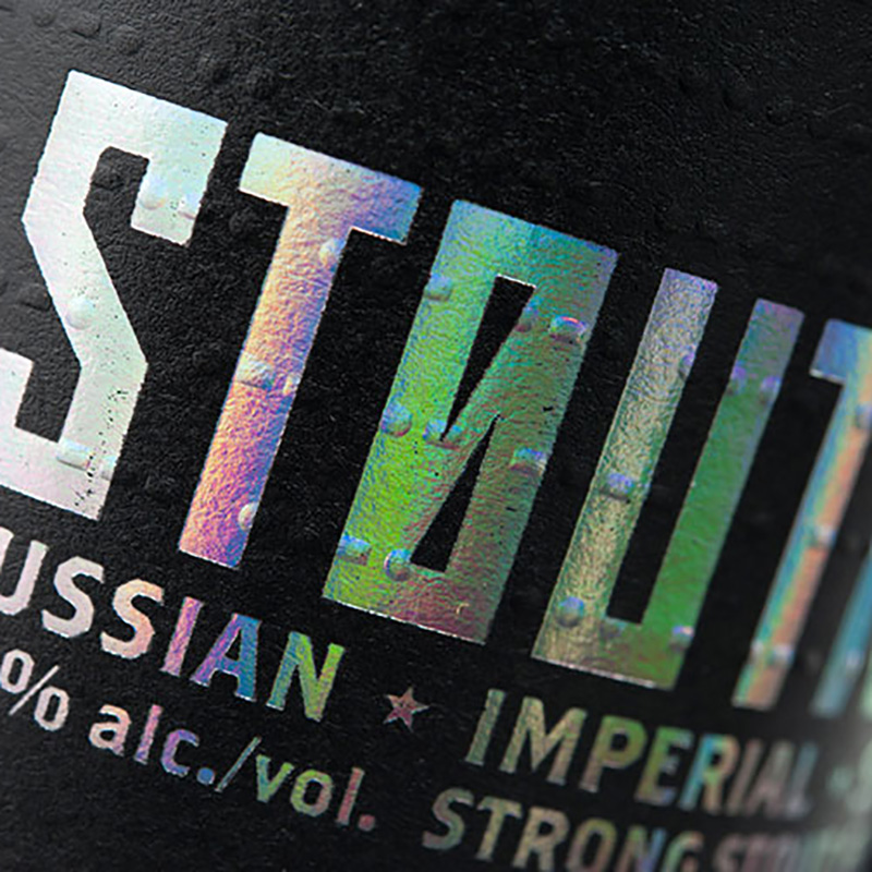
Great, mind-blowing, innovative packaging is rare, and this gem is certainly in a class all its own. Canadian firm Hired Guns Creative was tasked with creating unique brands of several beers for a local craft brewery, Longwood Brewery. While the design of each beer is pretty exceptional, one really stands out. HGC not only named…
Read MoreNegative Space Animals
Art director/illustrator George Bokhua, based in the Eurasian state of Georgia, has an affinity for both animals and negative space. This fantastic series marries both in these self-proclaimed masterpieces. Working with negative space is actually more difficult than it may look, but in the hands of Bokhua these marks really shine. Excellent work. Via Behance
Read MoreMagnificent Misery
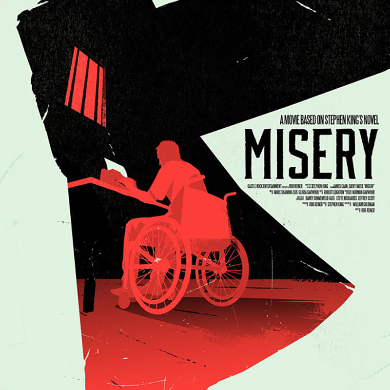
Who doesn’t love a good movie poster? The marriage of type and image is something that gets designers excited (us included). And some just really strike a balance. This take on the Stephen King novel turned movie by Belgian designer/illustrator Levente Szabó is one such example. We love the concept, executed in a fitting bold,…
Read MoreBEEloved
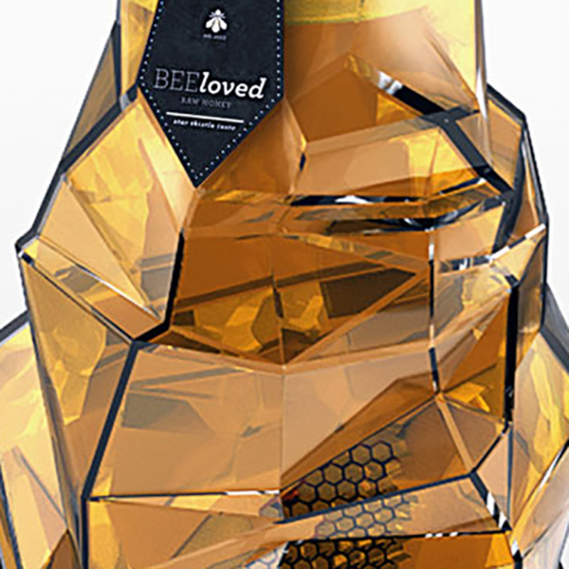
Young Serbian designer Tamara Mihajlovic has some impressive skills. Her student work for a luxury honey brand, of all things, is really, really good. From the container, to the logotype, to the typography, to the name, this project is well conceived and beautifully executed. Mihajlovic is a designer to watch. Via Behance
Read MoreTypography by Txaber, Part Two
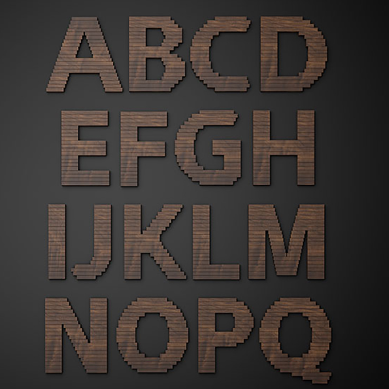
We’ve seen the terrific typographic work of Bilbao, Spain-based designer Txaber before (here). His latest work, a custom typeface for Nike is a great addition to his body of work. It’s composed of wooden slats, but for some added texture and dimension, Txaber curls the top layers. And the result is quite beautiful. Via txaber.net
Read MoreIt's a New Ball Game
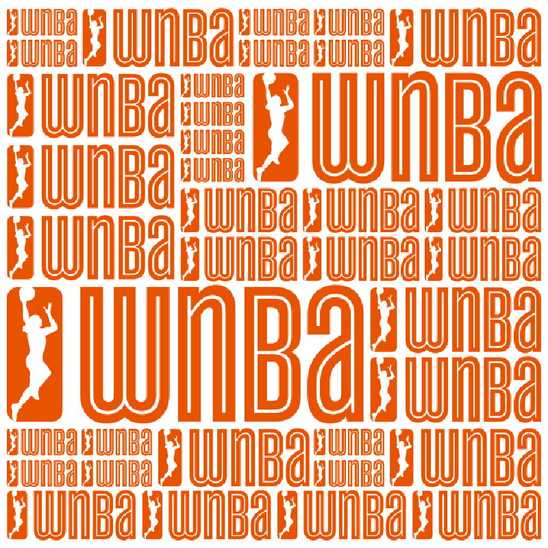
OCD, Original Champions of Design, in New York (Bobby Martin jr. and Jennifer Kinon) have created a fresh new identity for the WNBA. They’ve retained some of the old WNBA flavor but altered the fundamental look in terms of color (happy orange) and typography. The WNBA’s summer basketball season has for too long played second…
Read MoreFantastic Founders Brewing Menu
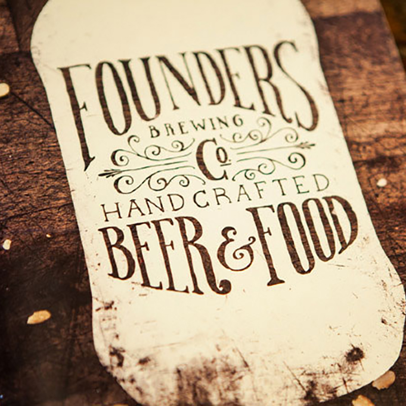
Menu design is often not recognized as much as it should be… truly under appreciated. Sure, there are plenty of pedestrian menu designs out there, but we sometimes encounter some great ones that make a lasting impression. Young, Grand Rapids, MI-based designer Scott Schermer designed this fantastic menu for Founders Brewing Co. (which, for some…
Read MoreTerrific Typography at Trafiq
The exceptional work by Hungarian designer Miklós Kiss is proof that good typography transcends culture. This typographical eye candy by Kiss is all part of the identity and interior design of Budapest club/bar/restaurant Trafiq. These flawless typographical treatments could easily stand on their own, but imagine being inundated by such beautifully executed and playful exercises…
Read More