Design Inspiration
Uncommon Greatness from Commoner, Inc.
Boston based design studio Commoner, Inc. is really good at what they do. They specialize in brand identity, custom type and illustration… with an edge. Love their style. Their identity for local restaurant The Lower Depths is particularly, um, awesome. We, as designers, relish in the (sadly rare) encounter of a really great menu design,…
Read MoreKreopoleio Restaurant Identity
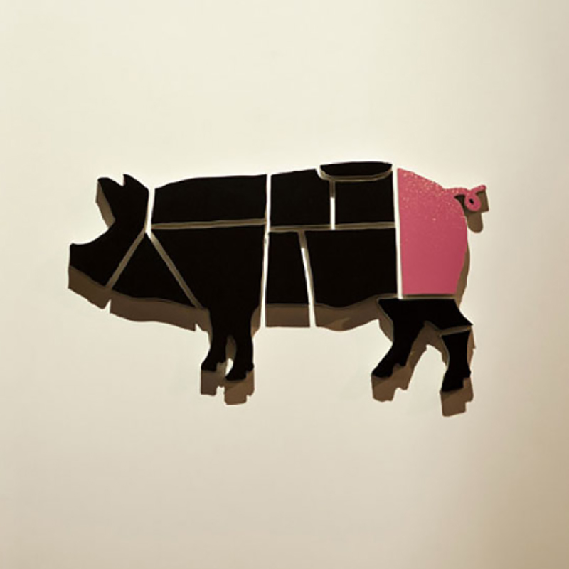
For fellow carnivores out there, this one’s for you. Greek designers Beetroot Design Group created this clever identity for Kreopoleio Restaurant (kreopoleion = shop in Greek). Visual references, like beef/pork chart, butcher’s knife and chalkboard all meld into a really nice, smart identity. The splash of color in the last cut (being the tail) is…
Read MoreKeep Calm and Type On
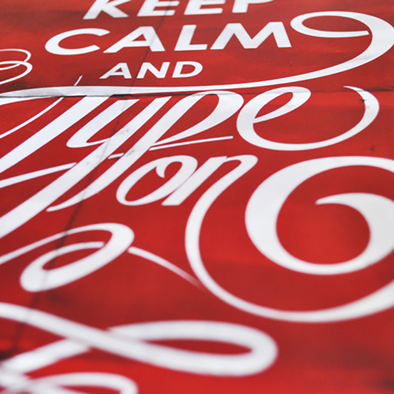
We’re all familiar with the “Keep Calm” series that seems to be everywhere lately. Super talented Mexican designer/typographer Alan Guzman tackles his own version from a designer’s perspective. Looks great, love the flourish-y hand lettering, and the pens are a nice touch. Not sure how/where to purchase the shirt, but I want one, please! Be…
Read MoreHarvest ID
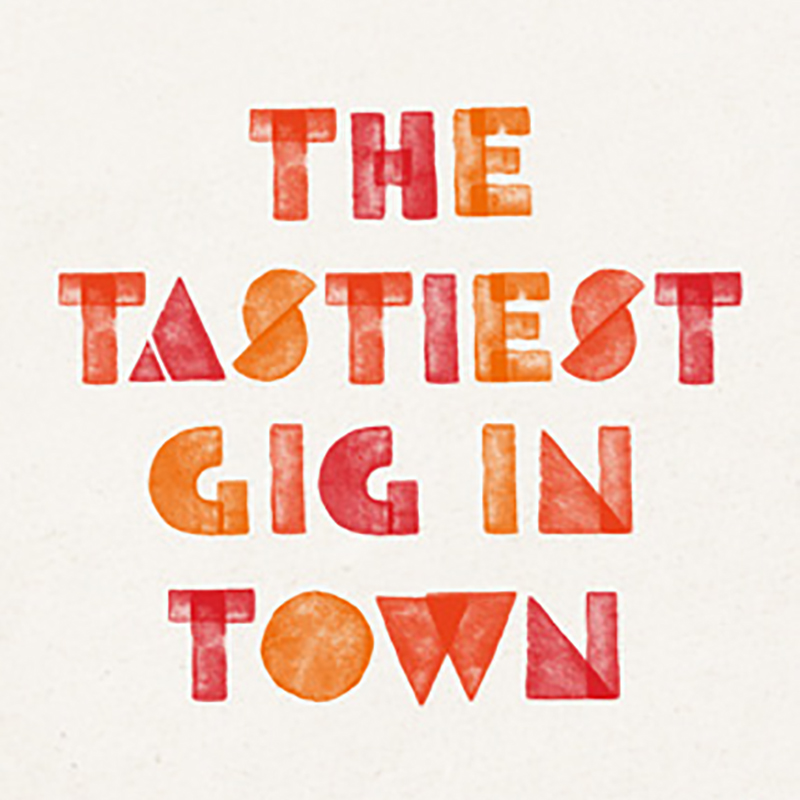
Potato prints are not just for school-age children anymore. UK designer Ben Brears made great use of this simple process for a festival identity, with great results. The lighthearted nature of the technique is very fitting for family oriented festival atmosphere, and the bold forms lend themselves to a variety of executions. Via brears.co.uk
Read MoreLeft Field Cards by Amelie Mancini
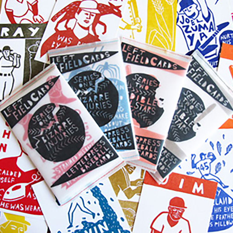
Love these linoleum block prints by Amelie Mancini. And I love each series with its quirky series collection names. Enjoy! Left Field Cards brings a playful and creative spin on the baseball cards loved and collected by generations of fans: our cards are hand printed from linoleum blocks, with space in the back for a…
Read MoreThe Wonderful Work of Jessica Hische
Type designer/letterer/illustrator Jessica Hische is wildly talented. We first became familiar with Hische’s work when it was featured in HOW Magazine a few years ago. Having built a body of work under Loiuse Fili, and later venturing out on her own, Hische has since become an “it-girl” in the field of typography and design. Below…
Read MoreDirty Work
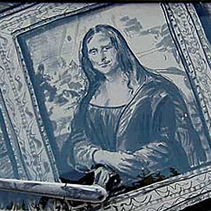
Okay, so this is not necessarily fine art or design, per se, but we’re intrigued nonetheless. We’ve all seen “Wash me!” etched into layers of dirt on filthy vehicles, but Texas artist Scott Wade has taken it to the next level. Wade, a formally trained artist, uses an array of brushes and his hands to…
Read MoreContemporary Classic
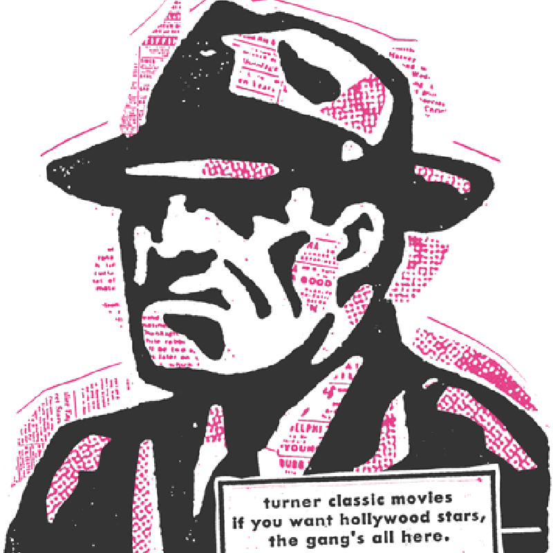
Highly regarded Minneapolis design firm Charles S. Anderson Design Company has a vast body of work, and their development of the Turner Classic Movies identity caught our eye. The modular structure is brilliant: “The TCM logotype we developed was brought to life with a series of 30 simple character icons, each representing a different movie…
Read MoreGood Travel
Ukraine designer Alex Volkov has a knack for illustrating highly effective icons/teasers. This travel set is ridiculously stunning. Makes me sort of envious…. Via kadasarva.com
Read MoreEdible Icons
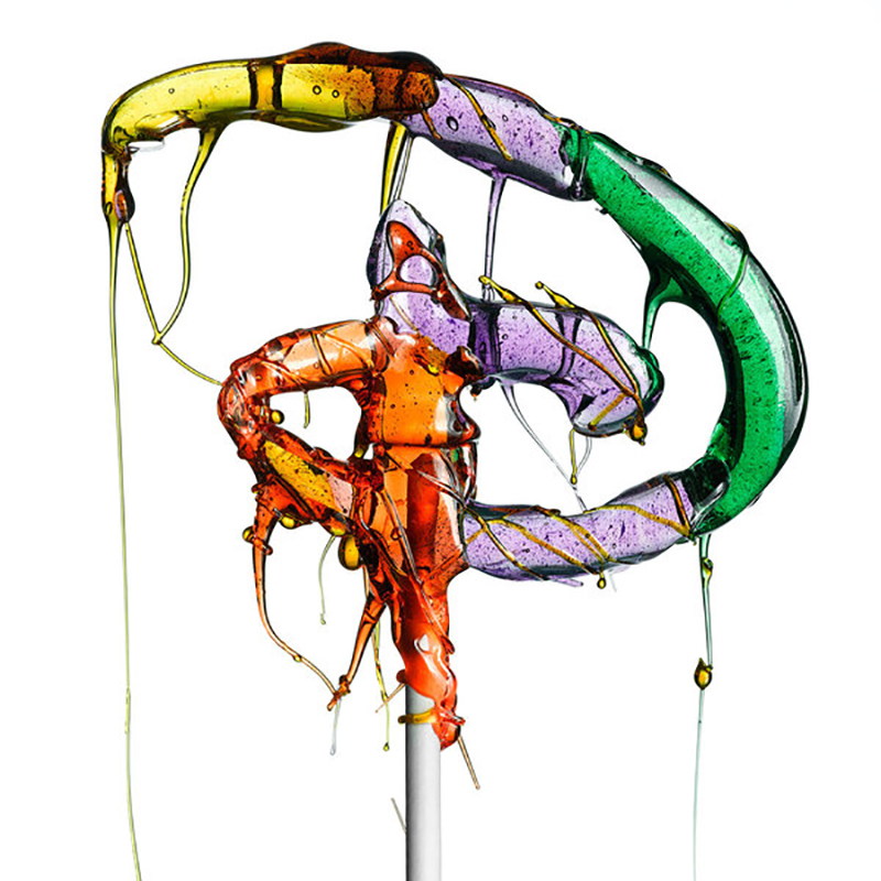
Italian born, New York-based photographer Massimo Gammacurta first distributed his handcrafted lollipop “sculptures”, if you will, over the internet a few years ago as an art experiment. Interest was so great, he decided to release a book, Lolli-pop, for wider consumption. These highly-recognizable corporate logos take on a whole new life as glossy, translucent hard…
Read More