
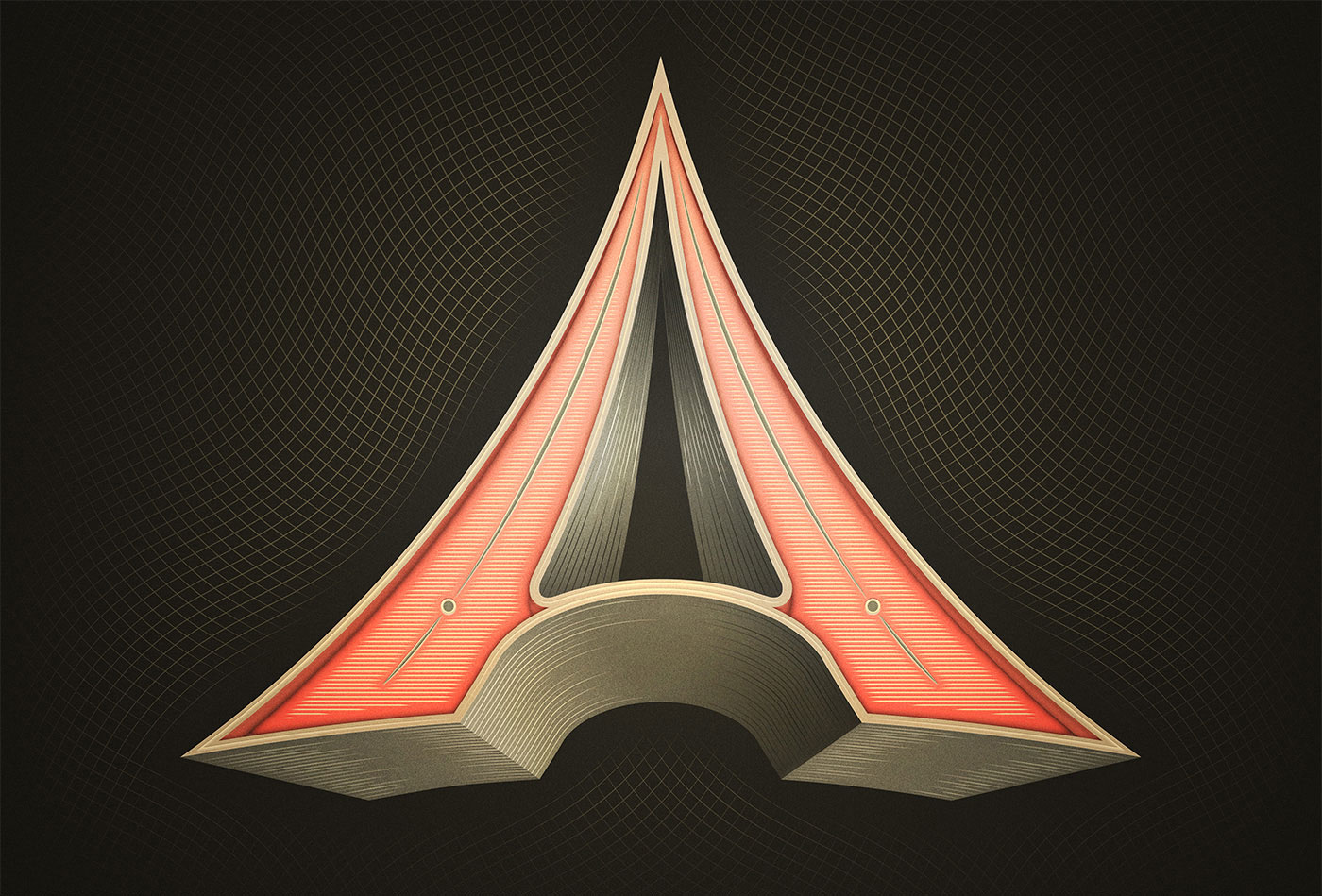
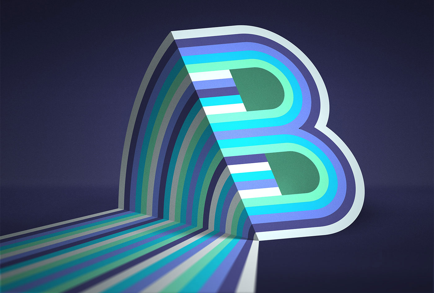
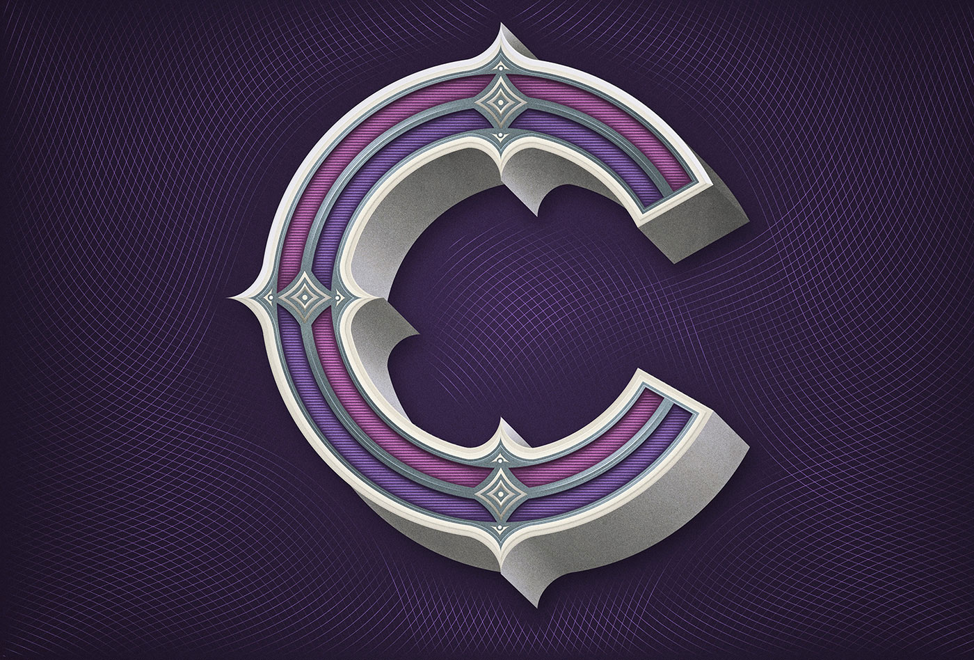
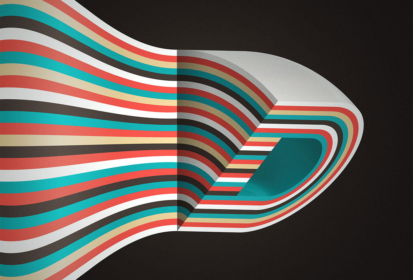
Daily Typographic Interpretations by Mario De Meyer
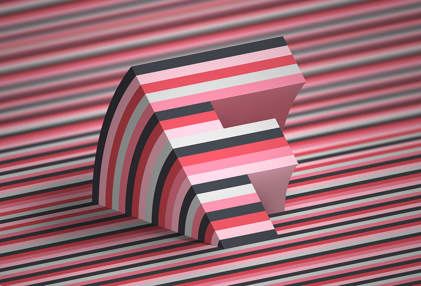
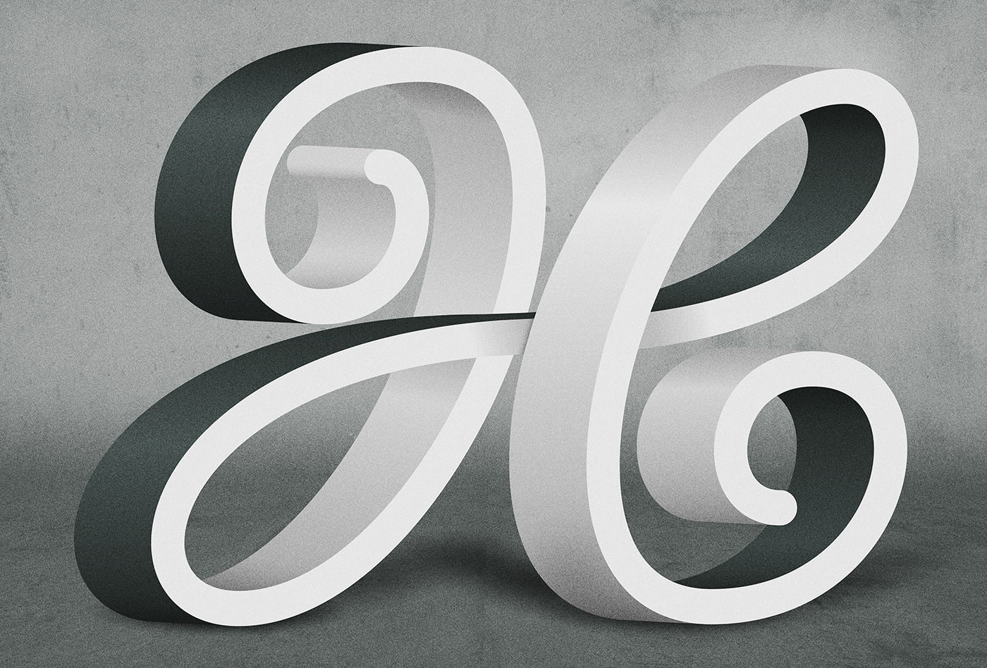
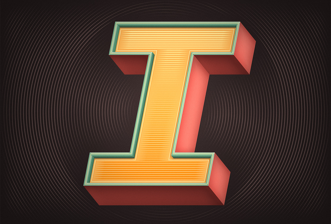
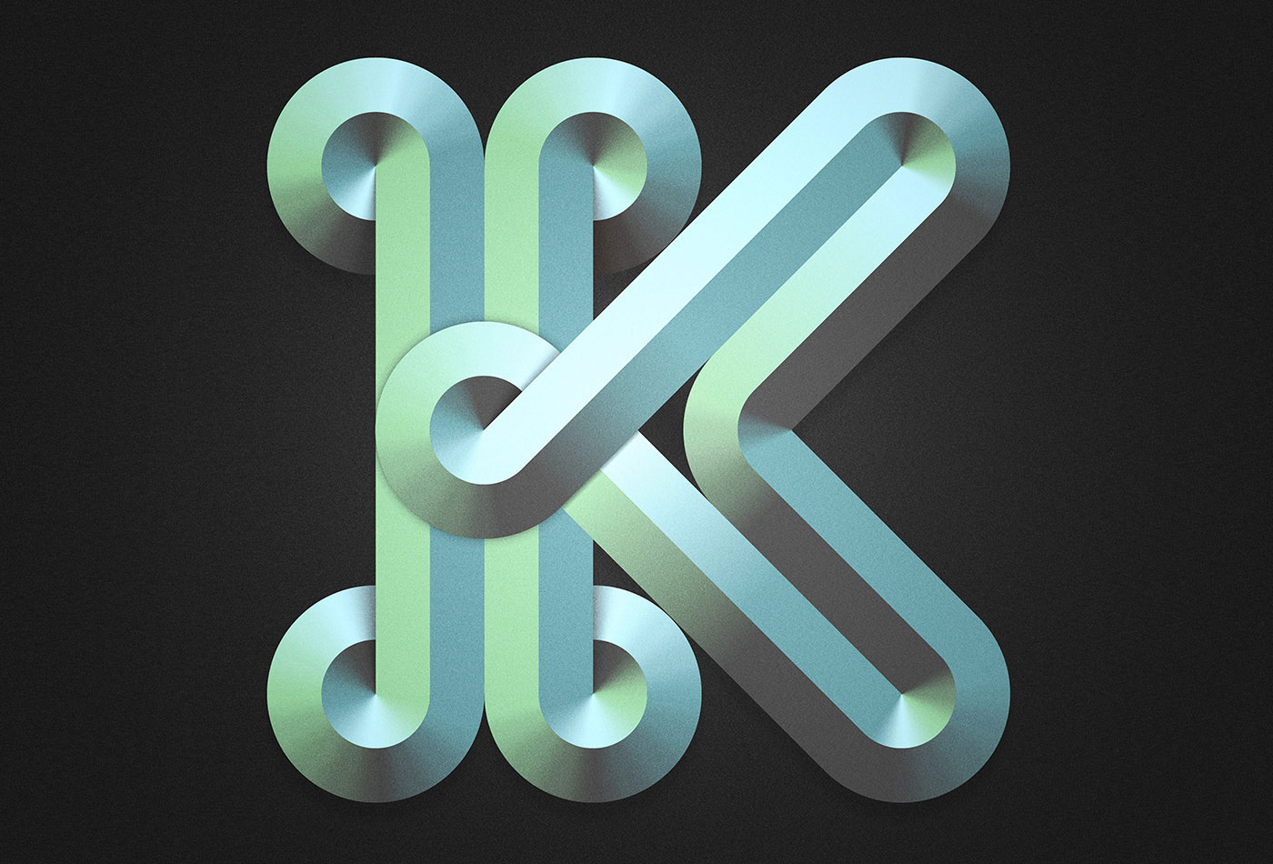
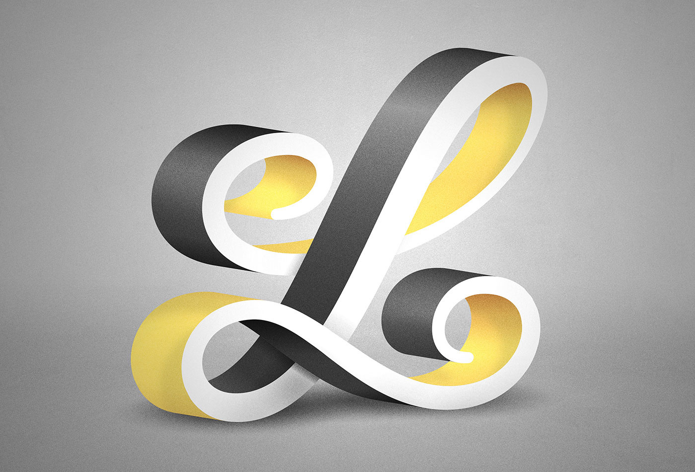
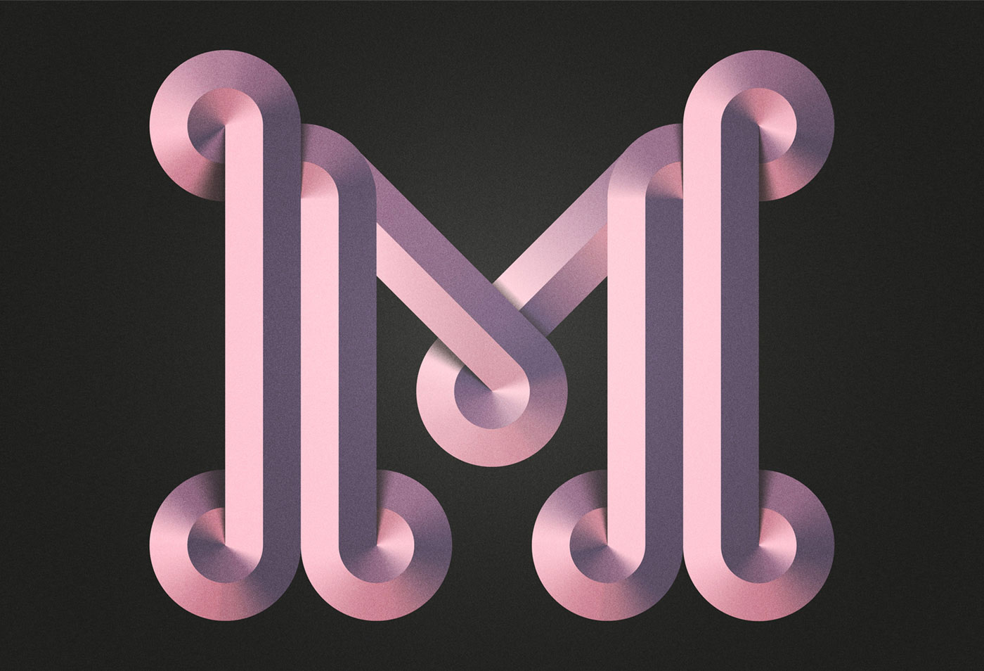
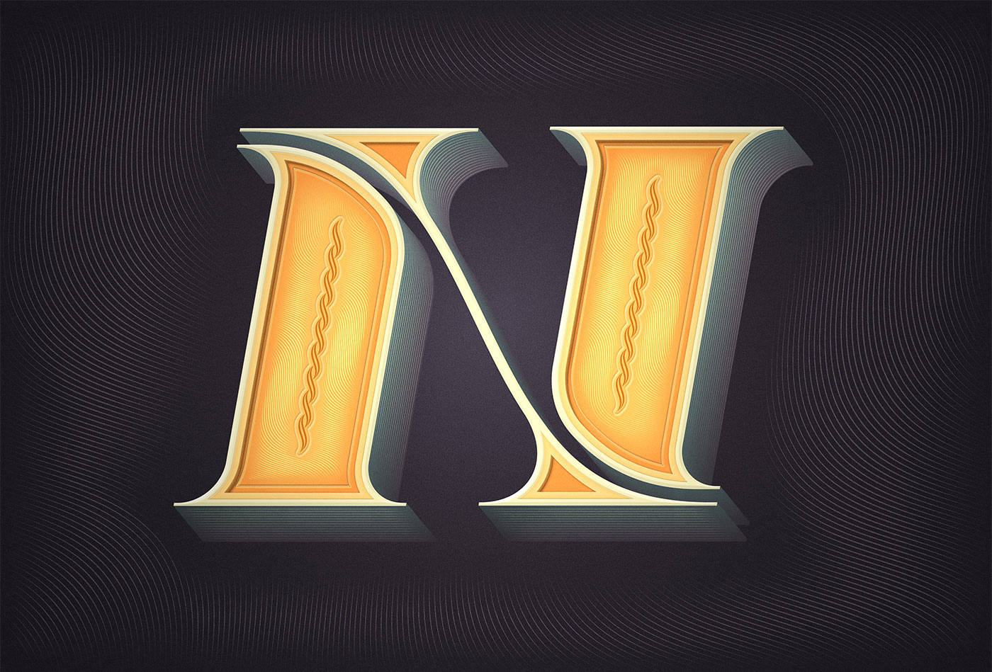
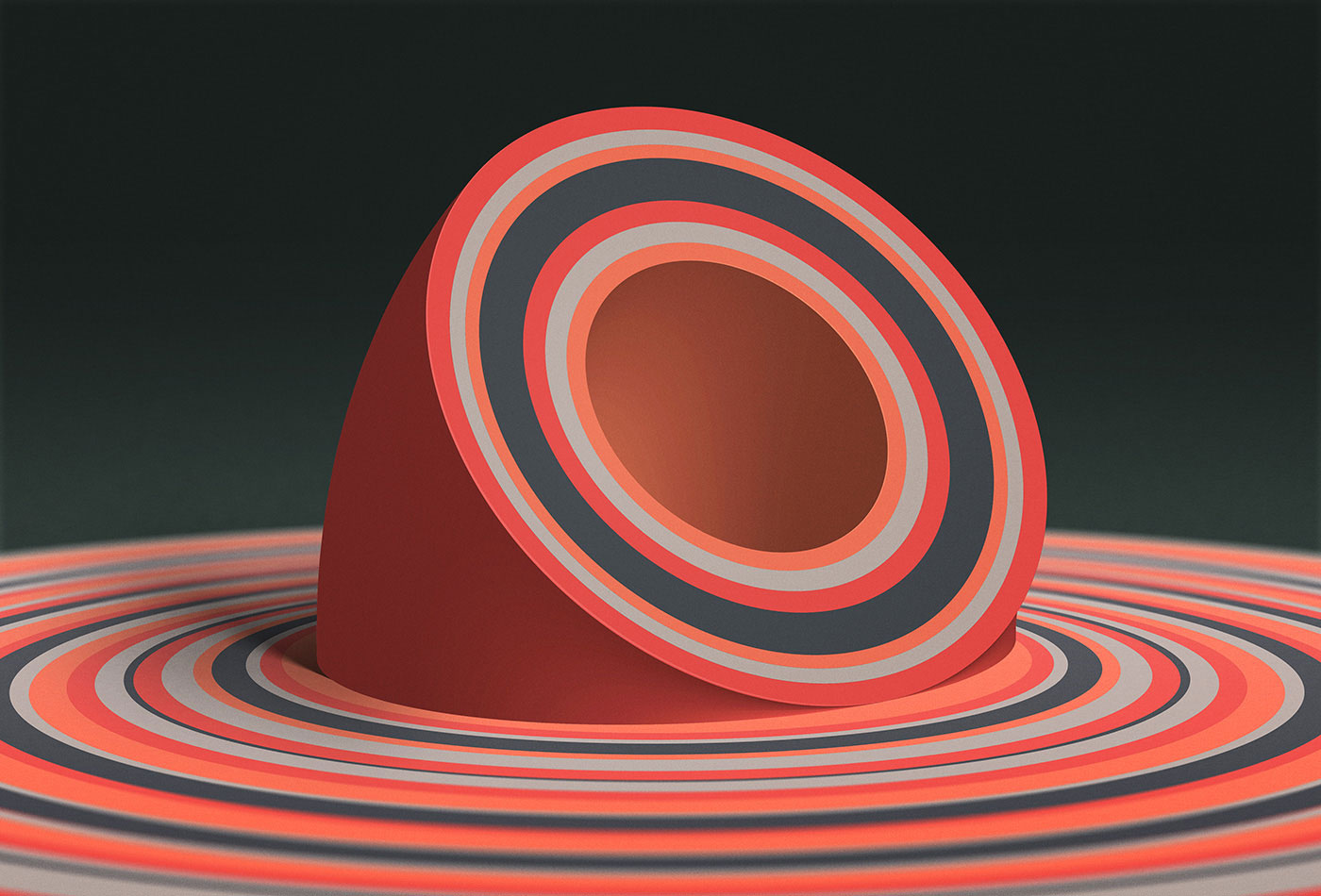
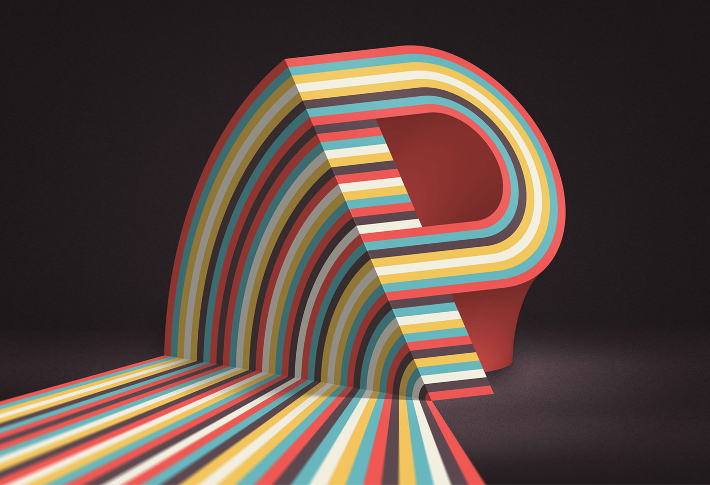
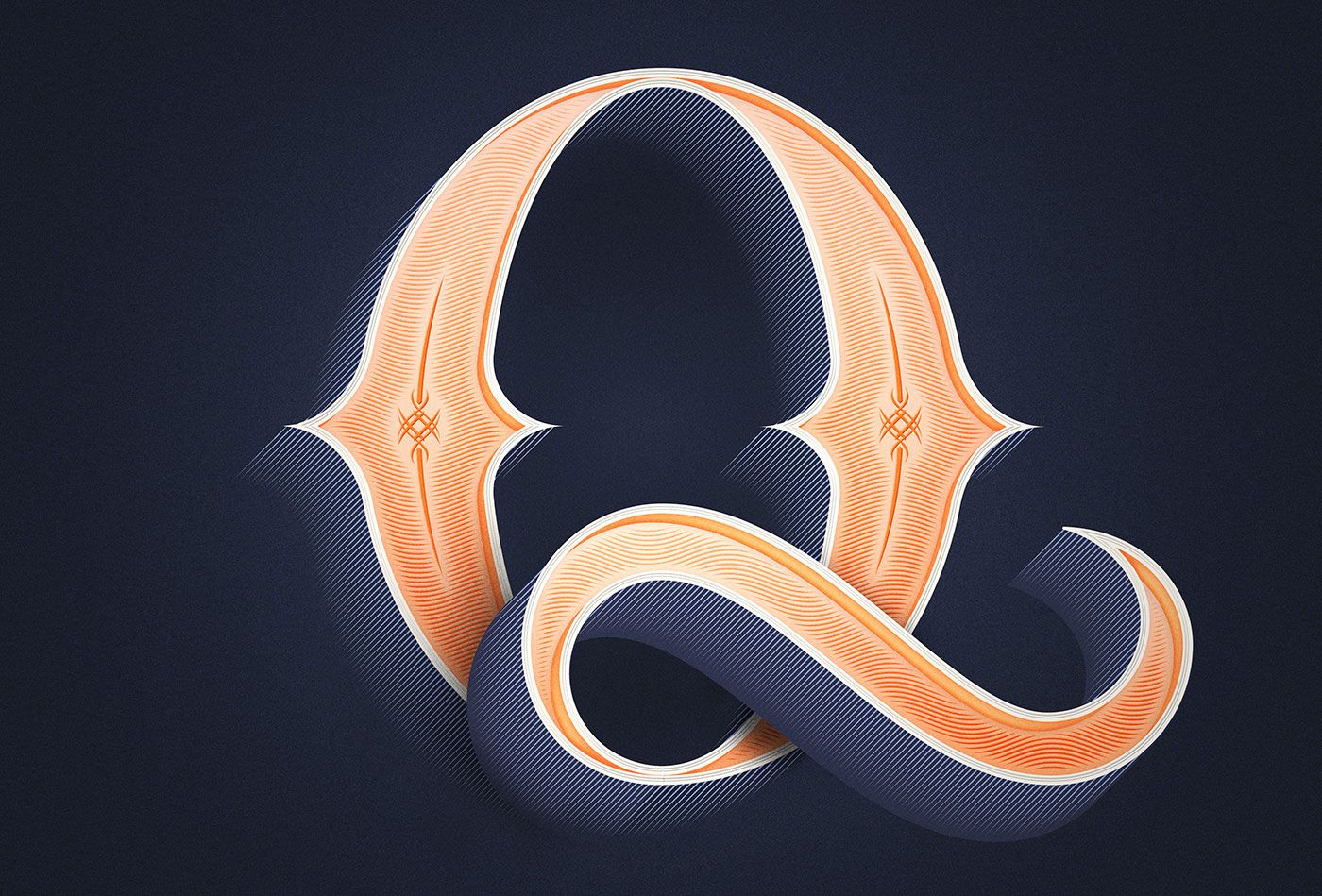
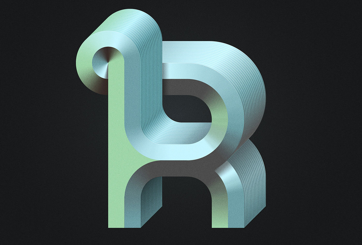
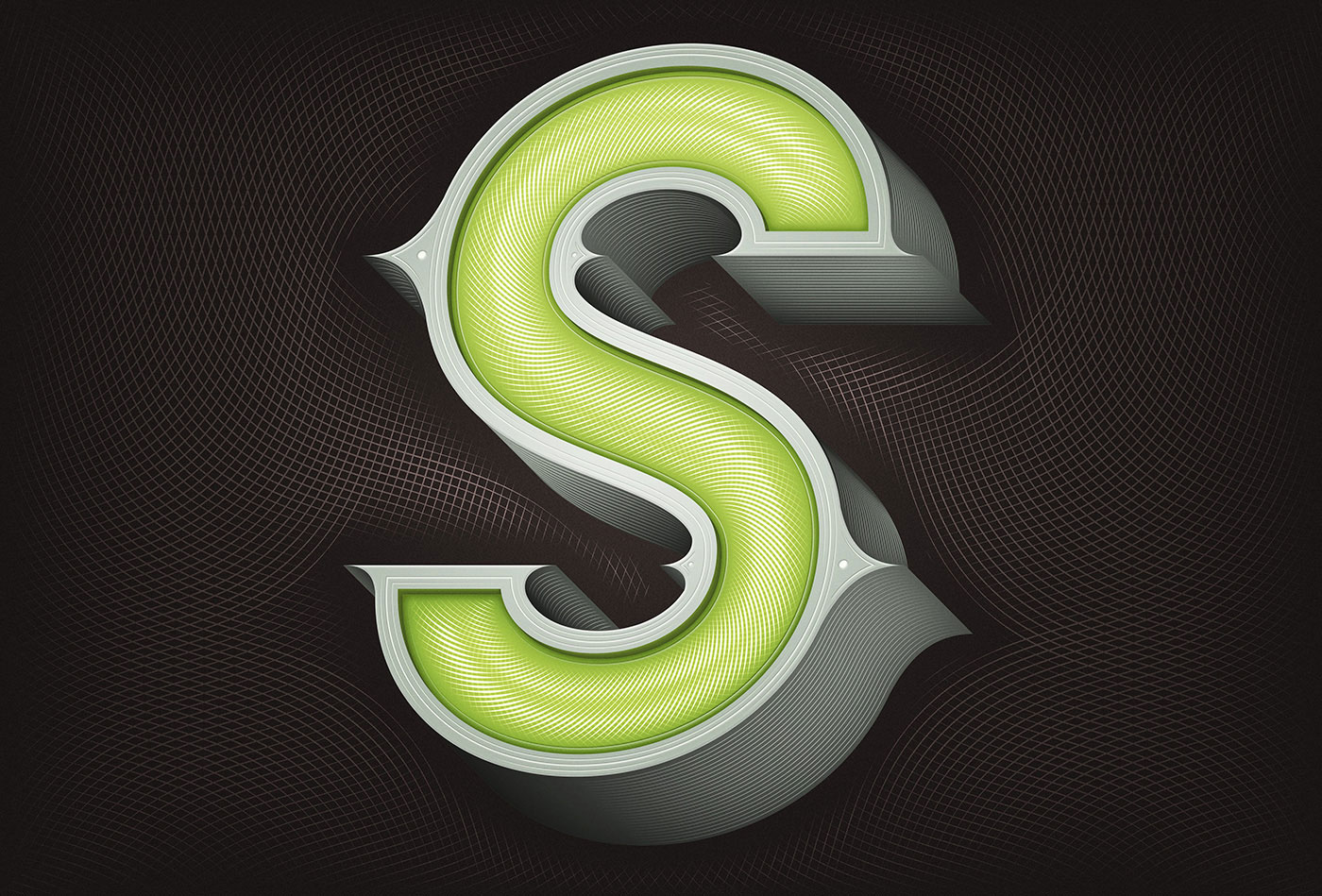
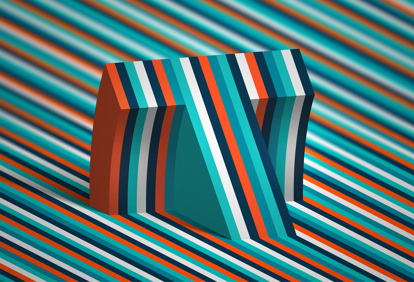
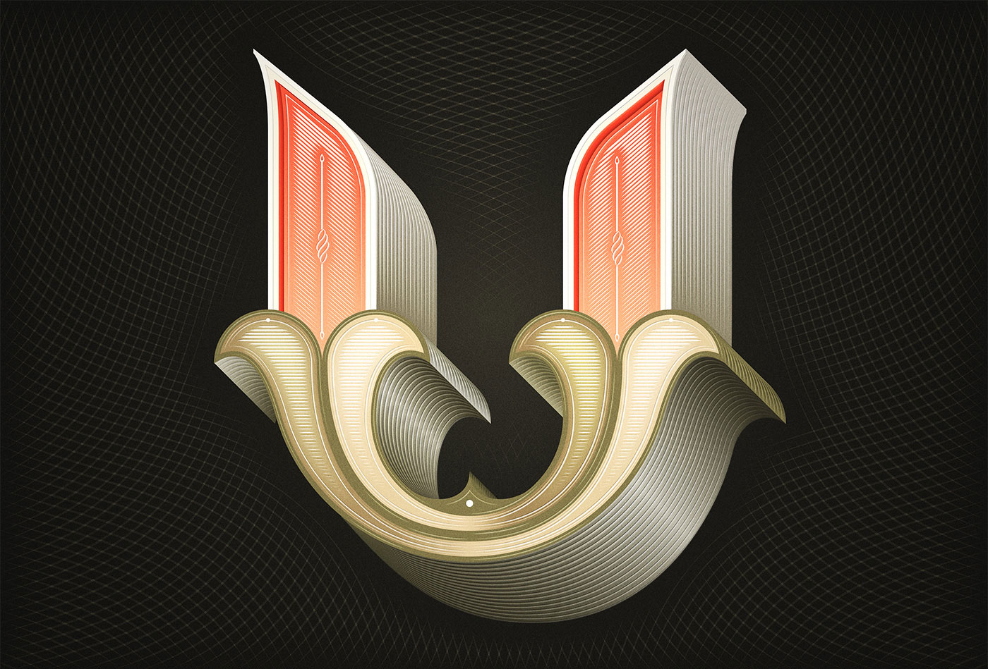
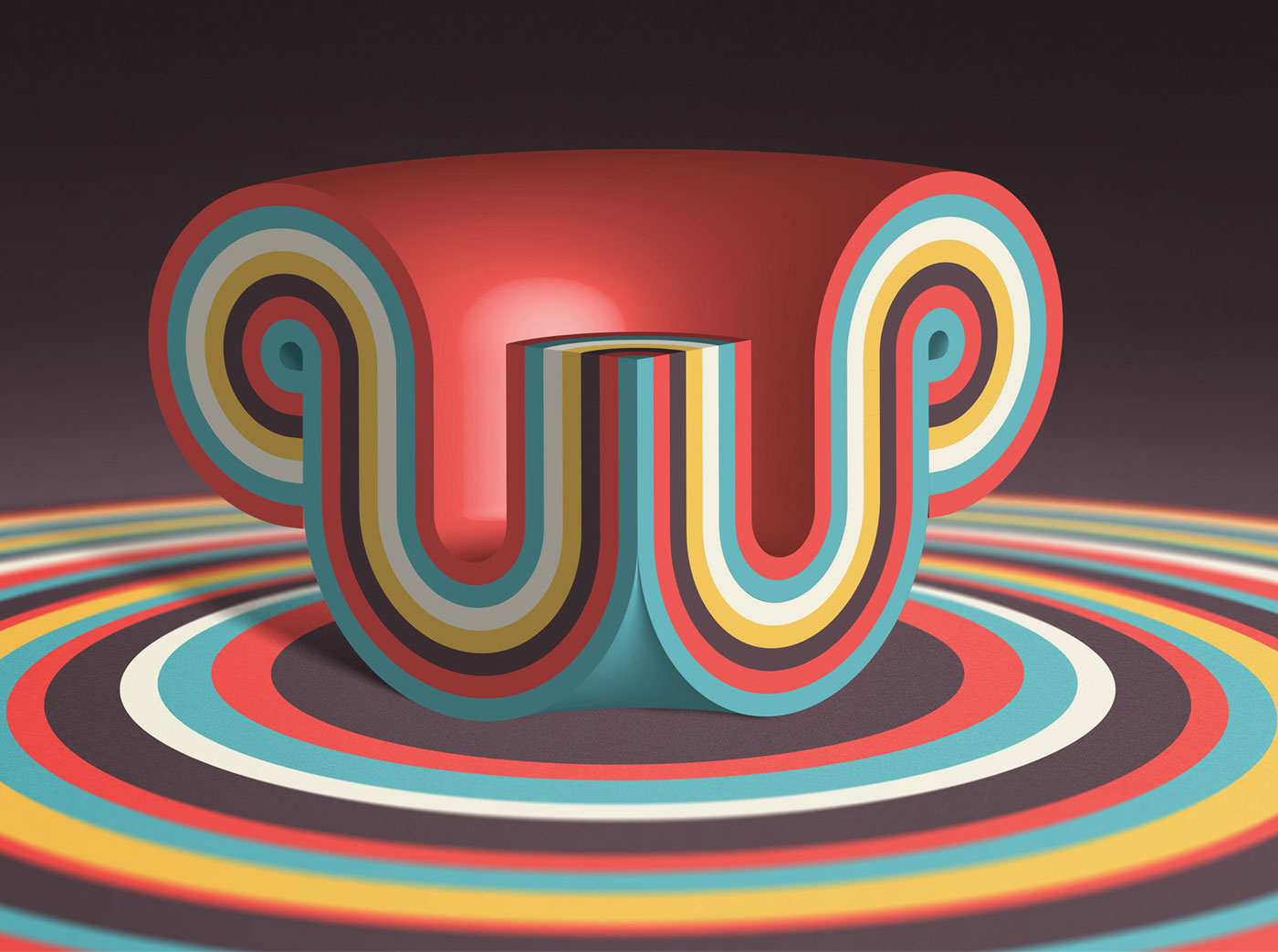
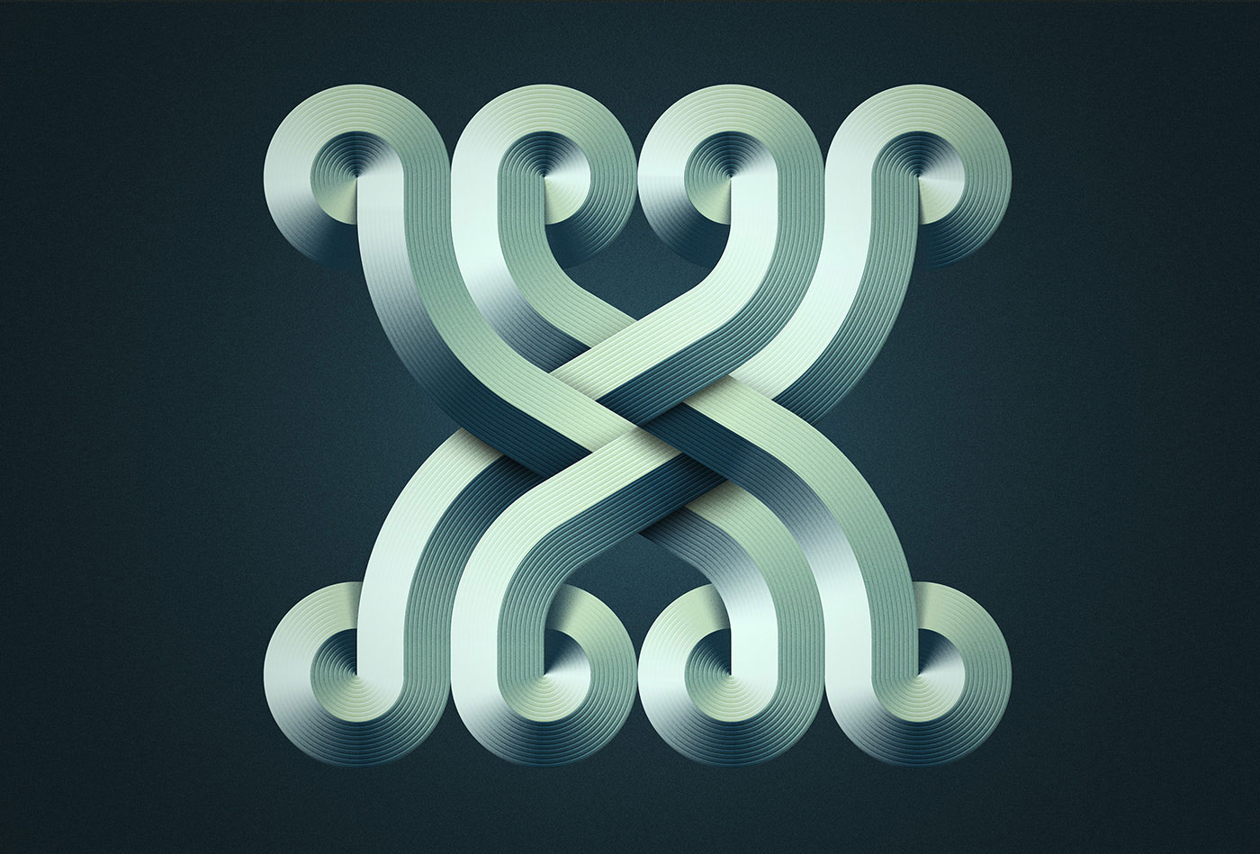
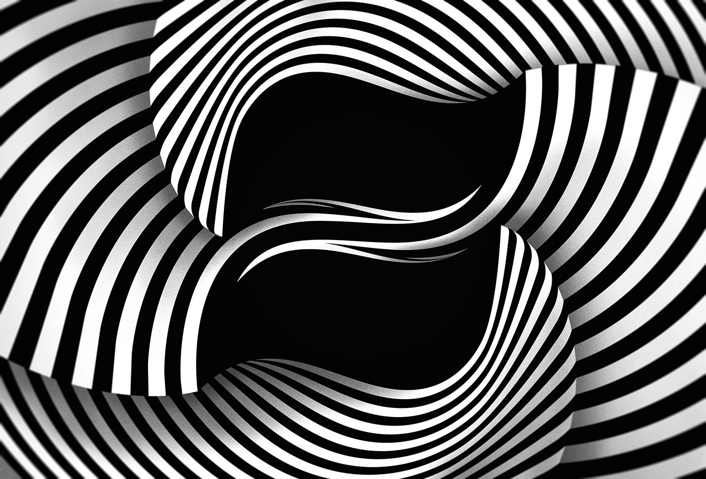
We have a thing for series, as you might have noticed from many of our posts. And serial projects, in which artists produce artwork for a specified stretch of time, whether it be daily or weekly or monthly, are some of our favorites (here and here and here). We recently stumbled upon 36 Days of Type, a yearly open call inviting designers, illustrators and visual artists to share their view on the letters and numbers from our alphabet. Originally conceived by Barcelona-based designers Nina Sans and Rafa Goicoechea, this creative initiative has literally generated tens of thousands of entries, and is now in its third year. The work of Belgian designer Mario De Meyer caught our eye, and led us to a virtual treasure trove of typographic wonders. For the 2016 edition, De Meyer dove head first into his varying letterforms, producing a variety of beautiful designs, each worthy of standing on its own. De Meyer’s imagination seems boundless, integrating depth and a terrific sense of color into his compositions. We’re looking forward to seeing what De Meyer whips up for 2017!
Via Behance and 36daysoftype.com


[…] no secret that we love admiring typographic projects (here and here and here). When we came across this gem from German studio/duo FOREAL (previously featured here), […]