
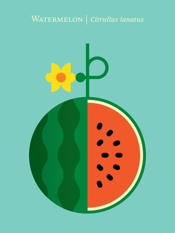
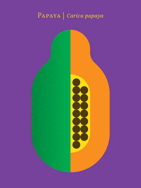
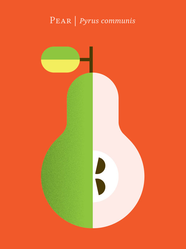
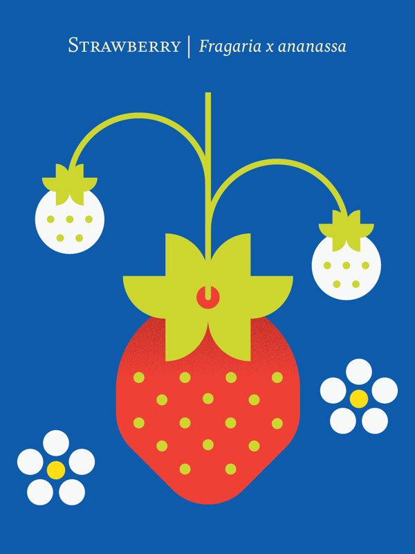
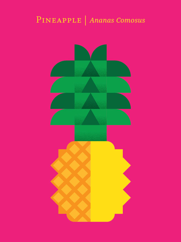
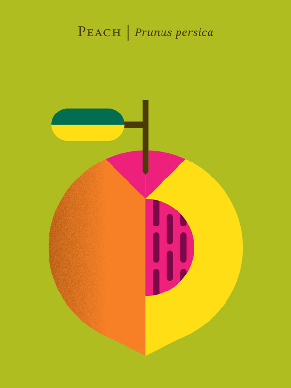
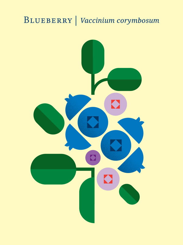
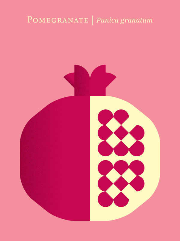
Fruit Prints by Chris Dina
With spring now in bloom, we are reminded of the bounty of fruits the warmer weather brings. What better way to start a Monday than with this vibrant series of prints by New York City-based designer Chris Dina. We have a certain fondness for series (and fruit!), so these pieces, complete with compelling shapes and colors, and fine typography are certainly worth sharing. Be sure to check out some of Dina’s other work, notably his work on wayfinding and informational signage at iconic Radio City Music Hall.
Via Behance
I usually gravitate toward this simple, elegant style whenever I look for cards. And this is the type of style I like on book covers. Bold, yet beautiful colors. I can’t help thinking of the art style of the Samurai Jack animated television series created by Genndy Tartakovsky.