Pumpkin Spiced Typography
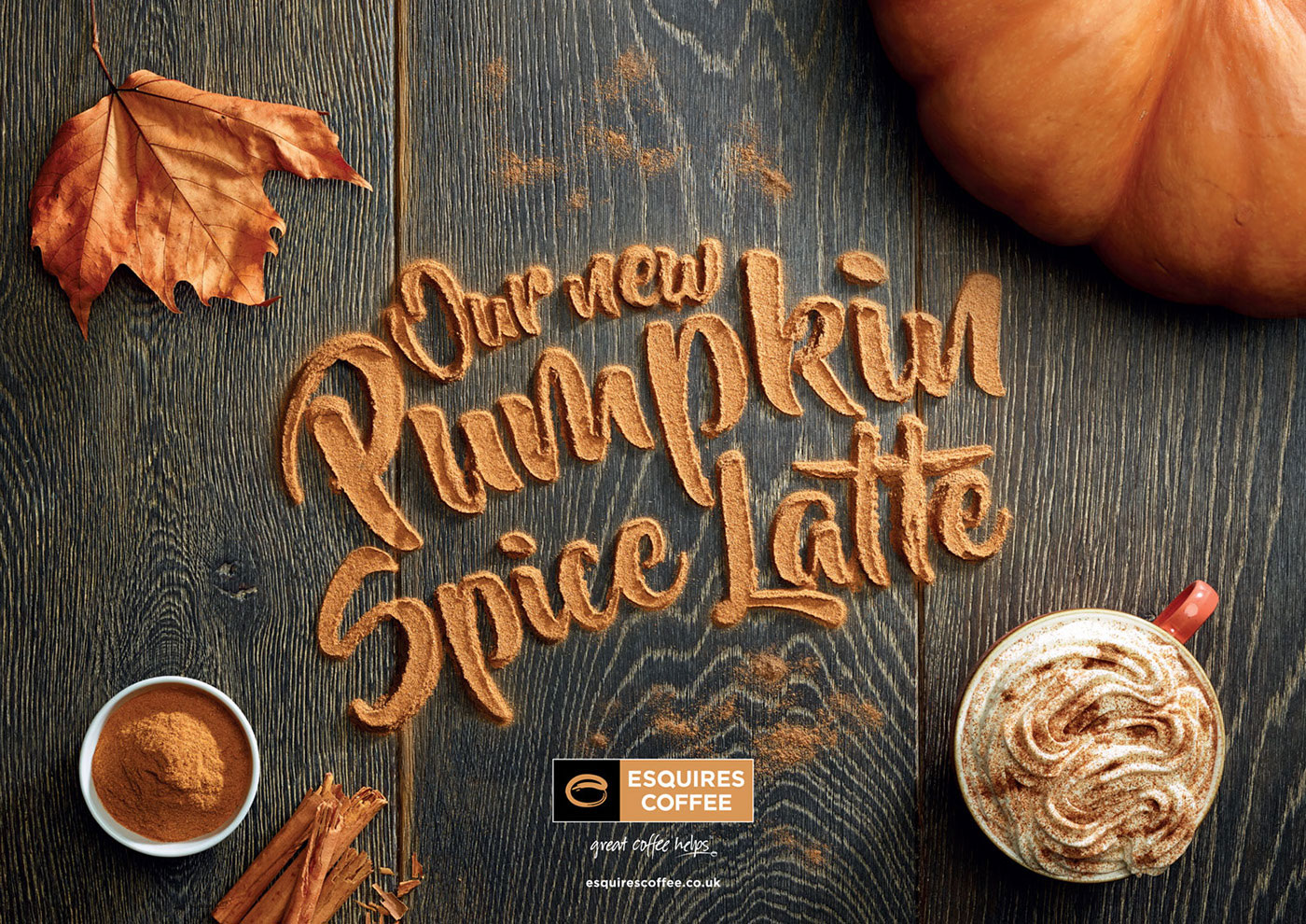
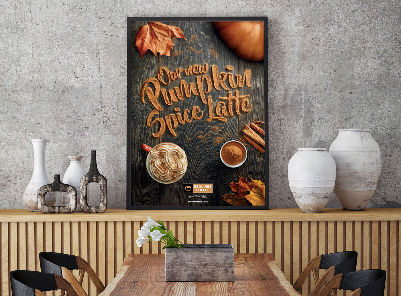
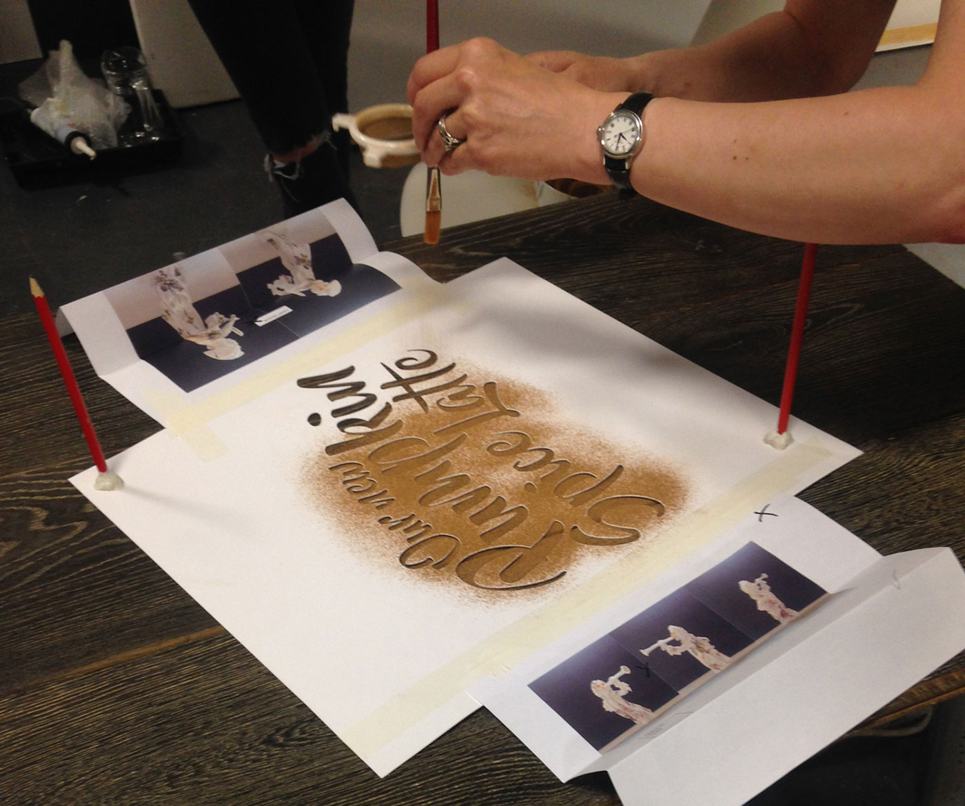
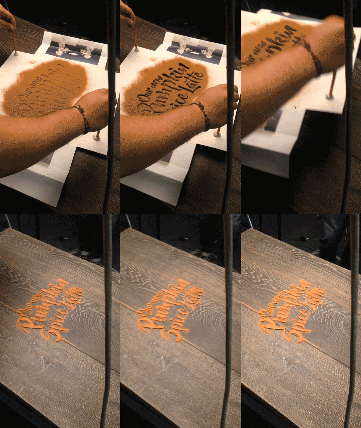
You must admit, the “pumpkin spice” phenomenon that has taken over in recent years may be getting bit out of hand. We find premature pumpkin spicing particularly offensive (as does this guy)… we do not need pumpkin spiced anything in August! In any case, with the autumnal flavors creeping in, so do all the colors, textures and visuals of the season. We love food-related typography (here and here and here), so when UK designer Daniel Coleman pulled back the curtain on his process for this fittingly delicious take on pumpkin spiced typography, we were immediately intrigued. In his own words, Coleman discusses the project: “Esquires’ Pumpkin Spice Latte is the coffee chain’s hero product for Autumn 2016. We were asked to produce a key visual that captured the Esquires brand points of being artisan and handmade, whilst conveying the products ingredients as authentic (and not just a syrup shot). We designed a visual that captured those standpoints, with a particular focus on the authentic ingredients. By creating the type out of cinnamon, we could emphasise the flavour in the latte. To further set the mood, we added leaves and key ingredients around the typography. We experimented with various ingredients, looking at what gave the greatest clarity, colour and perception of flavour. Given the nature of the product we decided to work with cinnamon. The type was created by adjusting a font named ‘Beyond the Mountains’, making sure it had no complete bowls, eyes or loops. The next step was to laser cut it out onto card to create our stencil. The final result took a few experiments, using varying amounts of cinnamon to ensure the best detail and legibility.”
Via Behance


