
Posts Tagged ‘experimental typography’
Letter Jam: The Tooned Alphabet
It’s no secret that we love admiring typographic projects (here and here and here). When we came across this gem from German studio/duo FOREAL (previously featured here), which harkens back to childhood memories filled with cartoon references, we were immediately drawn in. We absolutely love this series and the sheer variety FOREAL was able to…
Read MoreWanderlust Alphabet (A-F)
Our penchant for serial works never diminishes. There’s just something about the natural order of things that is so satisfying. Glasgow-based illustrator/designer Jack Daly taps into that systemization while exploring his love of illustration, typography, and travel with his aptly titled Wanderlust Alphabet. And we have to say, the results, so far, are pretty great.…
Read MoreAlex Schlegel’s Terrific Typography

Oh, experimental typography… how we love thee. Perhaps it’s a case of design envy, or we’re just taken with pretty things in general, but when done well, experimental typography can stand on its own, out of context. This is definitely the case with the work of Hamburg, Germany-based motion designer/illustrator Alex Schlegel. Schlegel’s visual explorations…
Read MorePumpkin Spiced Typography
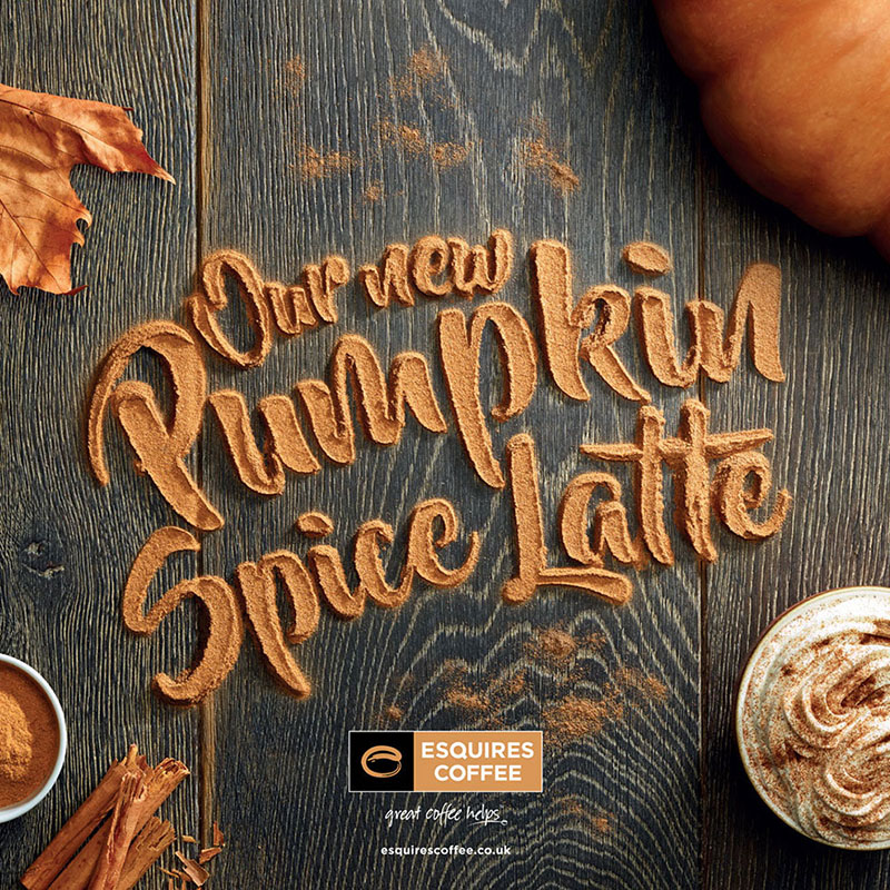
You must admit, the “pumpkin spice” phenomenon that has taken over in recent years may be getting bit out of hand. We find premature pumpkin spicing particularly offensive (as does this guy)… we do not need pumpkin spiced anything in August! In any case, with the autumnal flavors creeping in, so do all the colors,…
Read MoreTangible Typography
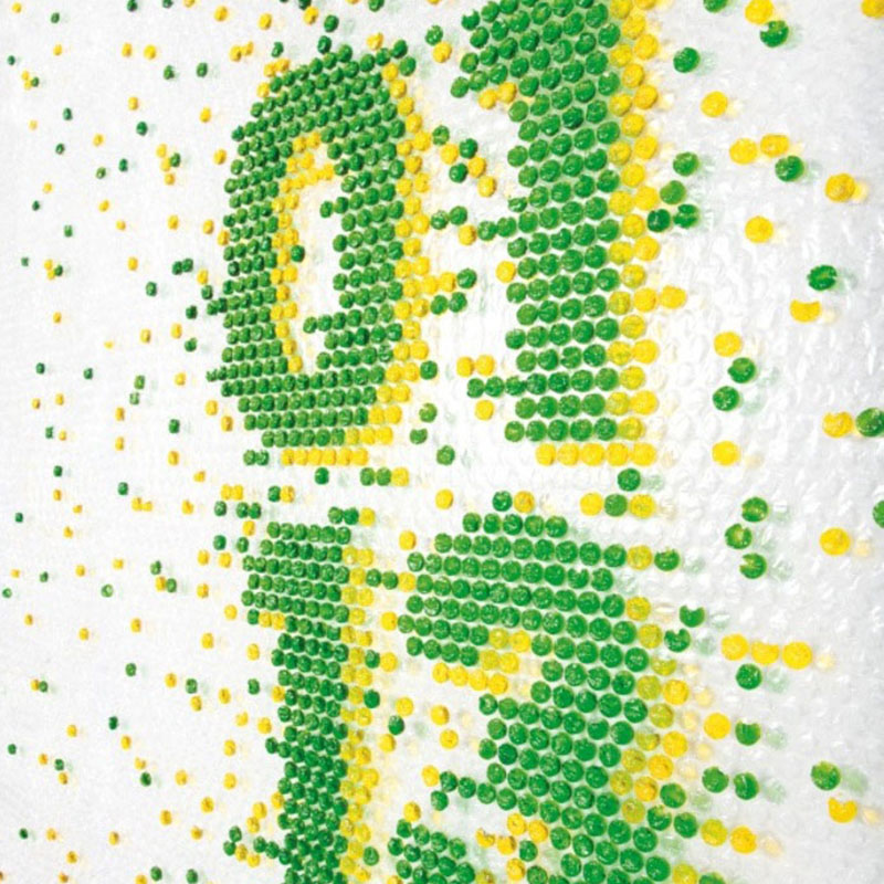
The shipping season has been hitting its peak over the past few days, so we thought it appropriate to share the typographic explorations of Barcelona-based design studio Lo Siento (previous post here). Among their highly creative undertakings are works in which they experiment with injecting colored liquid into individual pouches of plastic bubble wrap to…
Read MoreFast Cooked Poster
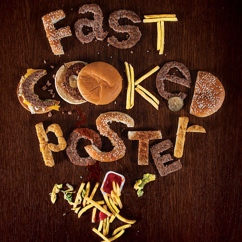
Let’s be honest here, food and typography are two of our favorite things. So when the two are paired with great skill, we take notice. This well-executed poster by Russian art director Alexander Eliseev as student work a few years back is one such example. According to Eliseev, the piece came together very quickly… just…
Read MoreAwesome Alphabet Work by Alejandro “Alex” López Becerro

We are suckers for experimental typography, especially when it’s served up as a nice tidy alphabet. This outstanding series by Madrid-based designer Alejandro “Alex” López Becerro is one such example. Becerro is crazy talented, and his 3D work is on the mark. We love the variety that’s showcased here, which seems to be key to…
Read MoreVoluminous Alphabet by Alexis Persani
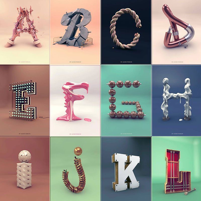
It’s no secret that we are totally taken with graphical interpretations of the alphabet, conceptual typography, and works that are done as a series. This gem of a project, by Paris-based designer Alexis Persani, gets high marks all around. Persani’s 3D illustration work is stellar. It doesn’t feel like the 3D is a gratuitous effect,…
Read MoreFresh Picked Typography
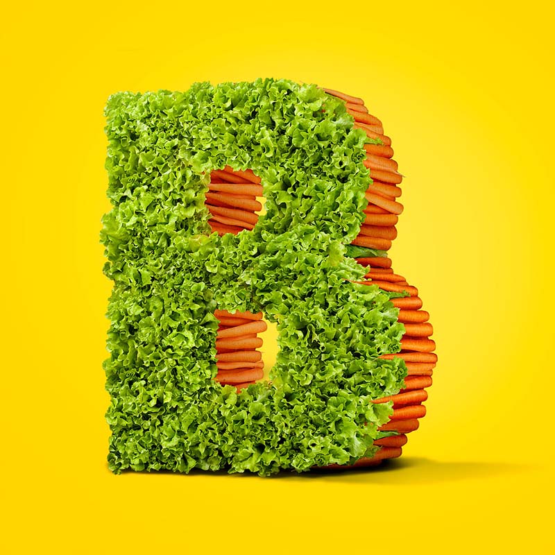
Sometimes you’ll find excellent examples of experimental typography in the most unexpected places. Take this terrific print ad from a Lithuanian grocer, for example. Under the art direction of Lithuanian designer Ignas Kozlovas by way of McCann Erickson, this typographic arrangement of real produce displays mastery in Photoshop, as well as an excellent eye for…
Read MoreGiving “Experimental Typography” New Meaning

This rather cerebral study of typography by Austrian designer/sculptor/artist Andreas Scheiger is quite fitting for Halloween. Taking inspiration from noted type designer Frederic W. Goudy´s “The Alphabet and Elements of Lettering,” and treating letters like organisms and typefaces as species, Scheiger created this amazing series, Evolution of Type. We’re fascinated by Scheiger’s surgical dissection and…
Read More