
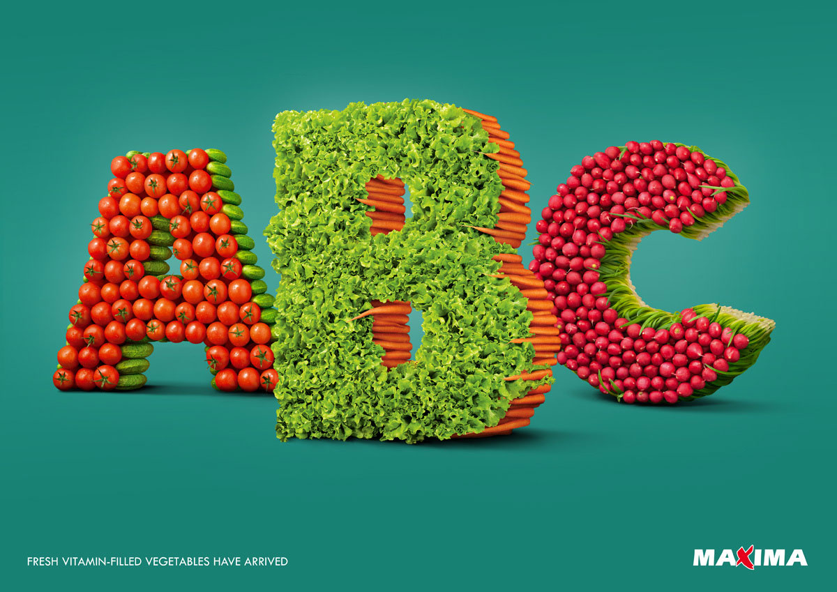
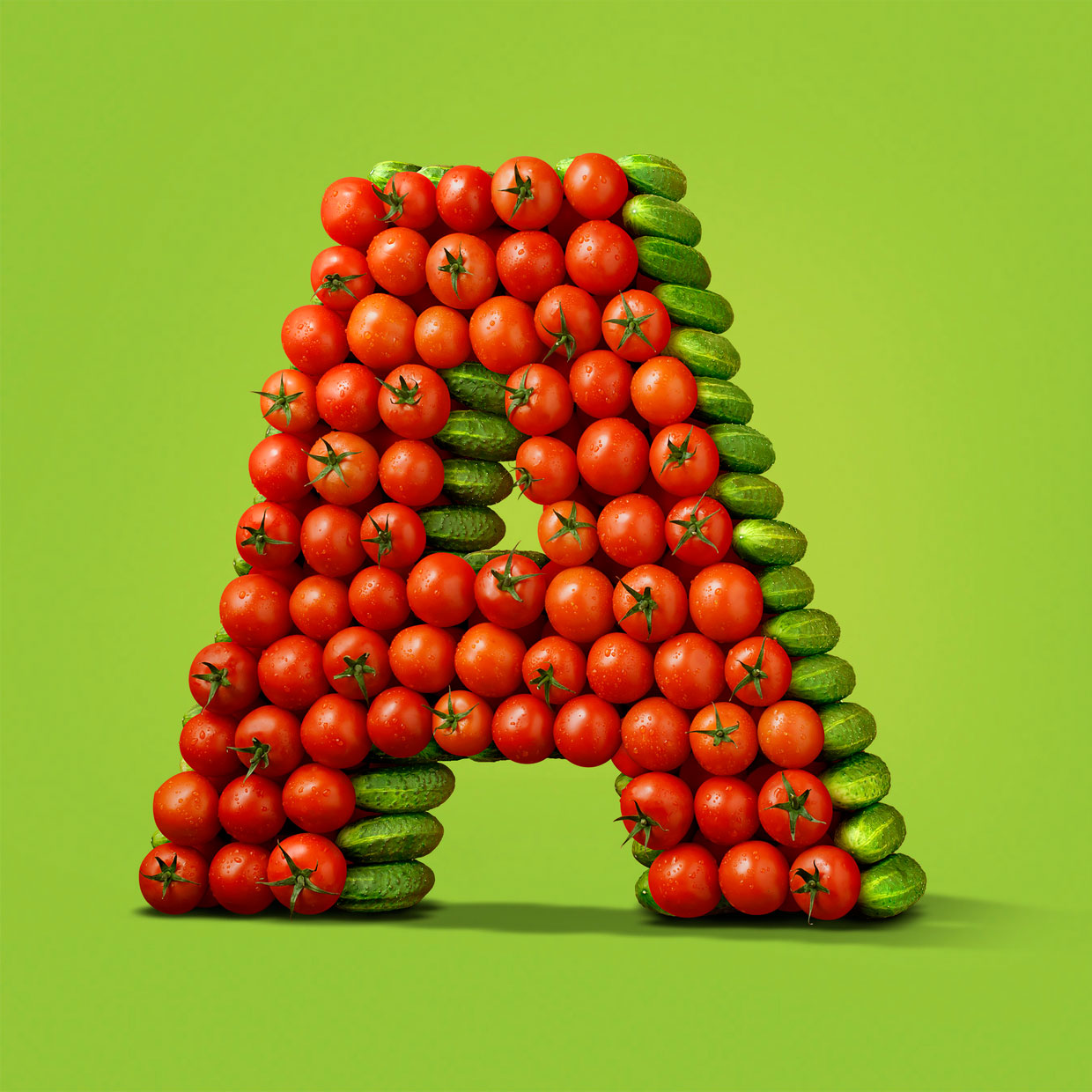
Fresh Picked Typography
Sometimes you’ll find excellent examples of experimental typography in the most unexpected places. Take this terrific print ad from a Lithuanian grocer, for example. Under the art direction of Lithuanian designer Ignas Kozlovas by way of McCann Erickson, this typographic arrangement of real produce displays mastery in Photoshop, as well as an excellent eye for composition. Really well executed… would love to see the rest of the alphabet. Some other examples of produce in design here and here and here.
Via Behance


[…] here) is really something, and reminiscent of some other typographic wonders (here and here and here). Their project entitled “Ride” is not too shabby either. These guys are […]
[…] More food-based typography here and here and here. […]
[…] the colors, textures and visuals of the season. We love food-related typography (here and here and here), so when UK designer Daniel Coleman pulled back the curtain on his process for this fittingly […]