Letter Jam: The Tooned Alphabet
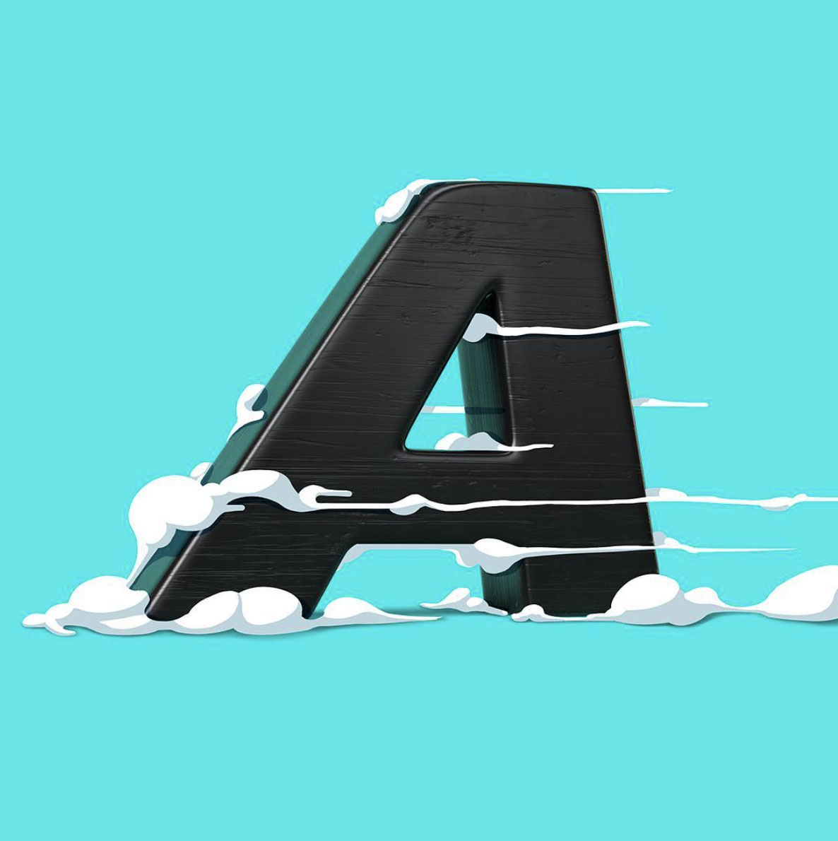
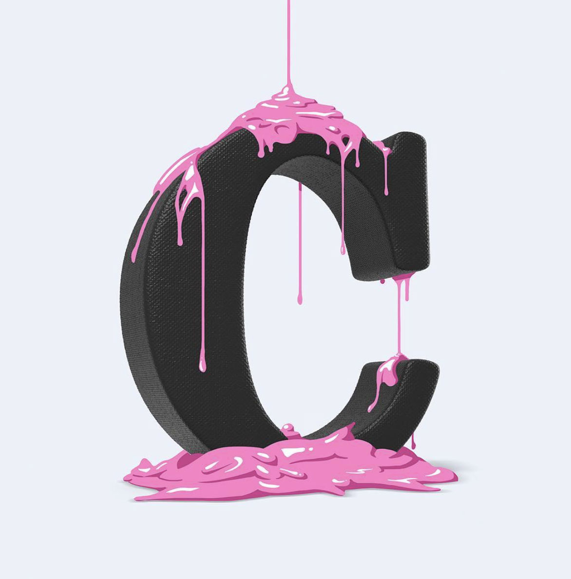
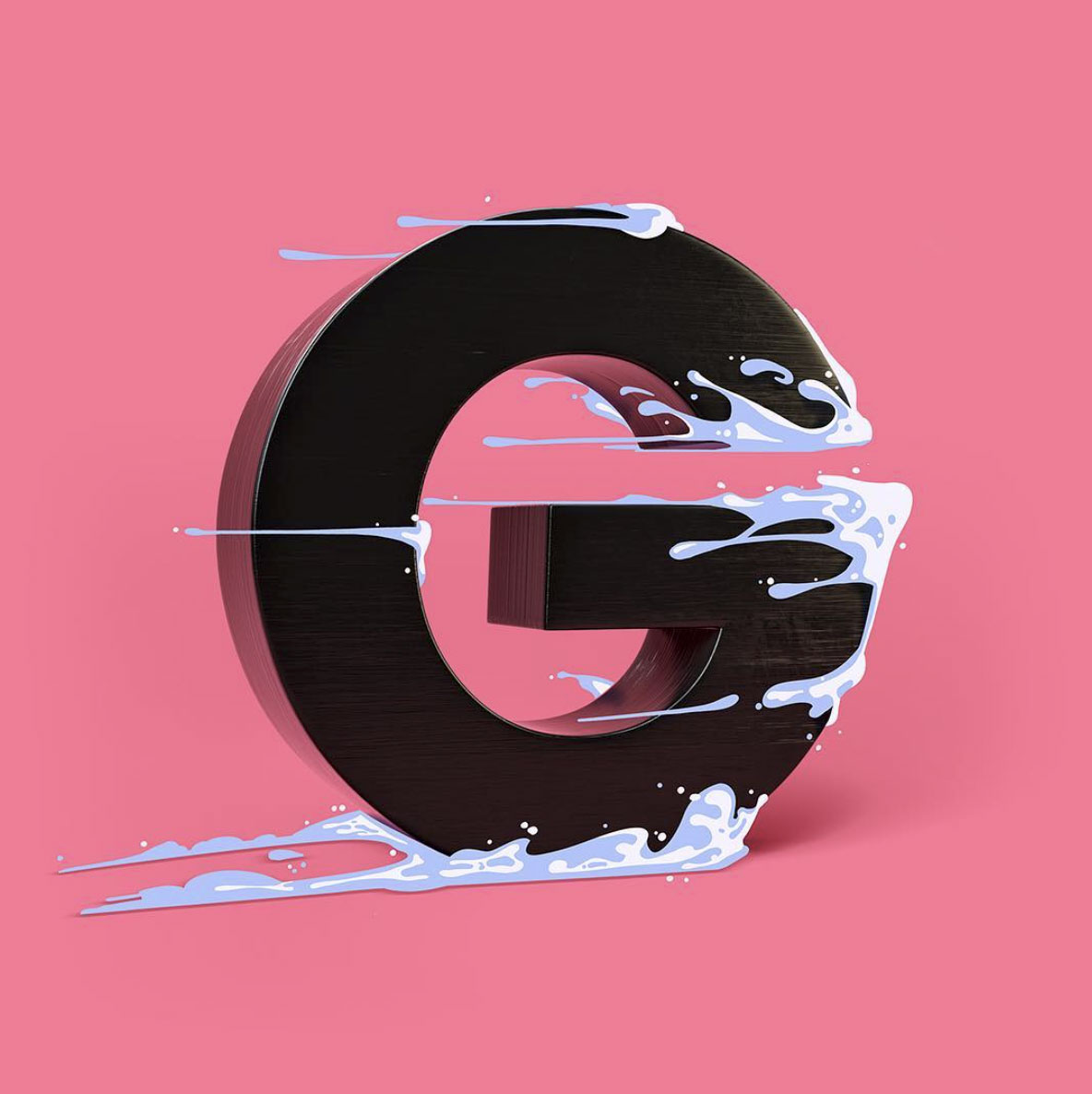
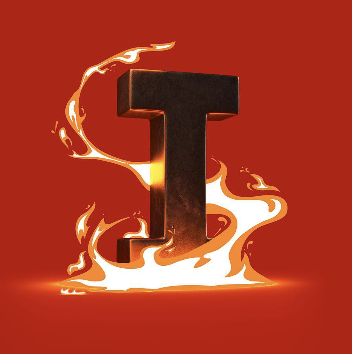
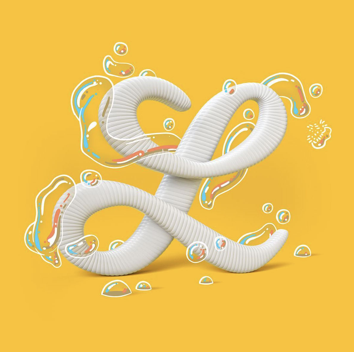
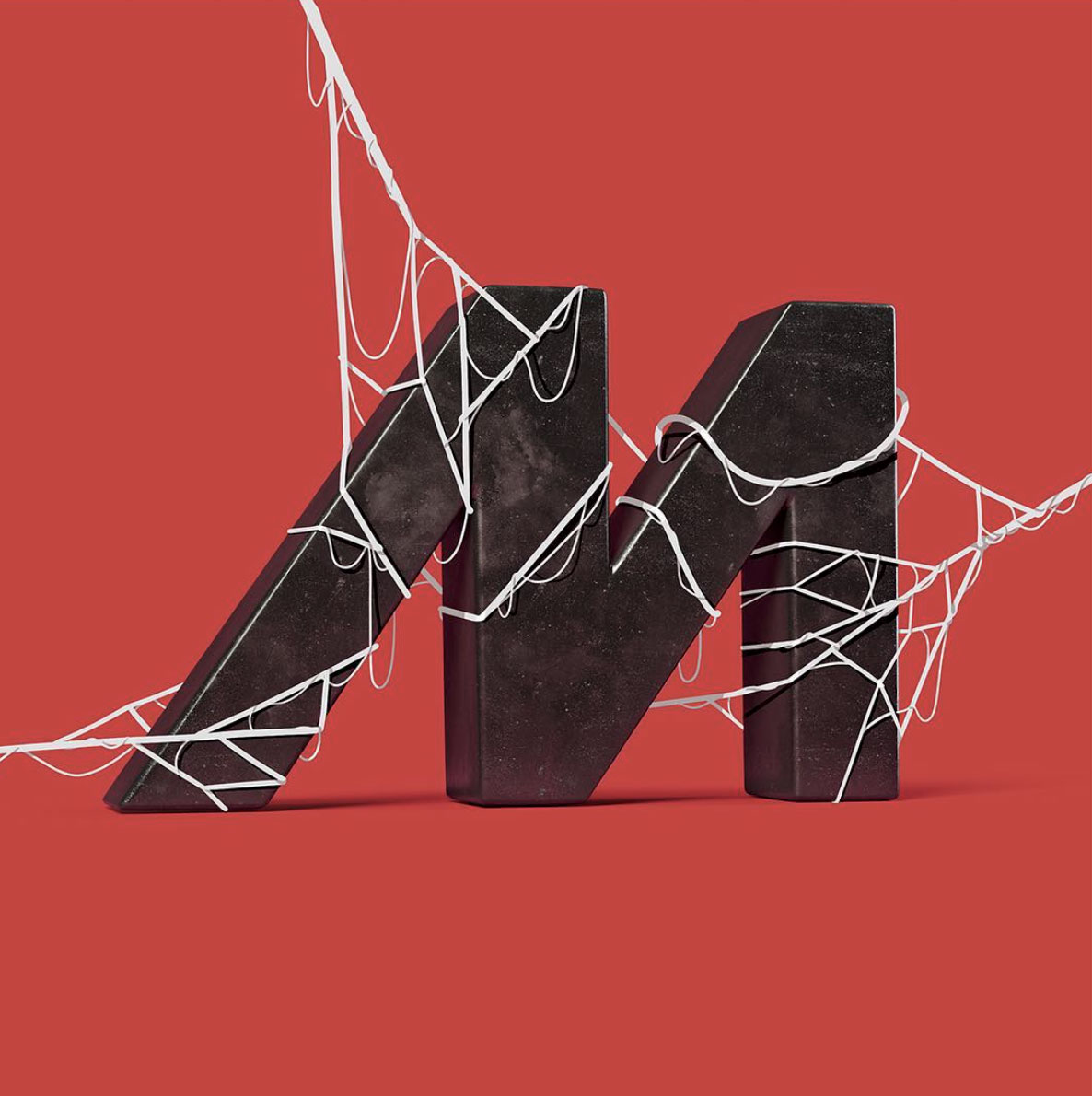
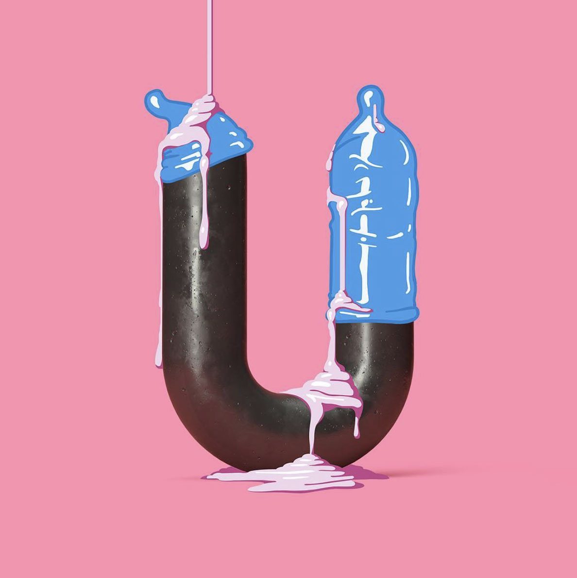
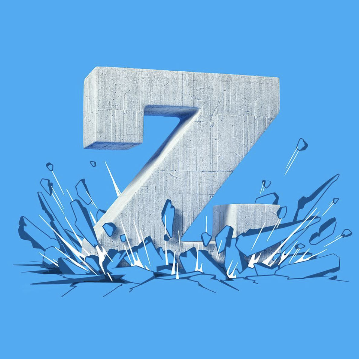
It’s no secret that we love admiring typographic projects (here and here and here). When we came across this gem from German studio/duo FOREAL (previously featured here), which harkens back to childhood memories filled with cartoon references, we were immediately drawn in. We absolutely love this series and the sheer variety FOREAL was able to employ. While each letterform is vastly different, they all work nicely as a set. As for the 36 Days of Type design challenge that sparked this series in the first place, FOREAL absolutely killed it. Quite simply, #designenvy. This is just a sampling, be sure to check out the entire collection on FOREAL’s Instagram (here).
Via weareforeal.com