
Posts Tagged ‘typographic’
Letter Jam: The Tooned Alphabet
It’s no secret that we love admiring typographic projects (here and here and here). When we came across this gem from German studio/duo FOREAL (previously featured here), which harkens back to childhood memories filled with cartoon references, we were immediately drawn in. We absolutely love this series and the sheer variety FOREAL was able to…
Read MoreAlex Schlegel’s Terrific Typography

Oh, experimental typography… how we love thee. Perhaps it’s a case of design envy, or we’re just taken with pretty things in general, but when done well, experimental typography can stand on its own, out of context. This is definitely the case with the work of Hamburg, Germany-based motion designer/illustrator Alex Schlegel. Schlegel’s visual explorations…
Read MoreThis Ampersand That
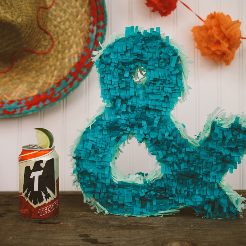
It’s no surprise that we’re big fans of photographer Emily Blincoe (previous posts here and here). Blincoe splits her time between Austin (ampersand) Nashville, creating some compelling photography, that’s both thoughtful and fun. A quick look at her typographic ampersand series, now several years old and aptly titled “This Ampersand That”, is long overdue. We…
Read MoreMosaic Master
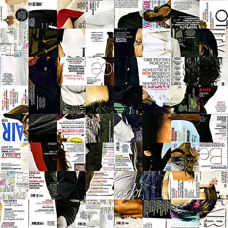
Exercises in typographic and mosaic compositions bring us back to our early studies as designers. Not because they are novice or effortless, but because they touch on the fundamentals of good design. Italian artist/designer known as Antonio Village9991 is quite adept at both, as exhibited by this sampling of his impressive body of work. For…
Read MoreTaking a Walk with Mitch Goldstein
In keeping with our (hopefully) weeklong theme of Create Upstate 2015 (other posts here and here), we turn the spotlight on fellow Rochester-based designer (and educator/writer) Mitch Goldstein. Those behind the planning of Create Upstate clearly made a deliberate decision to have Goldstein kick off the main event. Goldstein is the perfect blend of adept designer…
Read MoreA Book About A-holes
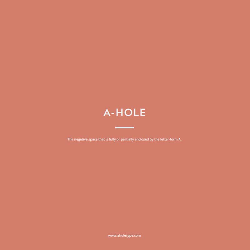
Continuing the theme of our fantastic experience at Create Upstate last week in Syracuse (previous post here), we’d like to introduce you to Curtis Canham of CSA Creative Studio. Canham is an art director/designer/educator based in the Albany area with an impressive and diverse portfolio, from sophisticated packaging to illustration-driven infographics to consumer-facing web design.…
Read MoreEmoji Alphabet by Christopher Rouleau

Let’s face it, emojis have infiltrated the general consciousness. When your mom is using them, you know they’ve hit the mainstream. These small digital images used to express an idea, emotion, etc., in electronic communication are now becoming the subject of art itself, which is another touchstone of cultural proliferation. Wildly talented Toronto-based letterer/designer/artist Christopher…
Read MoreLegit Lace Typography
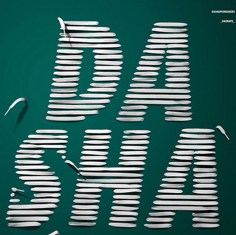
Type geeks rejoice! We love inventive type, like this stellar work by Madrid-based art director/designer Andrés Momó. Fittingly for “DASHAPE” sneaker event in Spain, Momó literally threaded sneaker laces in the shape of letters to form the title of the event. The care he took with the letterforms shows. And somehow, this just wouldn’t be…
Read MoreTangible Typography
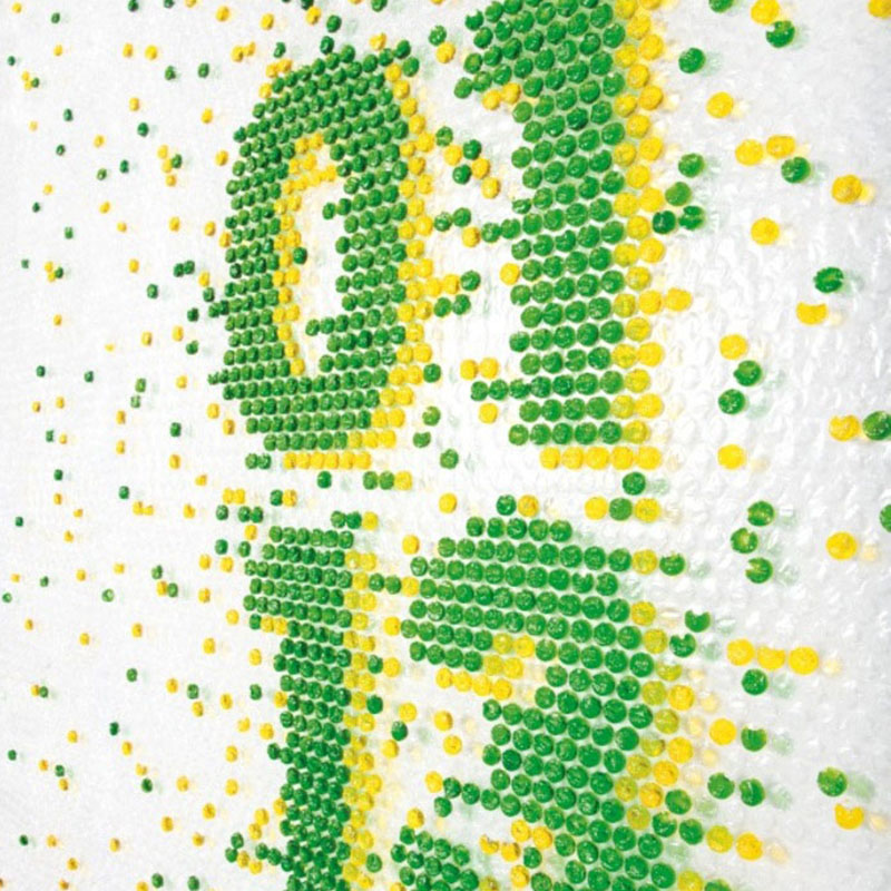
The shipping season has been hitting its peak over the past few days, so we thought it appropriate to share the typographic explorations of Barcelona-based design studio Lo Siento (previous post here). Among their highly creative undertakings are works in which they experiment with injecting colored liquid into individual pouches of plastic bubble wrap to…
Read More