
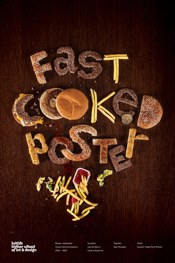
Fast Cooked Poster
Let’s be honest here, food and typography are two of our favorite things. So when the two are paired with great skill, we take notice. This well-executed poster by Russian art director Alexander Eliseev as student work a few years back is one such example. According to Eliseev, the piece came together very quickly… just two hours from conception to print. Which is fitting, given the subject matter. But it certainly doesn’t look like it was done in a hurry, but rather thoughtfully composed over time. We do know what it’s like to have things fall into place perfectly when a deadline is looming, though. Regardless of the turnaround time, this piece is a great example of experimental (and indulgently delicious) typography. More examples here and here and here.
Via Behance
[…] so do all the colors, textures and visuals of the season. We love food-related typography (here and here and here), so when UK designer Daniel Coleman pulled back the curtain on his process for this […]