Restaurant Branding Fit for a Silver Platter
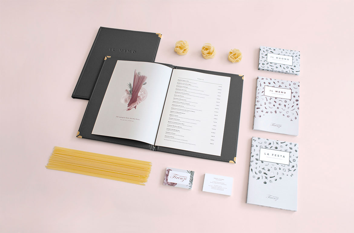
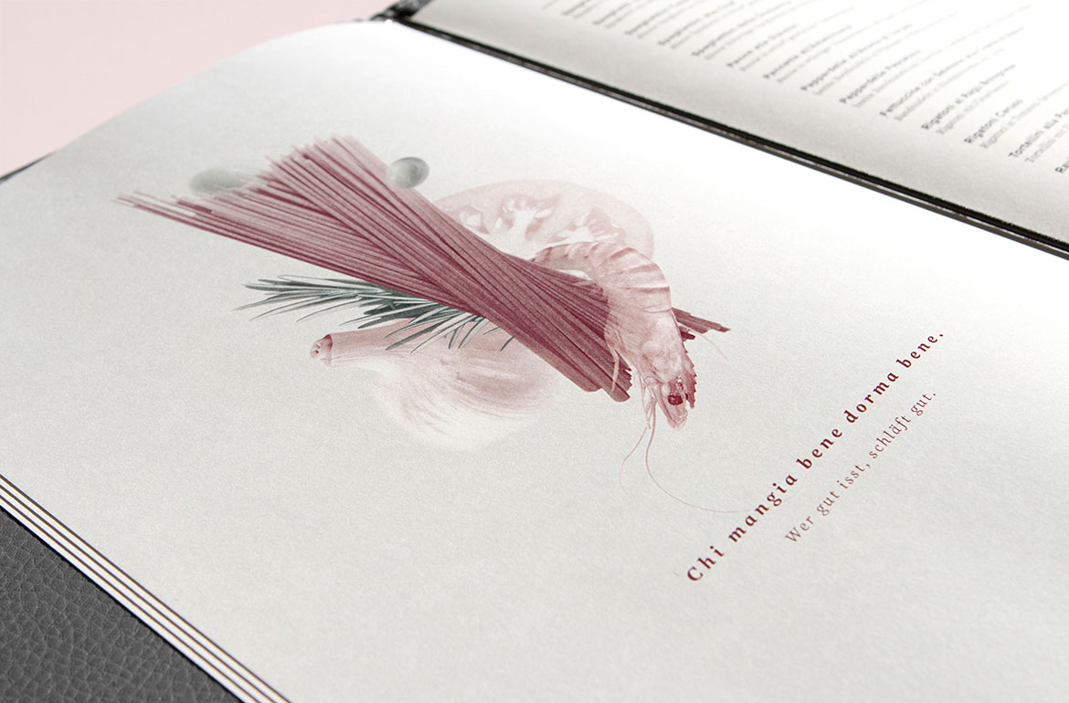
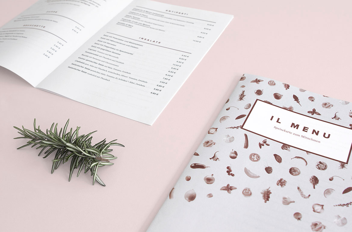
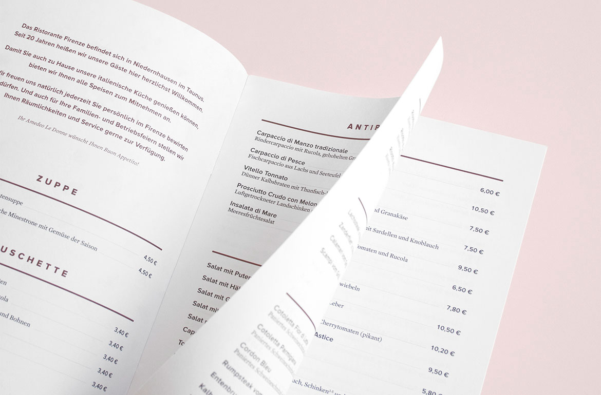
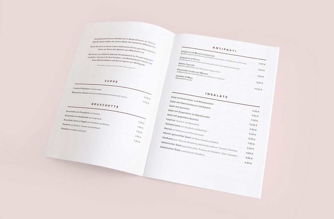
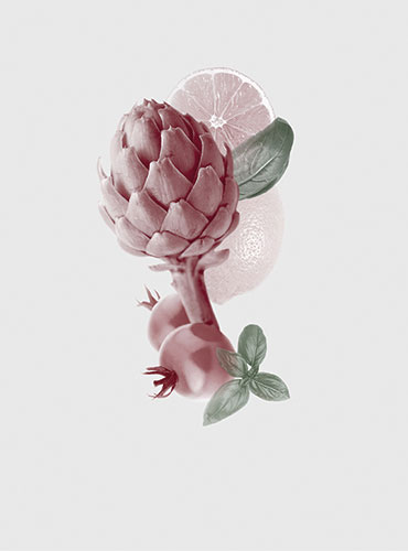
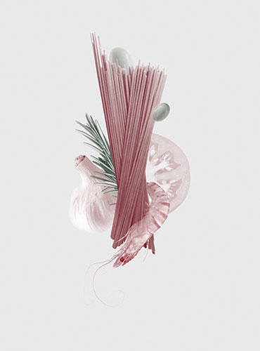
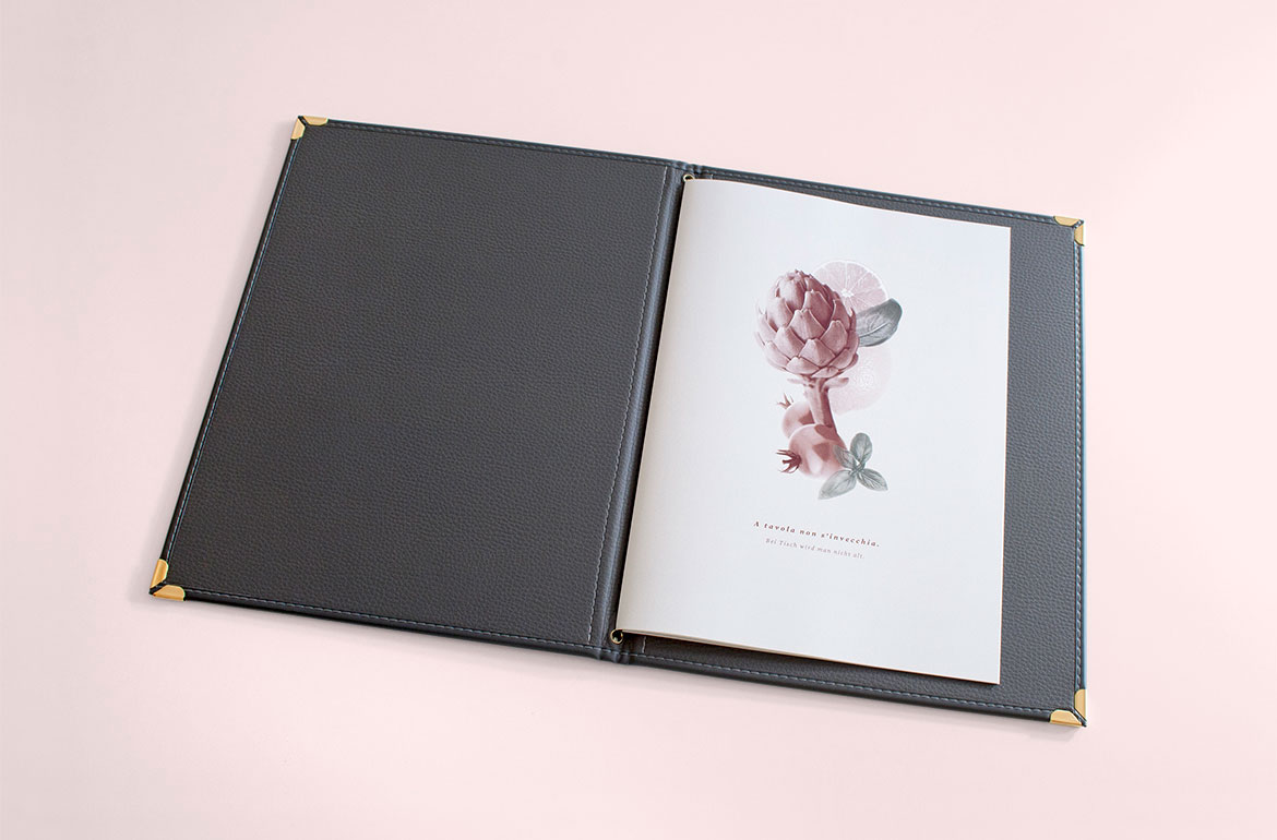
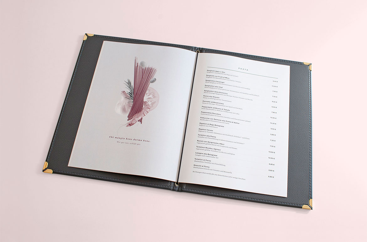
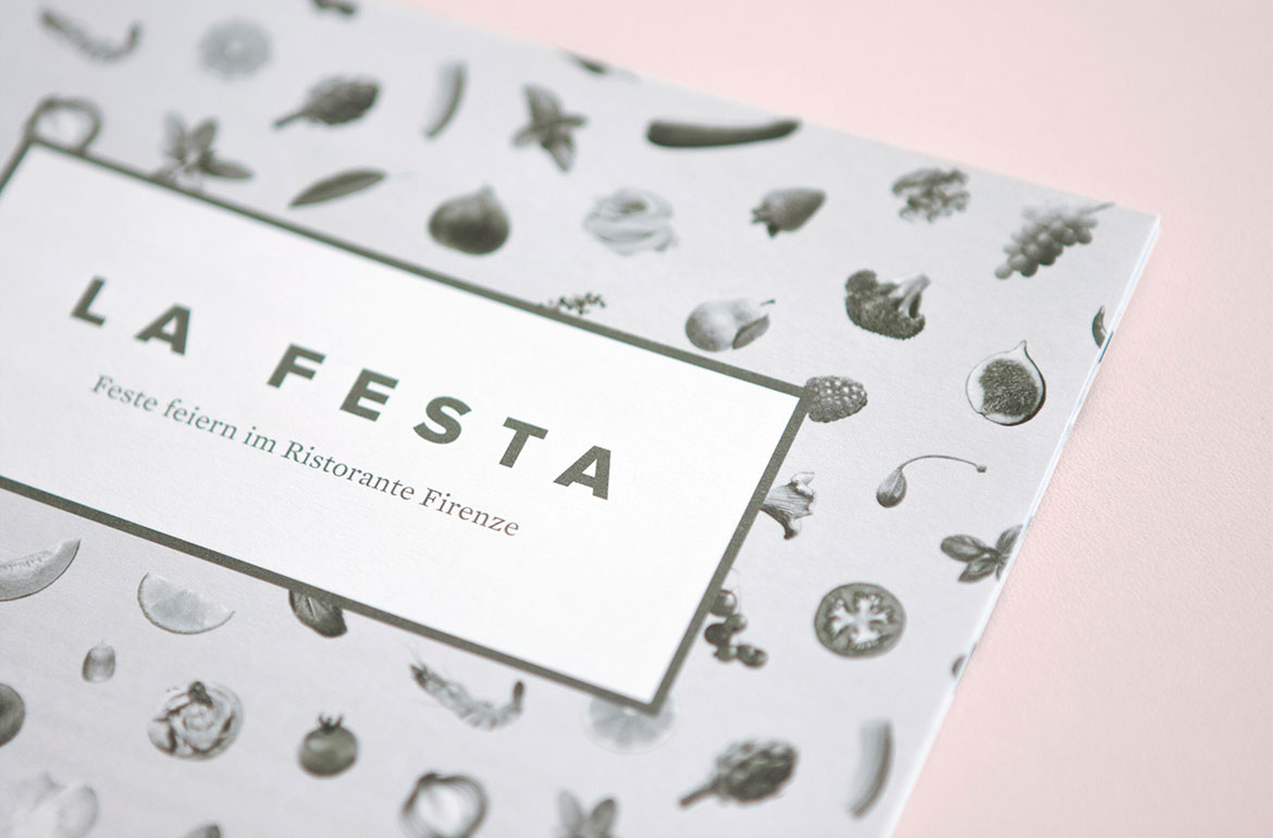
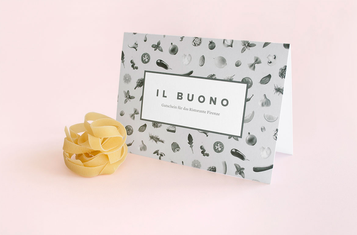
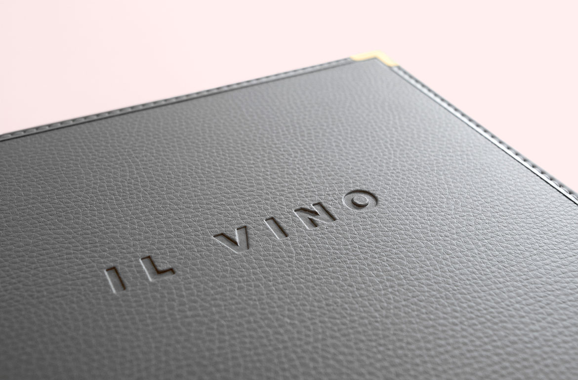
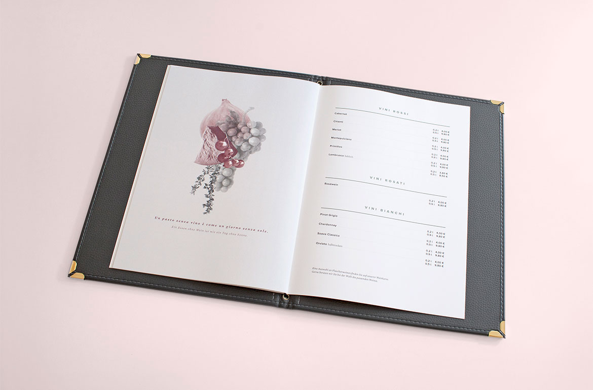
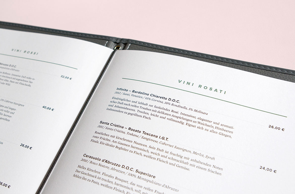
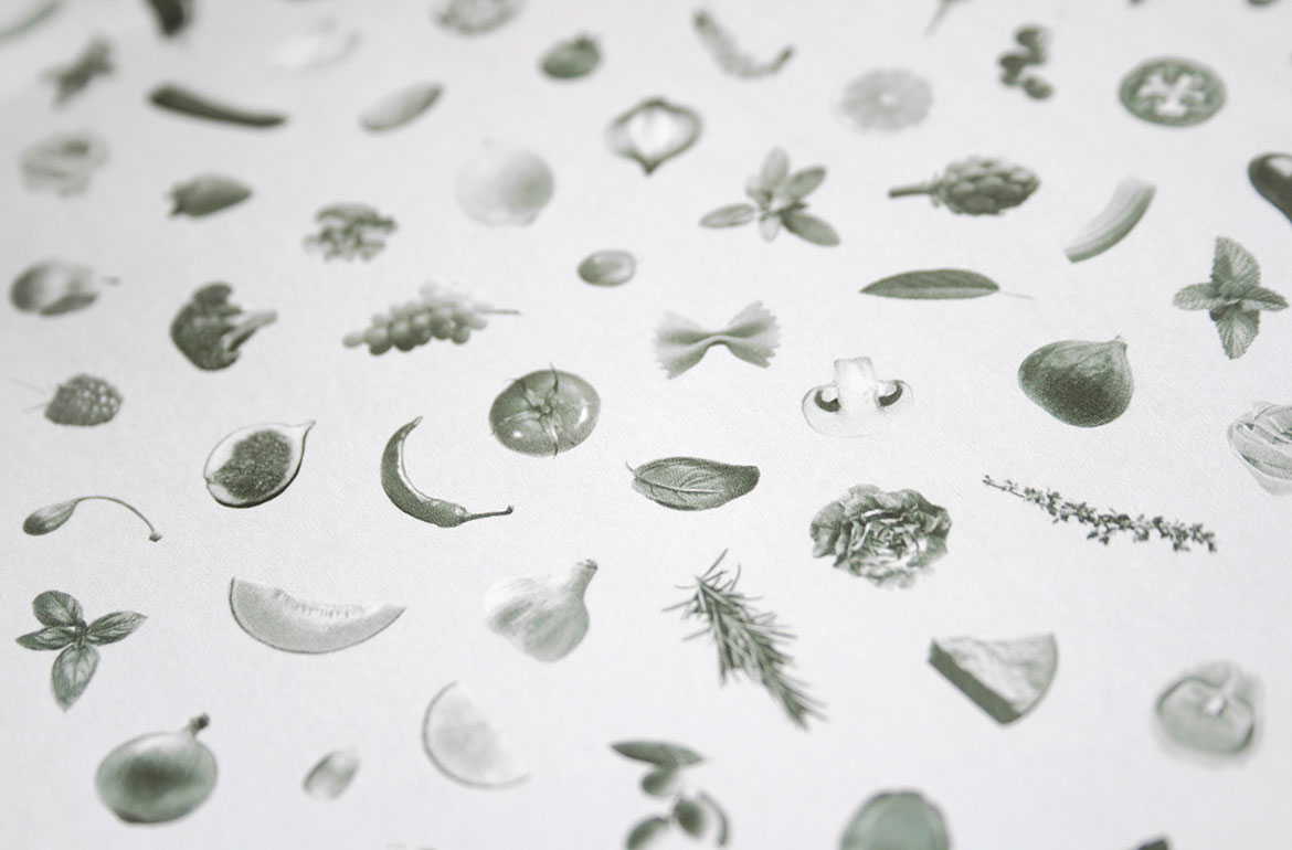
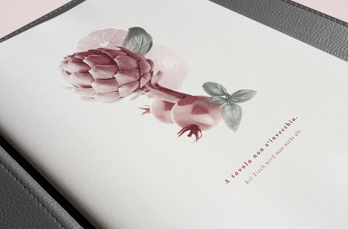
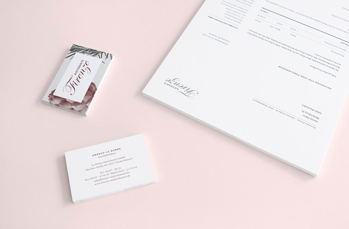
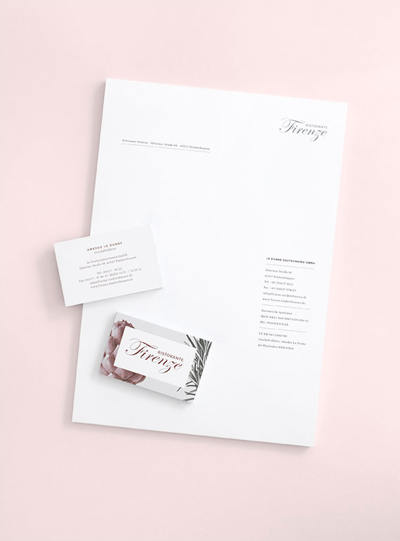
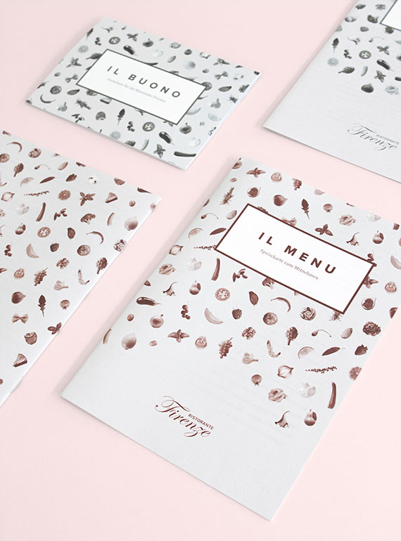
Call us tortured designers, but being exposed to really bad menu design in an otherwise decent establishment can be slightly agonizing. A business lunch with the Barbour crew inevitably ends up being a design critique of the menu (good or bad) upon the first few minutes of being seated. Yes, it’d probably make for a good SNL skit, but in all seriousness, menu design is an important detail that is sometimes missed. That is certainly not the case for this Italian restaurant, Ristorante Firenze, located near, of all places, Frankfurt, Germany. Stuttgart-based designer Sarah Le Donne is tremendously talented, and really shows her design chops with this branding package. We particularly love the typography and adept use of color. Le Donne explains: “After a small refresh of the existing logo, the task was to create a totally new concept and design for menu and wine cards, vouchers, brochures, business cards, letterheads and a website. The idea behind the identity was to lay the focus on the fresh products the restaurant is well known for. Also the classical Italian colors are reinterpreted in a modern way.” Really well done.
More restaurant-related design here and here and here.
Via sarahledonne.com