
Sports Inspired Typography
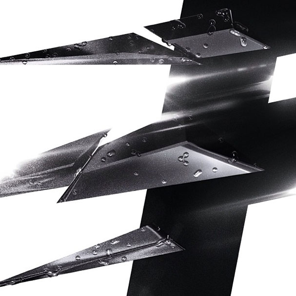
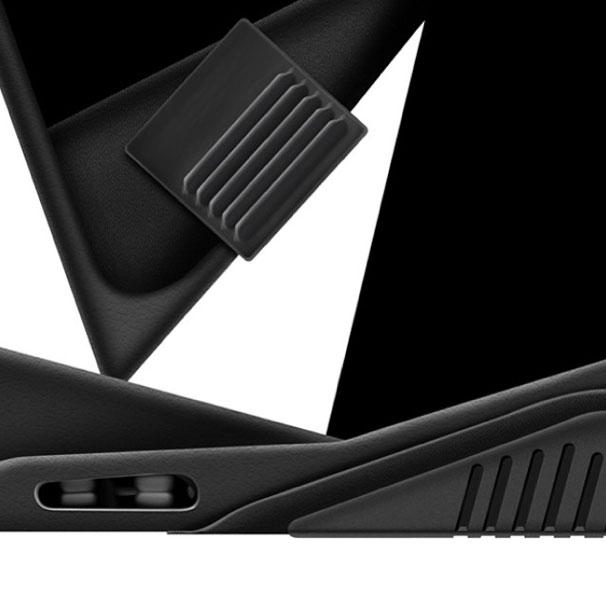
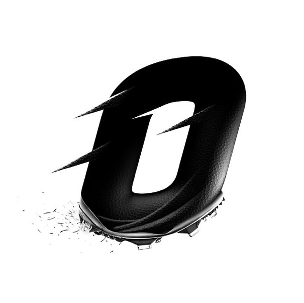
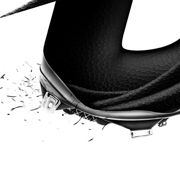
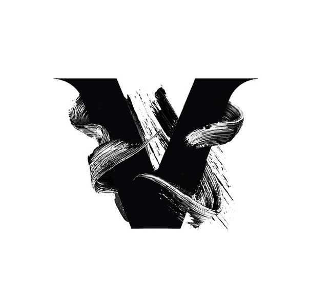
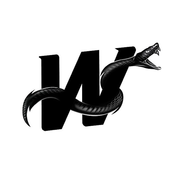
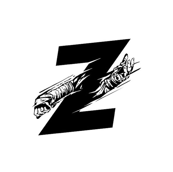
The typographic stylings of Australian illustrator/designer Christopher Haines are on point. We love his fresh take on this set letterforms from A to Z. This alphabet sort of evolves and shape shifts, from swooshy distortion of the letter C to the sneaker-inspired letter M to the full-on venomous viper wrapped around the letter W. Haines clearly draws inspiration from sports, and has a great attention to detail, thoughtfully building each form that could stand on its own.
Via Instagram


[…] Sports Inspired Typography […]