Posts Tagged ‘composition’
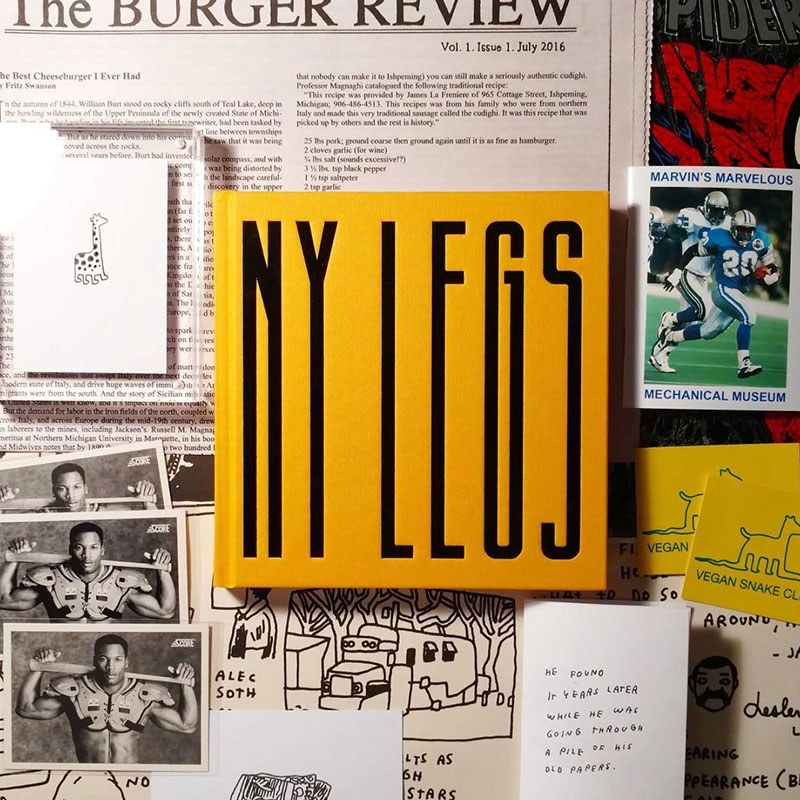
Stacey Baker’s Work Has Legs
On the heels of (no pun intended) the wildly popular Humans of New York series by Brandon Stanton, photographer Stacey Baker takes a slightly different approach, but in a similar vein. Baker, associate photo editor at The New York Times Magazine, takes to the streets and photographs women’s legs from the waist down. The collection…
Read MoreSuperb Typographic Structures
We love alphabet-based typography work (here and here), and artwork from everyday objects (here and here), so we are naturally drawn to this series, STRUCTURE x Type, by Indian design student Rigved Sathe. With form and structure in mind, Sathe created each individual letter from an object (or objects) corresponding to the letter. We love…
Read MoreSign of the Times: Surrealist Take on Trump
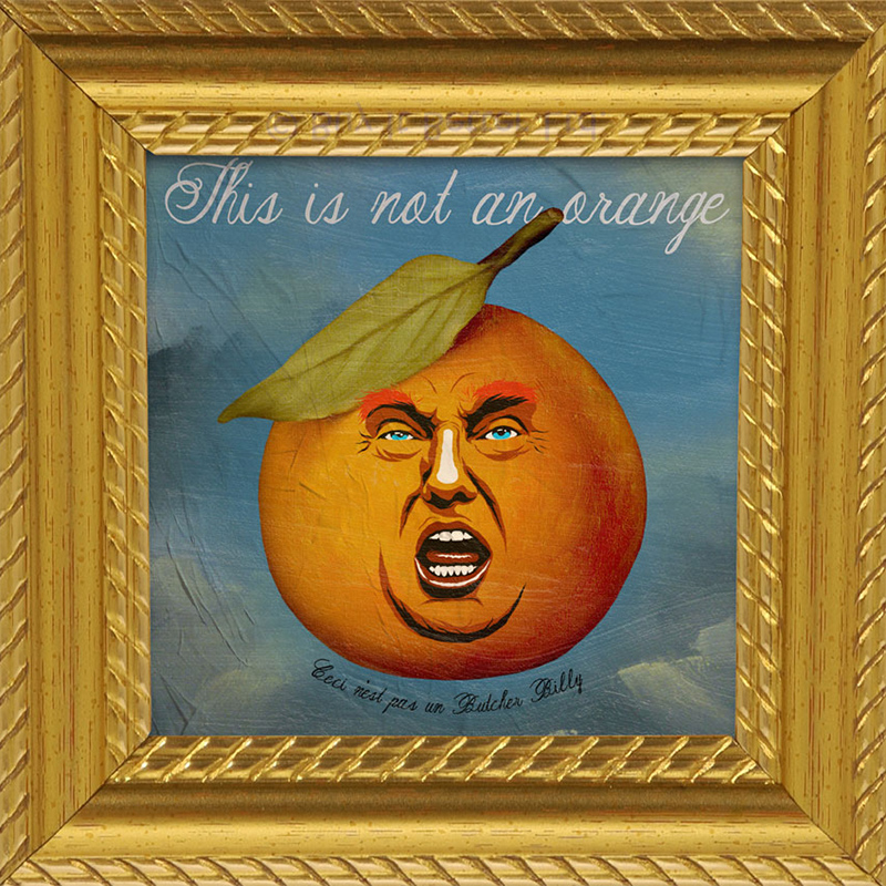
Fresh on the minds of Americans in this spirited election season, and following last night’s first presidential debate, Donald Trump has firmly cemented his Q Rating (whether favorable or not) into the public consciousness. It should come as no surprise, then, when artwork reflects current affairs (related posts here and here). We’ve discussed the awesome…
Read MoreExposing Environmental Wrongdoings Through CGI
We feel one of our fundamental responsibilities as designers is to employ our creative resources to help communicate and disseminate messages for public good, when possible. The right visuals can be powerful and in this instance, also quite beautiful. Commissioned by German environmental advocacy group Robin Wood, ad agency Grabarz & Partner collaborated with some…
Read MoreMeticulous Movie Director Portraits
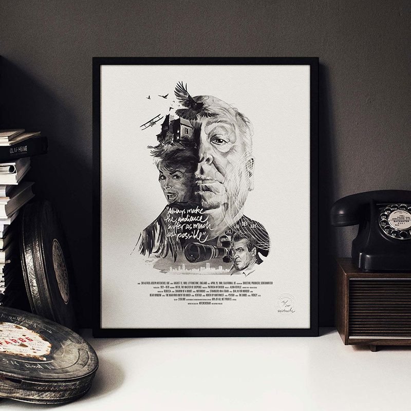
Movie buffs rejoice! While we certainly love movies, we are more excited about this incredible series of posters from a design and conceptual perspective. German multidisciplinary design studio Stellavie, in collaboration with illustrator/artist Julian Rentzsch, hit the mark with this superb series of prints paying homage to some of the foremost movie directors in history.…
Read MoreStriking Symmetry: FamilyTree Series by Bobby Neel Adams
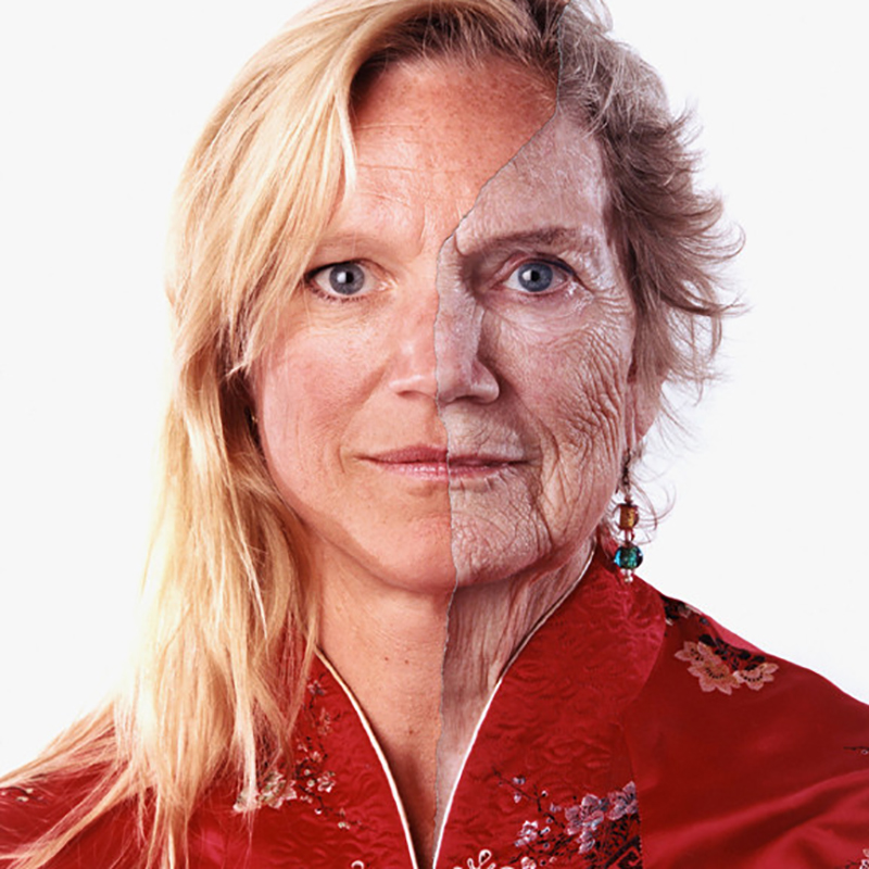
Family resemblance is a curious thing. When two immediate family members look so much alike, it can be jarring. North Carolina bred, Arizona based photographer Bobby Neel Adams capitalizes on this phenomenon of startling likeness in his stellar FamilyTree series. Adams captures portraits of two immediate family members (usually mother/daughter and father/son pairings) dressed and…
Read MoreUber Branding Blunder
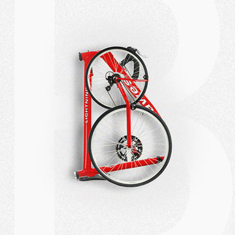
Just this week, Uber unveiled a global rebranding that not only strayed a bit from its recognizable logotype, but also introduced a rather detached set of app icons. Can’t say that we suffered from extreme design envy over the previous Uber logotype, but it was fine. While their new logotype seems like a step in…
Read MoreGenetically Modified Photography
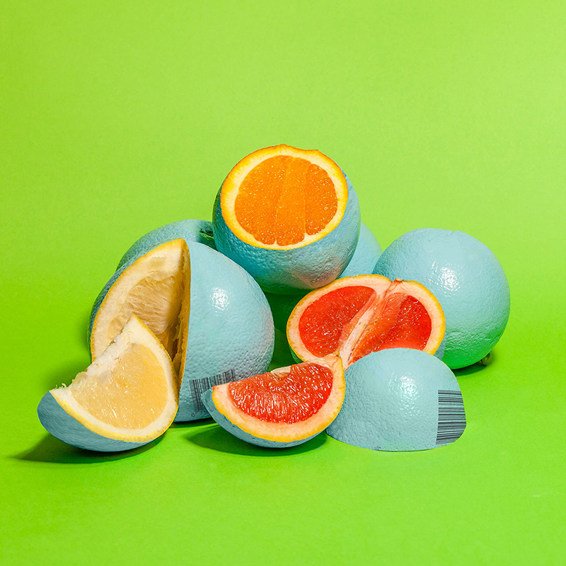
Conceptual food photography has got to be one of our favorite niche disciplines lately, only confirmed by this excellent collaboration between Sydney-based creatives Enrico Becker and Matt Harris. Created as visuals to accompany editorial on genetically modified foods, these photos could easily stand on their own. We love the choice of colors and thoughtful compositions.…
Read MorePositively Terrific Use of Negative Space
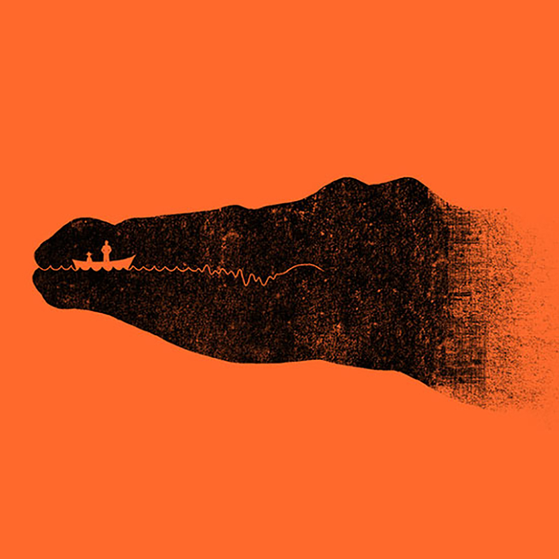
Negative space as a design device may look simple to the average person, but it’s actually quite complicated to effectively pull off. Few present-day artists know this better than illustrator/designer/artist Tang Yau Hoong. Malaysia-based Hoong has an awesome body of work (see previous post here), a good portion of which explores the interplay of positive…
Read MoreFaux Food by David Sykes
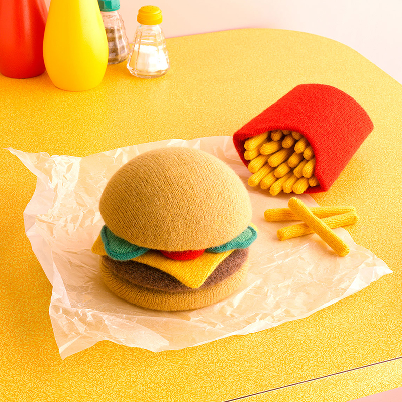
We certainly have a thing for creative food photography (here and here and here), so it’s no surprise that the inventive work of London-based photographer David Sykes caught our eye. Sykes looks at food from an unconventional perspective, and we particularly like the subtle injection of humor in his work. In fact, it’s not exactly…
Read More