
Posts Tagged ‘ESPN’
Terrifically Turbulent Portraiture
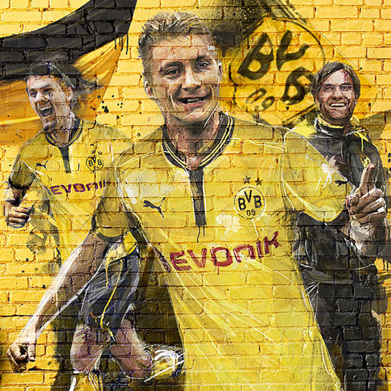
French illustrator/designer Florian Nicolle employs mixed media to create wonderfully complex portraits that are so bold, yet nuanced, that they almost seem to move. With newsprint, watercolor, pencil, ink and Photoshop in his arsenal, Nicolle’s meticulously crafted chaos has been sought after by some pretty high profile clients, including Nike, Puma, Los Angeles Times and…
Read MoreESPN Planning Guide 2014
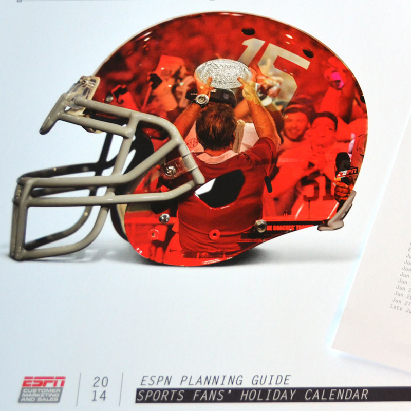
Annually, we (Barbour) are presented with the wonderful challenge of designing the ESPN Planning Guide—printed and digital collateral serving as a one-stop shop for all the sports, events, facts and figures that media professionals need to create their 2014 advertising plan. Our task is to make this information both very usable and readable, but also…
Read MoreCollege Basketball Poster by Barbour Design
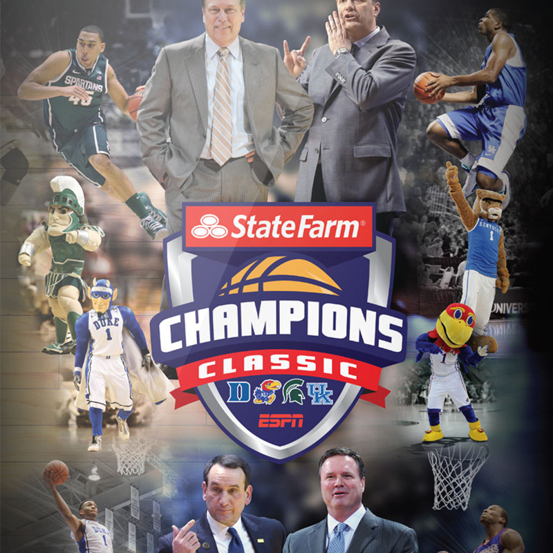
You may have caught the college hoops doubleheader in Chicago last night. Barbour was proudly a part of the action with this event poster design.
Read MoreGraphic Genius Alberto Seveso
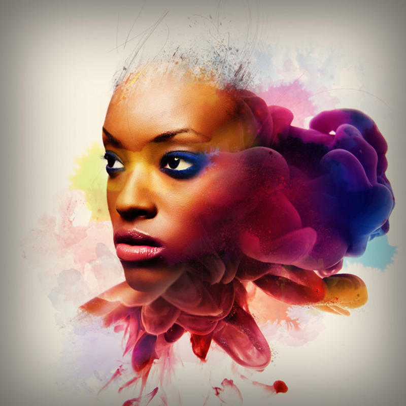
Italian illustrator/designer Alberto Seveso employs some awesome Photoshop skills to merge contrasting textures for a very distinct design style. We’ve featured his work before, but had to share some of his latest work. From album artwork, to packaging for Adobe, Seveso is a true master of digital art. He brings a certain beauty and elegance…
Read MoreBoom! Barbour hits keep on coming…
Illustrations by David Despau

Spanish illustrator David Despau has a very particular style, incorporating ink sketch and watercolor. His execution is flawless, and his impressive body of work is a testament to that. We particularly love his depiction of the latest Superman, Man of Steel’s Henry Cavill. We also admired his work a few months back in ESPN The…
Read MoreSportsCenter Motion Graphics

We often take slick television graphics for granted, so let’s take a moment to recognize the awesomeness of one of the best and most dynamic in the business: SportsCenter. Los Angeles-based art director/motion designer Craig Stouffer did some stellar work on these highly detailed sequences as part of the team at creative branding agency Troika…
Read MoreCustom Liquor Bottle Labels by Barbour Design
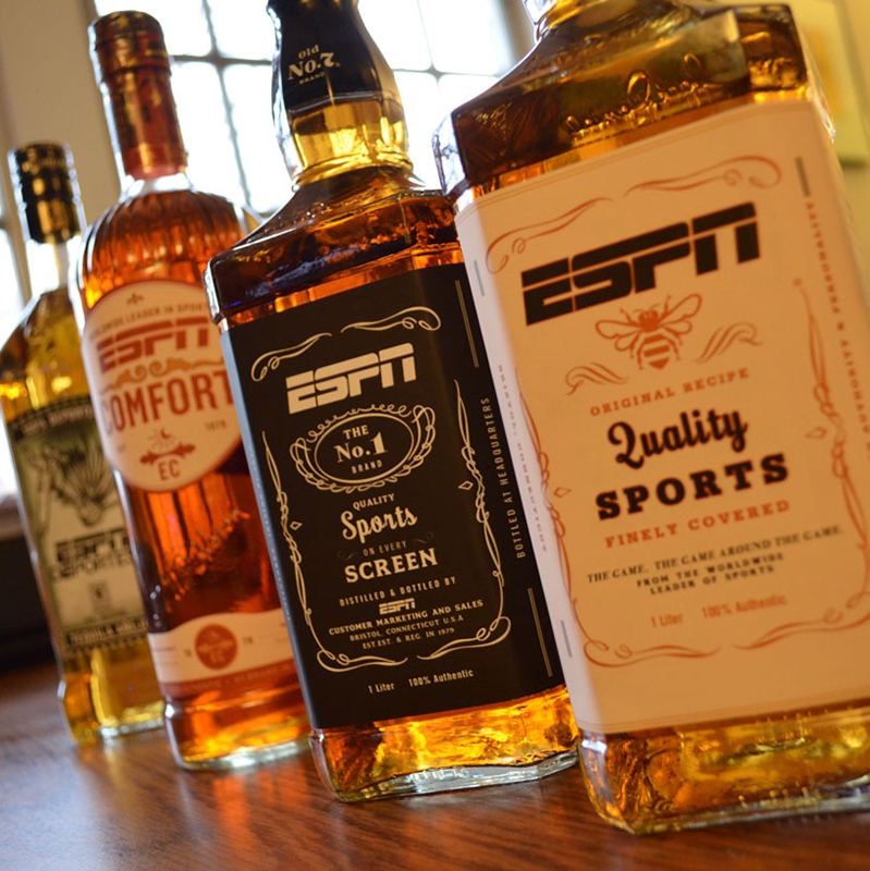
In an effort to showcase potential ESPN partnerships, the Barbour team recently designed these custom labels as a gift to marketing executives. They mimic the actual packaging, but with ESPN branding. A really fun project that was well received.
Read MoreESPN 2013 Planning Guide by Barbour Design
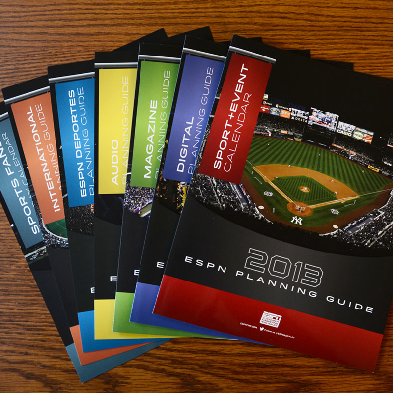
Barbour Design recently designed a media kit for ESPN, their annual Planning Guide. This year, the design was driven by some great stadium photography, paired with dark hues and contrasting vibrant accents. All materials were printed on a silk stock with dull varnish, plus a spot gloss UV for some punch.
Read MoreGold Medal Design
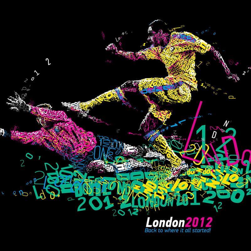
To honor the 2012 London Olympics, which begin today, Greek designer Charis Tsevis took a really compelling approach to these portraits. As with previous works, the complexity of Tsevis’s work is stunning. His use of type, the colors, everything. Simply awesome. Via espn.com
Read More