Branding
A3 Design Strikes a Balance
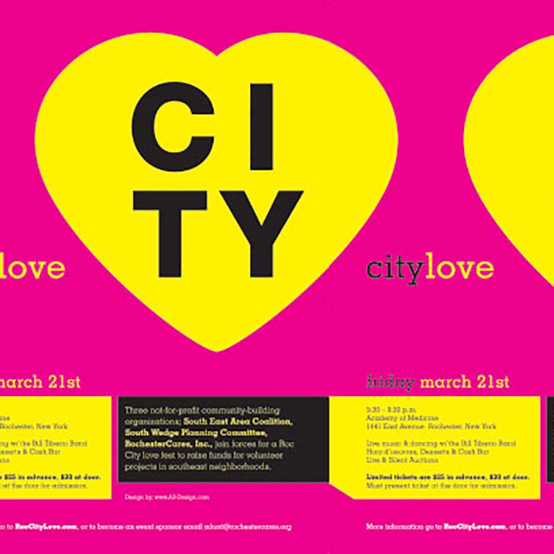
Balancing work and family is an issue close to our hearts. The culture at Barbour fosters this balance brilliantly, so we listened intently when Amanda Altman of Rochester-based A3 Design took the stage at Create Upstate (see related posts here, here and here) last week. Her speech, entitled Mind My Own Business, explored the ins and…
Read MoreLettering Work of the Incomparable Dana Tanamachi
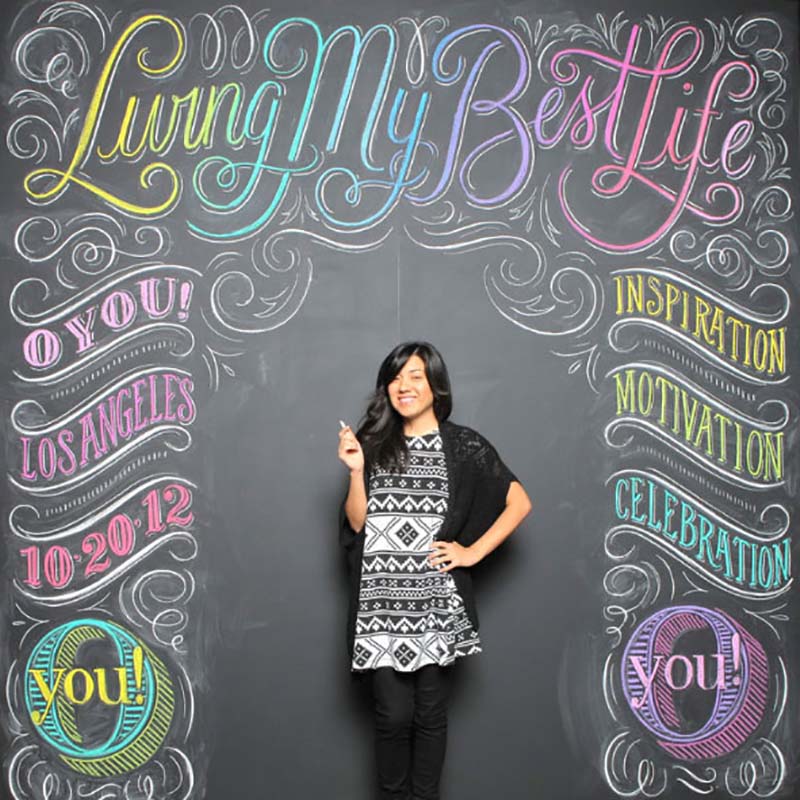
A couple members of the Barbour team had the honor of witnessing a speaking engagement by the incomparable Dana Tanamachi at Create Upstate in Syracuse last week. The event itself was terrific, from the impressive venue (great food, btw), awesome vendors, and stellar lineup of speakers. One highlight was undoubtedly the inspirational work and philosophy…
Read MorePlay with Oreo
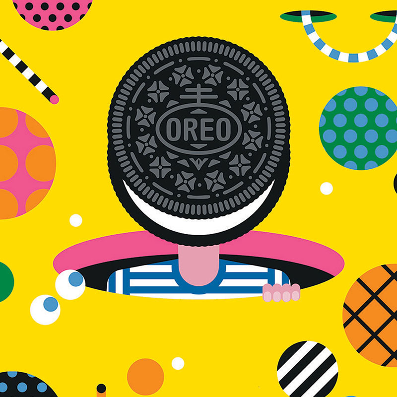
Few food items are more iconic than the beloved Oreo cookie. Introduced 103 years ago tomorrow (Happy Birthday, Oreo!), this sandwich cookie has long been recognized as the best-selling cookie in the U.S. With credentials like that, it’s no surprise that the Oreo brand has a massive advertising budget that allows for some terrifically creative…
Read MoreThe Beaming Body of Work by Linzie Hunter
Given the abundance of fonts out there (many of which are often free), one would think that the tradition of lettering would be dead. But similar to the rise of vinyl in music these days, the opposite is actually true. Lettering is experiencing a sort of renaissance in the design community. Call it novelty or…
Read MoreRestaurant Branding Fit for a Silver Platter
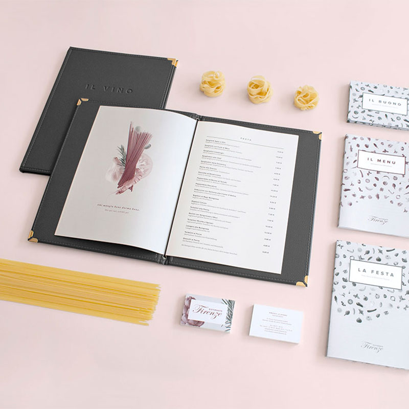
Call us tortured designers, but being exposed to really bad menu design in an otherwise decent establishment can be slightly agonizing. A business lunch with the Barbour crew inevitably ends up being a design critique of the menu (good or bad) upon the first few minutes of being seated. Yes, it’d probably make for a…
Read MoreCheers to Some Exceptional Package Design
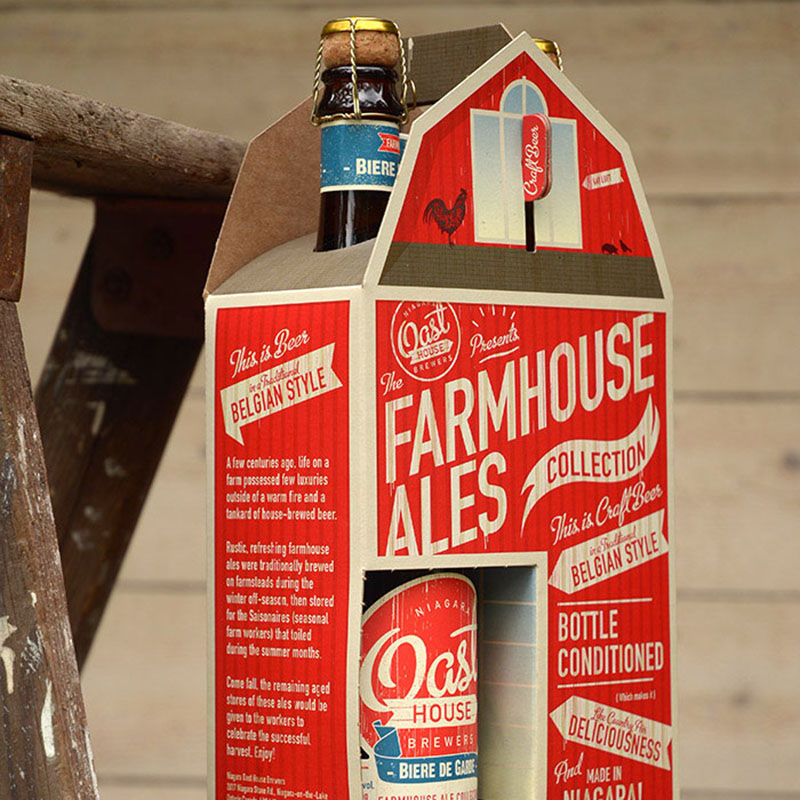
Packaging is no easy feat. Most people take it for granted because we are inundated with it from every angle in so many consumer categories. And coming up with fresh and original packaging concepts in the beverage industry is particularly challenging. The market is flooded with craft breweries and boutique wineries — never mind the…
Read MoreCam Curiosity
We may have a subconscious fixation with design in Italy… unintentionally our second such post in a row. This time, we look at some imaginative work of Italian art director Matteo Pozzi. Though these are advertisements for the baby product company Cam, they could easily stand on their own as examples of surrealist design. Cam’s…
Read MoreStunning Swoosh Portraits
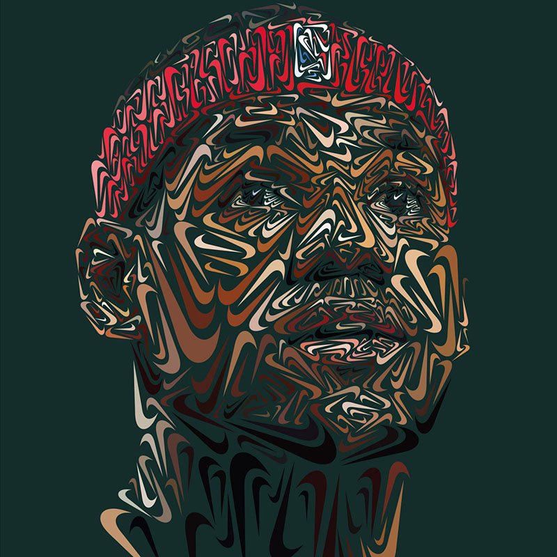
There’s no doubt that in our image-obsessed culture particular iconic brands still have a certain cachet to inspire art. And that is, at least in part, a good indicator that they are iconic. These portraits by German-based illustrator/Designer Andy Gellenberg are a perfect example. Gellenberg painstakingly created these portraits in the likeness of a few…
Read MorePick Our Brain
Corporate Identity Bliss
At the risk of sounding totally geeky, there’s nothing quite like a really well executed corporate identity. No matter the industry, effective branding design gets us excited. This example, by German-based designer Luca Fontana, of a logo and identity for a plant nursery in Italy is a perfect specimen of a very thoughtfully conceived and…
Read More