Typography
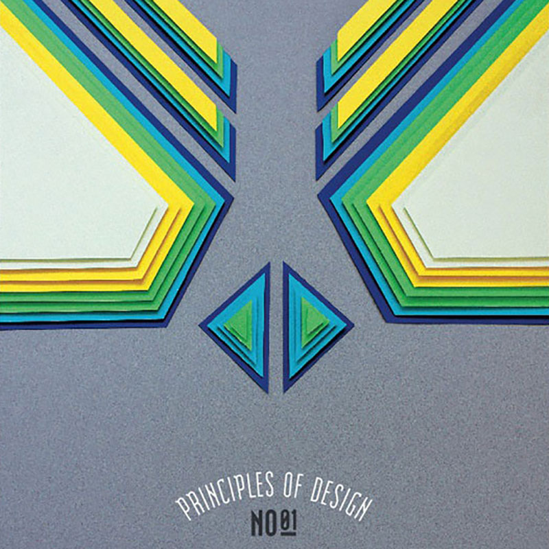
Principles of Design Poster Series
With school back in session, it seemed appropriate to feature some brilliant design work that’s education related. Turkish designer Efil Türk had the tall order of illustrating ten principles of design for her thesis project at Dokuz Eylul University of Fine Arts in İzmir, Turkey. These visual fundamentals — balance, hierarchy, pattern, rhythm, space, proportion,…
Read MoreOrigami Kicks
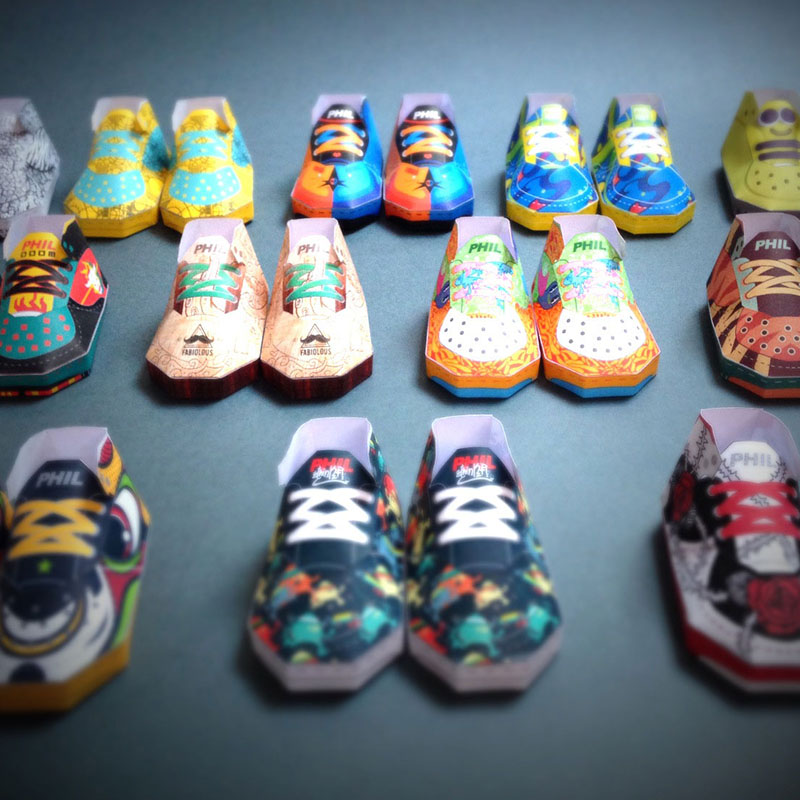
Folding paper in interesting ways is an ancients tradition, but also a favorite childhood pastime for many. Filippo Perin, paper artist of Phil Toys based in Conegliano, Italy, recently set out on a mission to collaborate with fellow artists and designers in creating paper sneakers for the Paperair Art Show. The results are fantastic, almost…
Read MoreTypography From Another Dimension
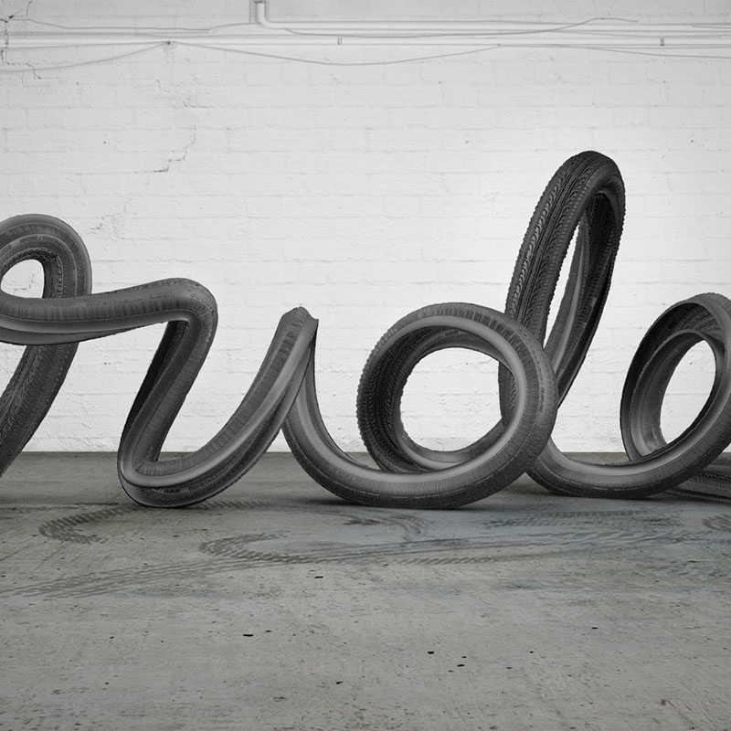
3D graphics have really improved (and continue to) exponentially in recent years. Buenos Aires based design studio Six & Five, established by art directors/designers Andy Reisinger and Ezequiel Pini, really capitalize on such advancements in compelling ways. Their approach is really refined and thoughtful, and based on the fundamentals of good design. Their typographic treatments…
Read MoreWe Love Lathe
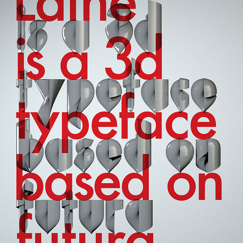
When London-based designer Alexander Klement sets a personal design goal, he follows through in a big way. And his Lathe typeface is a shining example. As fellow designers, we understand that typeface design is no easy task. How do you create something fresh and new, when it has been done over and over in so…
Read MoreMasterclass in Purposeful Play
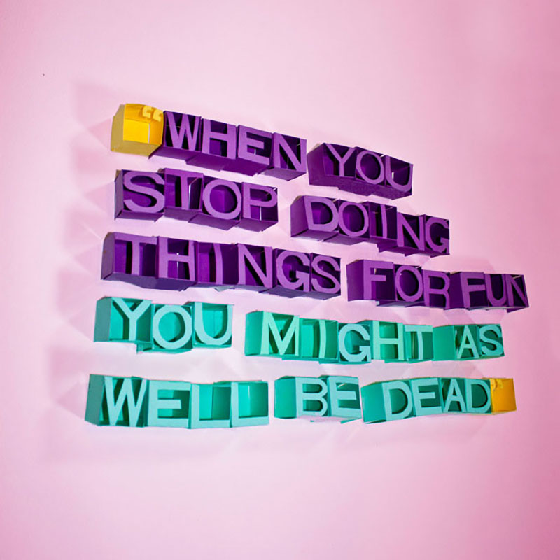
We really admire Allison Supron’s artistic spirit. Supron, a young, New York City-based designer, shows her creative chops in all their glory in her project entitled “Play”. We love her compositions of unconventional materials that focus on working with ones hands, rather than relying on the computer. It’s a process Supron likens to childhood experiences.…
Read MoreBrilliant Blue Ballpoint Illustrations
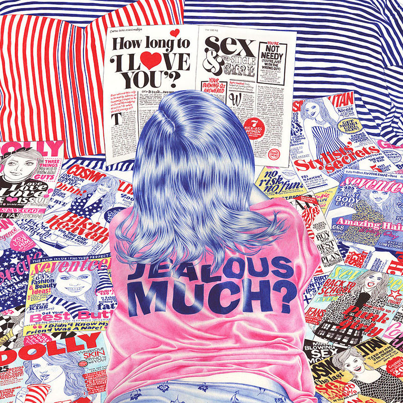
Um, wow. That’s our initial reaction to the impressive work of Paris-based illustrator Helena Hauss. These days, being a fantastic illustrator isn’t necessarily enough to stand out in a very crowded landscape of creative professionals. Hauss finds her sweet spot in her love of the color blue. A good portion of her work is done…
Read MoreSports Inspired Typography
The typographic stylings of Australian illustrator/designer Christopher Haines are on point. We love his fresh take on this set letterforms from A to Z. This alphabet sort of evolves and shape shifts, from swooshy distortion of the letter C to the sneaker-inspired letter M to the full-on venomous viper wrapped around the letter W. Haines…
Read MoreA Stylistic Survey of Graphic Design
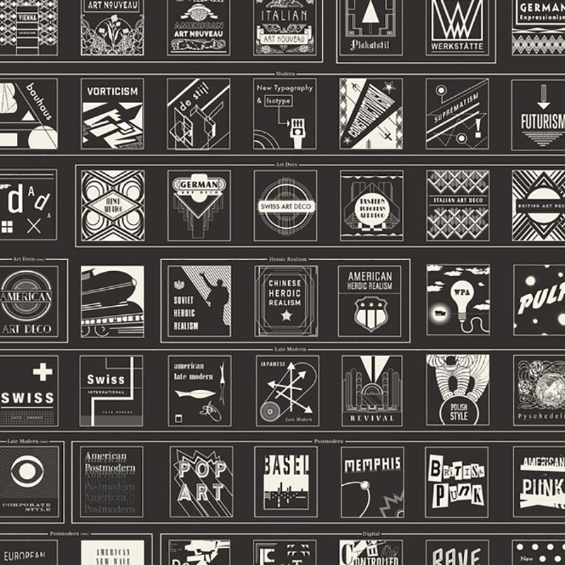
The folks at Brooklyn-based Pop Chart Lab have done it again. Their proficiency for infographical treatments is astounding, no matter the subject matter. Whether it be a “Visual Compendium of Guitars” or “Cartography of Kitchenware” or any number of alcohol-related compositions (think “The Marvelous Mixology of Martinis”, “Fantastical Fictive Beers”, “Wineries of Napa”, etc.), the…
Read MoreGraphic Designer Gets Stamp of Approval
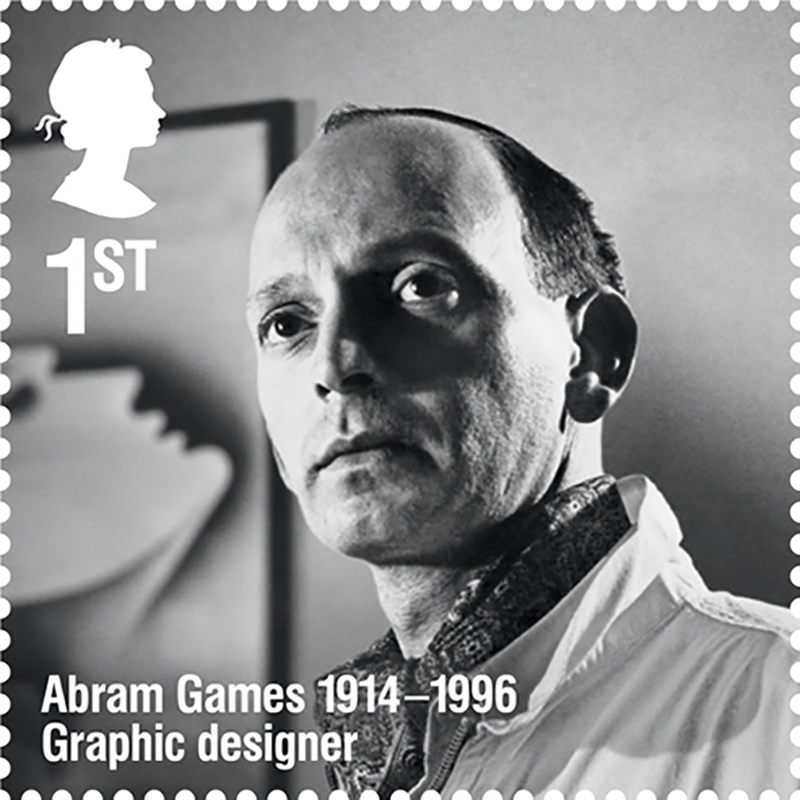
Abram Games (July 29, 1914 – August 27, 1996) was born the same year as Paul Rand and died the same year too. (August 15, 1914 – November 26, 1996). Now he is commemorated in a stamp issued by the Royal Mail. Royal Mail celebrates a selection of remarkable individuals from the realms of sport,…
Read MoreOrnate Paper Alphabet by Dan Hoopert
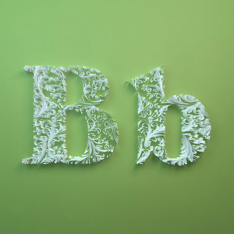
Young UK-based designer Dan Hoopert’s latest project epitomizes intricacy in design and execution. This personal project—partly handmade, partly digital—explores ornate three-dimensional forms within characters of the alphabet. Simply amazing. We cannot even imagine how many hours were spent on this. Beautiful. Hoopert is a promising young designer, for sure. More paper art here and here…
Read More